Materials · 2026-07-08

How Does Impasto Change Perceived Value?

A flat image can look convincing on screen, then feel ordinary on a wall. Buyers notice that difference fast.

I see impasto as a visible record of making. It can increase perceived value when the texture supports the image, stays stable, and is described honestly as part of the specification.

I do not treat thick paint as a shortcut to “premium.” I ask what the surface adds to the idea and what it asks from production.
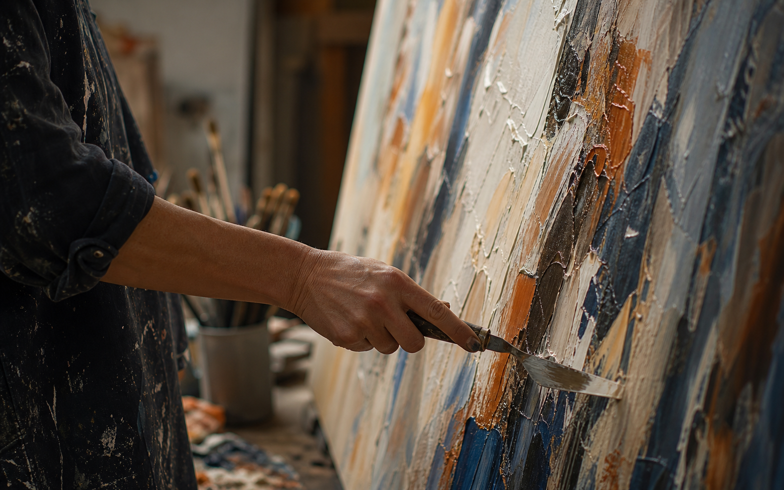
How Does Impasto Change Perceived Value

What does impasto communicate before anyone reads a caption?

Raised paint gives viewers evidence that a surface has been built, not simply printed.

I use that evidence carefully because the mark must still fit the artwork.

Editorial visual for What does impasto communicate before anyone reads a caption

What I examine first

I separate visual depth, labour, material risk, and buyer expectation. I use that evidence carefully because the mark must still fit the artwork. I start with the actual setting, not a mood-board label. I ask who will see the work, from where they will see it, and what practical decision the answer must support. This keeps the discussion close to the room, the buyer, and the final configuration. I do not use a general claim when I can name the visual or physical condition that changes the result.

In this part of the process, I look for proof that a choice can be repeated and explained. I compare the reference with the approved size, finish, and delivery route. I also leave space for the natural differences that belong to artist-made work. A good brief does not erase those differences. It makes them visible before production starts, so the buyer knows what is fixed and what remains expressive.

QuestionWhat I recordWhy it matters
IntentWhat does impasto communicate before anyone reads a captionIt gives the project a clear decision rule.
ReferenceApproved image, scale, and finishIt keeps the conversation specific.
HandoverQuote notes and final configurationIt makes later checks easier.

What I take from community practice

I also read practitioner discussions, including Reddit r/ContemporaryArt, shipping textured paintings discussion, to learn which questions recur in real projects. I treat those comments as individual experience, not a production standard. They help me notice concerns that a formal brief can miss, then I check the relevant detail against the approved project requirements.

Where I slow down

I slow down when a choice could affect rights, handling, installation, or a buyer's expectation. That pause is useful. It gives me time to compare the detail against the full project instead of treating one image or one sentence as the whole answer. I use hand-painted catalog, printed wall art route, and project quotation form when I need the project team to move from an idea to a defined route.

How do I keep texture from becoming decoration?

Texture loses force when every area competes for attention.

I place depth where it can guide the eye and leave breathing room elsewhere.

Editorial visual for How do I keep texture from becoming decoration

What I examine first

I separate visual depth, labour, material risk, and buyer expectation. I place depth where it can guide the eye and leave breathing room elsewhere. I start with the actual setting, not a mood-board label. I ask who will see the work, from where they will see it, and what practical decision the answer must support. This keeps the discussion close to the room, the buyer, and the final configuration. I do not use a general claim when I can name the visual or physical condition that changes the result.

In this part of the process, I look for proof that a choice can be repeated and explained. I compare the reference with the approved size, finish, and delivery route. I also leave space for the natural differences that belong to artist-made work. A good brief does not erase those differences. It makes them visible before production starts, so the buyer knows what is fixed and what remains expressive.

QuestionWhat I recordWhy it matters
IntentHow do I keep texture from becoming decorationIt gives the project a clear decision rule.
ReferenceApproved image, scale, and finishIt keeps the conversation specific.
HandoverQuote notes and final configurationIt makes later checks easier.

What I take from community practice

I also read practitioner discussions, including Reddit r/ContemporaryArt, shipping textured paintings discussion, to learn which questions recur in real projects. I treat those comments as individual experience, not a production standard. They help me notice concerns that a formal brief can miss, then I check the relevant detail against the approved project requirements.

Where I slow down

I slow down when a choice could affect rights, handling, installation, or a buyer's expectation. That pause is useful. It gives me time to compare the detail against the full project instead of treating one image or one sentence as the whole answer. I use hand-painted catalog, printed wall art route, and project quotation form when I need the project team to move from an idea to a defined route.

What changes in a specification for textured work?

A texture promise needs a reference, a tolerance, and a clear finish route.

I describe the surface in plain language and approve it against a sample or benchmark.

Editorial visual for What changes in a specification for textured work

What I examine first

I separate visual depth, labour, material risk, and buyer expectation. I describe the surface in plain language and approve it against a sample or benchmark. I start with the actual setting, not a mood-board label. I ask who will see the work, from where they will see it, and what practical decision the answer must support. This keeps the discussion close to the room, the buyer, and the final configuration. I do not use a general claim when I can name the visual or physical condition that changes the result.

In this part of the process, I look for proof that a choice can be repeated and explained. I compare the reference with the approved size, finish, and delivery route. I also leave space for the natural differences that belong to artist-made work. A good brief does not erase those differences. It makes them visible before production starts, so the buyer knows what is fixed and what remains expressive.

QuestionWhat I recordWhy it matters
IntentWhat changes in a specification for textured workIt gives the project a clear decision rule.
ReferenceApproved image, scale, and finishIt keeps the conversation specific.
HandoverQuote notes and final configurationIt makes later checks easier.

What I take from community practice

I also read practitioner discussions, including Reddit r/ContemporaryArt, shipping textured paintings discussion, to learn which questions recur in real projects. I treat those comments as individual experience, not a production standard. They help me notice concerns that a formal brief can miss, then I check the relevant detail against the approved project requirements.

Where I slow down

I slow down when a choice could affect rights, handling, installation, or a buyer's expectation. That pause is useful. It gives me time to compare the detail against the full project instead of treating one image or one sentence as the whole answer. I use hand-painted catalog, printed wall art route, and project quotation form when I need the project team to move from an idea to a defined route.

How do I compare hand-painted and printed options fairly?

The right choice depends on the role of variation, repeatability, timing, and quantity.

I explain the trade-off before I ask a buyer to choose a route.

Editorial visual for How do I compare hand-painted and printed options fairly

What I examine first

I separate visual depth, labour, material risk, and buyer expectation. I explain the trade-off before I ask a buyer to choose a route. I start with the actual setting, not a mood-board label. I ask who will see the work, from where they will see it, and what practical decision the answer must support. This keeps the discussion close to the room, the buyer, and the final configuration. I do not use a general claim when I can name the visual or physical condition that changes the result.

In this part of the process, I look for proof that a choice can be repeated and explained. I compare the reference with the approved size, finish, and delivery route. I also leave space for the natural differences that belong to artist-made work. A good brief does not erase those differences. It makes them visible before production starts, so the buyer knows what is fixed and what remains expressive.

QuestionWhat I recordWhy it matters
IntentHow do I compare hand-painted and printed options fairlyIt gives the project a clear decision rule.
ReferenceApproved image, scale, and finishIt keeps the conversation specific.
HandoverQuote notes and final configurationIt makes later checks easier.

What I take from community practice

I also read practitioner discussions, including Reddit r/ContemporaryArt, shipping textured paintings discussion, to learn which questions recur in real projects. I treat those comments as individual experience, not a production standard. They help me notice concerns that a formal brief can miss, then I check the relevant detail against the approved project requirements.

Where I slow down

I slow down when a choice could affect rights, handling, installation, or a buyer's expectation. That pause is useful. It gives me time to compare the detail against the full project instead of treating one image or one sentence as the whole answer. I use hand-painted catalog, printed wall art route, and project quotation form when I need the project team to move from an idea to a defined route.

Conclusion

I use impasto to show intention, not to imitate value with a thicker surface.

Notes

  1. Tate, “Impasto”
  2. Canadian Conservation Institute, “Caring for paintings”
  3. Smithsonian Provenance
  4. U.S. Copyright Office, visual artists
  5. Reddit r/ContemporaryArt, shipping textured paintings discussion