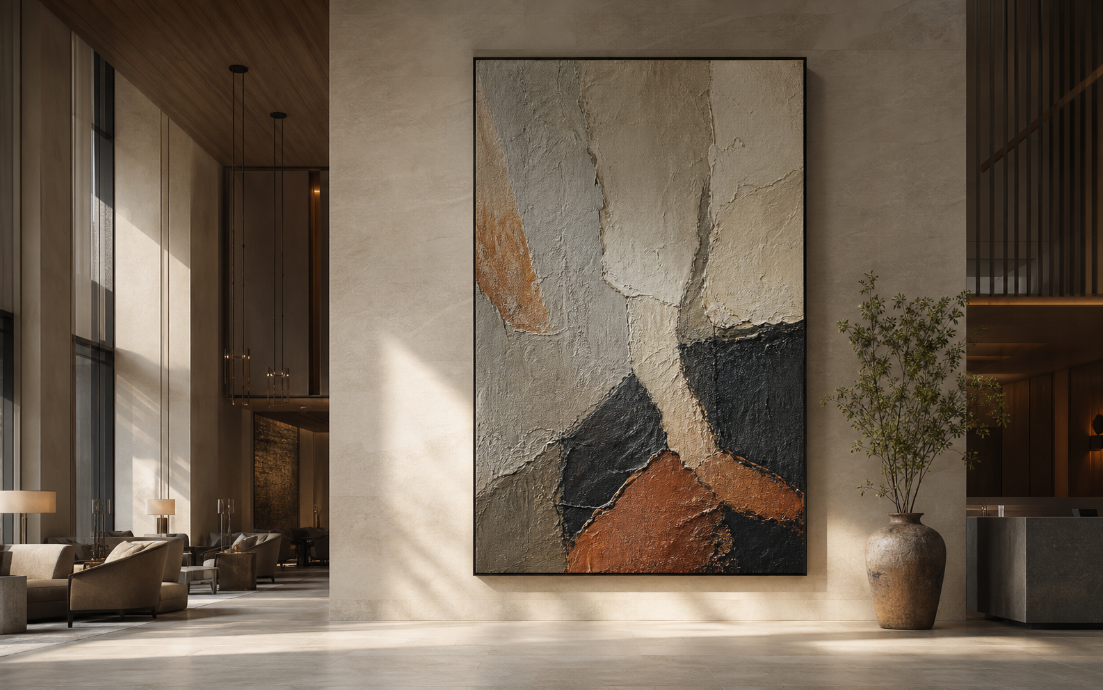
Why Does Texture Matter More Than Color in a Monumental Room?
Large rooms can make good color disappear. Flat work then feels distant, and the wall loses the attention it deserves.
I use texture as the first tool for a monumental room because relief changes with distance and light. Color sets mood, but surface gives the work a physical presence that can hold a large wall.
I start with the room, not a paint chip. I watch how people enter, pause, and move past the wall before I choose a direction.

What changes when viewers move through the room?
A tall wall can look impressive on a plan and empty in person. Movement exposes that gap.
I map the first view, the close view, and the exit view before I select a work.

What I examine first
I assess relief, scale, viewing distance, and light as one system. I map the first view, the close view, and the exit view before I select a work. I start with the actual setting, not a mood-board label. I ask who will see the work, from where they will see it, and what practical decision the answer must support. This keeps the discussion close to the room, the buyer, and the final configuration. I do not use a general claim when I can name the visual or physical condition that changes the result.
In this part of the process, I look for proof that a choice can be repeated and explained. I compare the reference with the approved size, finish, and delivery route. I also leave space for the natural differences that belong to artist-made work. A good brief does not erase those differences. It makes them visible before production starts, so the buyer knows what is fixed and what remains expressive.
| Question | What I record | Why it matters |
|---|---|---|
| Intent | What changes when viewers move through the room | It gives the project a clear decision rule. |
| Reference | Approved image, scale, and finish | It keeps the conversation specific. |
| Handover | Quote notes and final configuration | It makes later checks easier. |
What I take from community practice
I also read practitioner discussions, including Reddit r/interiordesignideas, large textured art discussion, to learn which questions recur in real projects. I treat those comments as individual experience, not a production standard. They help me notice concerns that a formal brief can miss, then I check the relevant detail against the approved project requirements.
Where I slow down
I slow down when a choice could affect rights, handling, installation, or a buyer's expectation. That pause is useful. It gives me time to compare the detail against the full project instead of treating one image or one sentence as the whole answer. I use hand-painted catalog, printed wall art route, and project quotation form when I need the project team to move from an idea to a defined route.
How do I use light to reveal a painted surface?
Even a quiet palette can become active when side light reaches a raised mark.
I treat daylight, downlights, and evening lighting as separate tests.

What I examine first
I assess relief, scale, viewing distance, and light as one system. I treat daylight, downlights, and evening lighting as separate tests. I start with the actual setting, not a mood-board label. I ask who will see the work, from where they will see it, and what practical decision the answer must support. This keeps the discussion close to the room, the buyer, and the final configuration. I do not use a general claim when I can name the visual or physical condition that changes the result.
In this part of the process, I look for proof that a choice can be repeated and explained. I compare the reference with the approved size, finish, and delivery route. I also leave space for the natural differences that belong to artist-made work. A good brief does not erase those differences. It makes them visible before production starts, so the buyer knows what is fixed and what remains expressive.
| Question | What I record | Why it matters |
|---|---|---|
| Intent | How do I use light to reveal a painted surface | It gives the project a clear decision rule. |
| Reference | Approved image, scale, and finish | It keeps the conversation specific. |
| Handover | Quote notes and final configuration | It makes later checks easier. |
What I take from community practice
I also read practitioner discussions, including Reddit r/interiordesignideas, large textured art discussion, to learn which questions recur in real projects. I treat those comments as individual experience, not a production standard. They help me notice concerns that a formal brief can miss, then I check the relevant detail against the approved project requirements.
Where I slow down
I slow down when a choice could affect rights, handling, installation, or a buyer's expectation. That pause is useful. It gives me time to compare the detail against the full project instead of treating one image or one sentence as the whole answer. I use hand-painted catalog, printed wall art route, and project quotation form when I need the project team to move from an idea to a defined route.
Why can a limited palette still carry a large wall?
A narrow palette becomes strong when value, edge, and surface change are clear.
I keep colour calm when the room needs rest, then let material create the movement.

What I examine first
I assess relief, scale, viewing distance, and light as one system. I keep colour calm when the room needs rest, then let material create the movement. I start with the actual setting, not a mood-board label. I ask who will see the work, from where they will see it, and what practical decision the answer must support. This keeps the discussion close to the room, the buyer, and the final configuration. I do not use a general claim when I can name the visual or physical condition that changes the result.
In this part of the process, I look for proof that a choice can be repeated and explained. I compare the reference with the approved size, finish, and delivery route. I also leave space for the natural differences that belong to artist-made work. A good brief does not erase those differences. It makes them visible before production starts, so the buyer knows what is fixed and what remains expressive.
| Question | What I record | Why it matters |
|---|---|---|
| Intent | Why can a limited palette still carry a large wall | It gives the project a clear decision rule. |
| Reference | Approved image, scale, and finish | It keeps the conversation specific. |
| Handover | Quote notes and final configuration | It makes later checks easier. |
What I take from community practice
I also read practitioner discussions, including Reddit r/interiordesignideas, large textured art discussion, to learn which questions recur in real projects. I treat those comments as individual experience, not a production standard. They help me notice concerns that a formal brief can miss, then I check the relevant detail against the approved project requirements.
Where I slow down
I slow down when a choice could affect rights, handling, installation, or a buyer's expectation. That pause is useful. It gives me time to compare the detail against the full project instead of treating one image or one sentence as the whole answer. I use hand-painted catalog, printed wall art route, and project quotation form when I need the project team to move from an idea to a defined route.
What should enter the final specification?
A good visual brief names more than dimensions. It records the effect that the buyer expects to see.
I document scale, placement, preferred relief, lighting notes, and the approved reference.

What I examine first
I assess relief, scale, viewing distance, and light as one system. I document scale, placement, preferred relief, lighting notes, and the approved reference. I start with the actual setting, not a mood-board label. I ask who will see the work, from where they will see it, and what practical decision the answer must support. This keeps the discussion close to the room, the buyer, and the final configuration. I do not use a general claim when I can name the visual or physical condition that changes the result.
In this part of the process, I look for proof that a choice can be repeated and explained. I compare the reference with the approved size, finish, and delivery route. I also leave space for the natural differences that belong to artist-made work. A good brief does not erase those differences. It makes them visible before production starts, so the buyer knows what is fixed and what remains expressive.
| Question | What I record | Why it matters |
|---|---|---|
| Intent | What should enter the final specification | It gives the project a clear decision rule. |
| Reference | Approved image, scale, and finish | It keeps the conversation specific. |
| Handover | Quote notes and final configuration | It makes later checks easier. |
What I take from community practice
I also read practitioner discussions, including Reddit r/interiordesignideas, large textured art discussion, to learn which questions recur in real projects. I treat those comments as individual experience, not a production standard. They help me notice concerns that a formal brief can miss, then I check the relevant detail against the approved project requirements.
Where I slow down
I slow down when a choice could affect rights, handling, installation, or a buyer's expectation. That pause is useful. It gives me time to compare the detail against the full project instead of treating one image or one sentence as the whole answer. I use hand-painted catalog, printed wall art route, and project quotation form when I need the project team to move from an idea to a defined route.
Conclusion
I make a monumental room feel complete by giving light and movement something real to read.