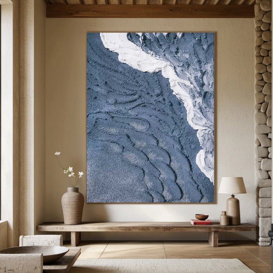
Artist-painted · BGA 164
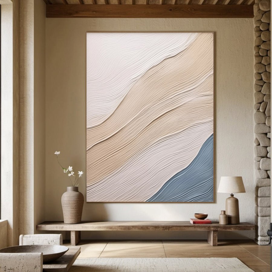
3D Textured Aerial Seascape, Minimalist Blue and White Art #BGA 164
13 standard sizes · Made to order
Neutral wall art uses relationships between ivory, sand, taupe, beige, grey and earth tones to add depth without introducing a dominant accent color. This hand-painted collection focuses on tactile surfaces and adaptable palettes for living rooms, guestrooms, lobbies and calm commercial interiors.
3D Textured Aerial Seascape, Minimalist Blue and White Art #BGA 164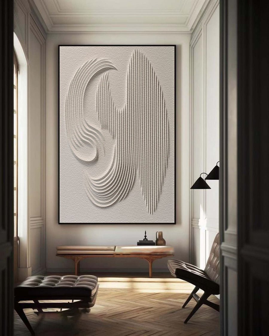 3D Textured Wall Art with Organic Waves in Minimalist Neutral Tones #BBM 022
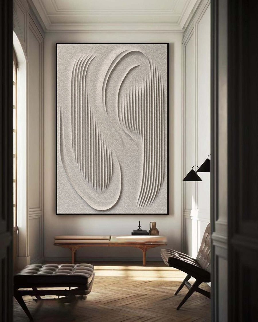 3D Textured Wall Art with Organic Waves in Minimalist Neutral Tones #BBM 023
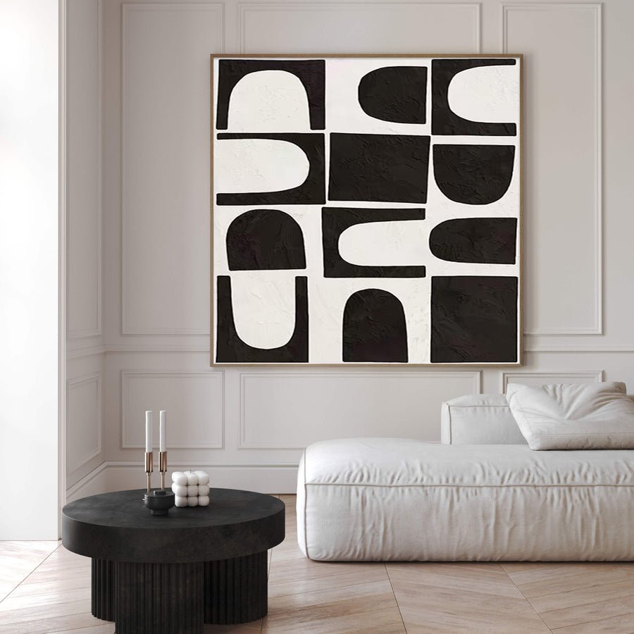
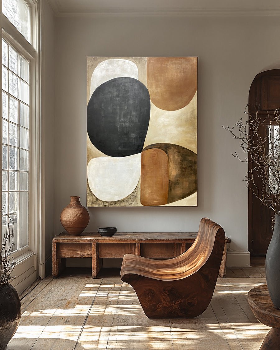 Abstract Art with Textured Shapes in Black, White, and Beige #BGA 281
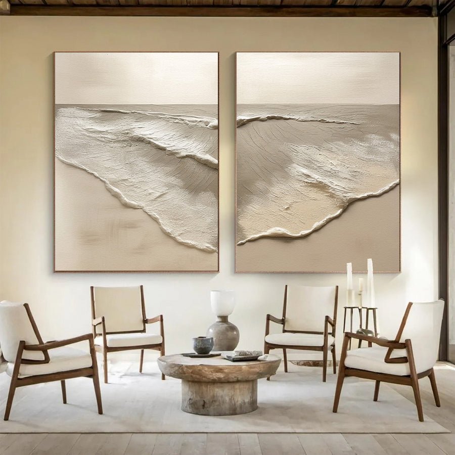 Abstract Beach Pair with Naturally Textured Muted Tones #BGA 220
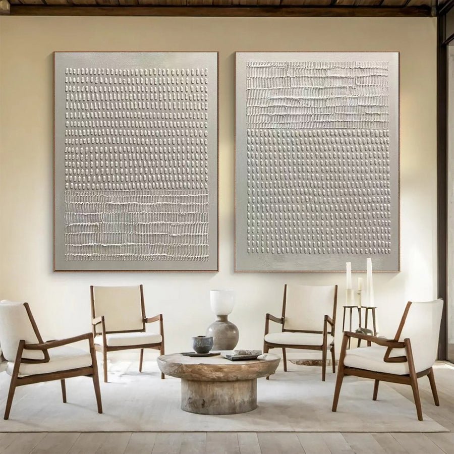 Abstract Diptych with Textured Bands and Vertical Details #BGA 259
13 standard sizes · Made to order
13 standard sizes · Made to order
13 standard sizes · Made to order
13 standard sizes · Made to order
15 standard sizes · Made to order
15 standard sizes · Made to order
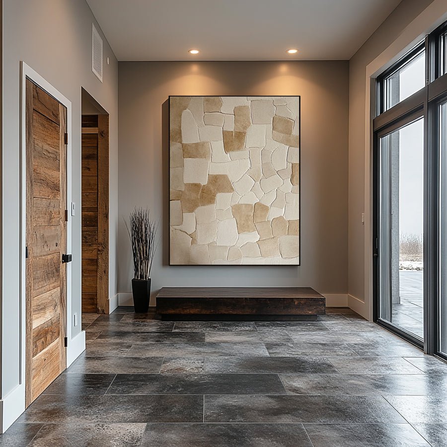
13 standard sizes · Made to order
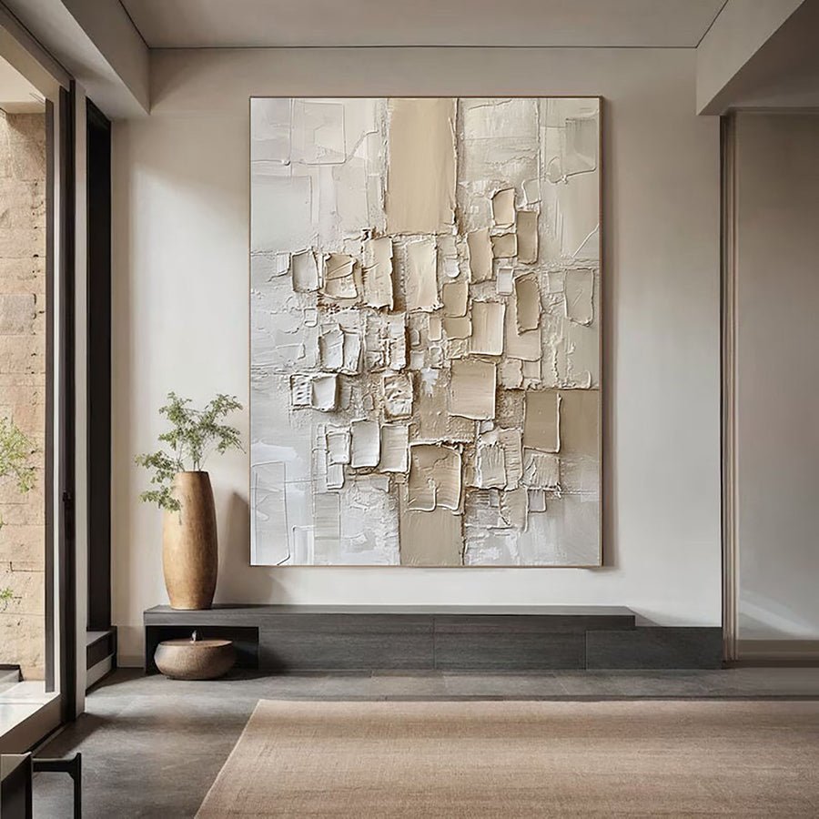
13 standard sizes · Made to order
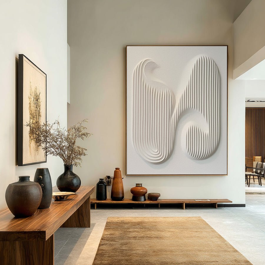
13 standard sizes · Made to order
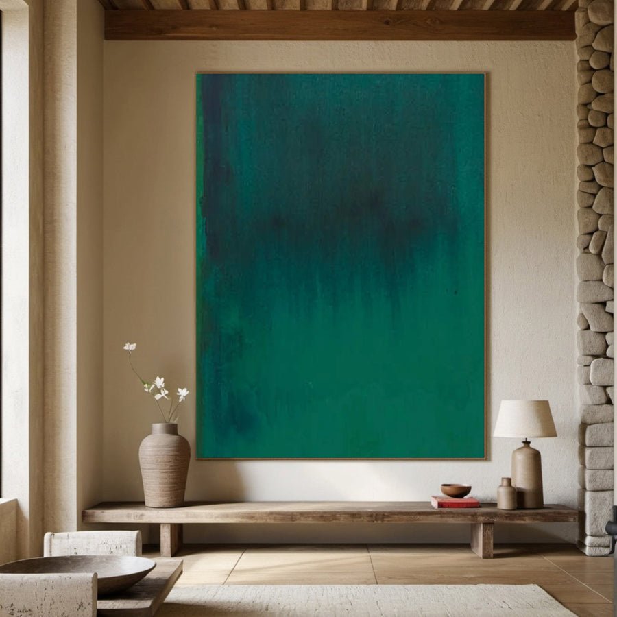
13 standard sizes · Made to order
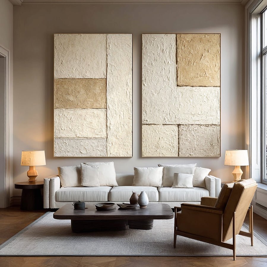
15 standard sizes · Made to order
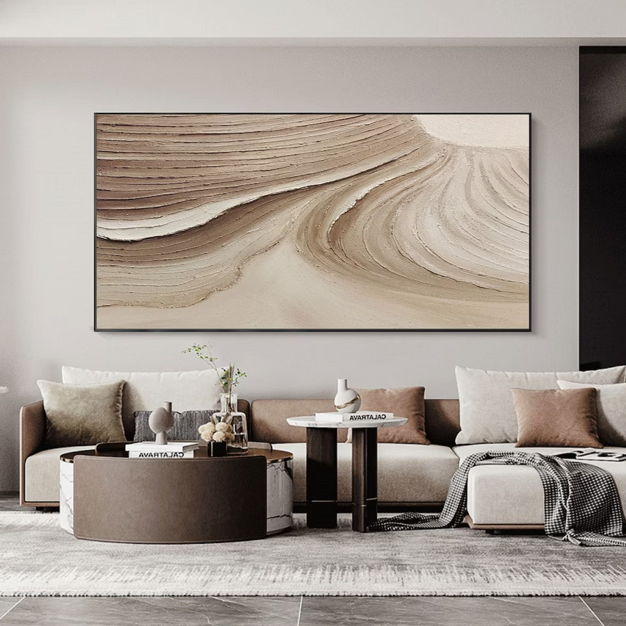
16 standard sizes · Made to order
13 standard sizes · Made to order
11 standard sizes · Made to order
11 standard sizes · Made to order
13 standard sizes · Made to order
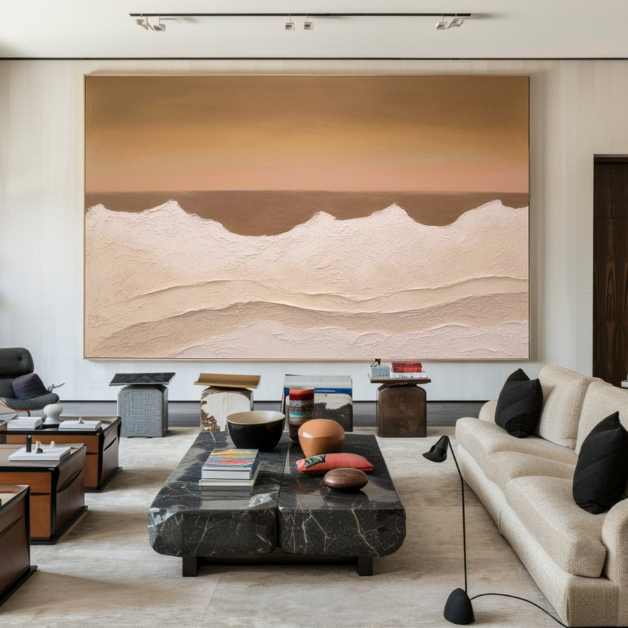
16 standard sizes · Made to order
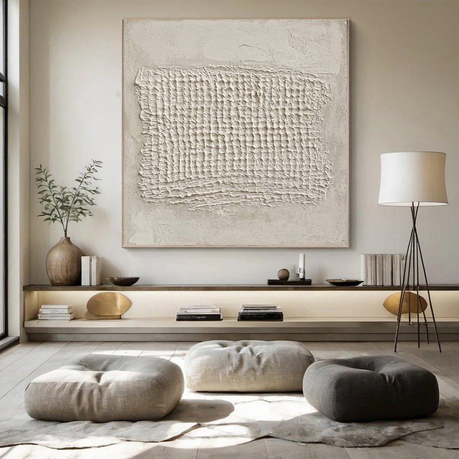
11 standard sizes · Made to order
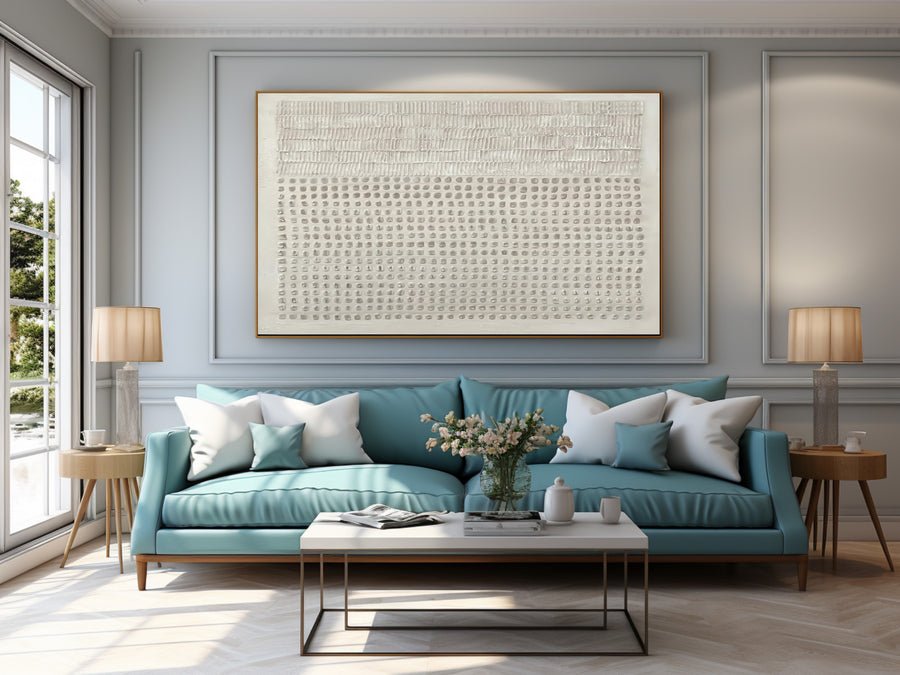
16 standard sizes · Made to order
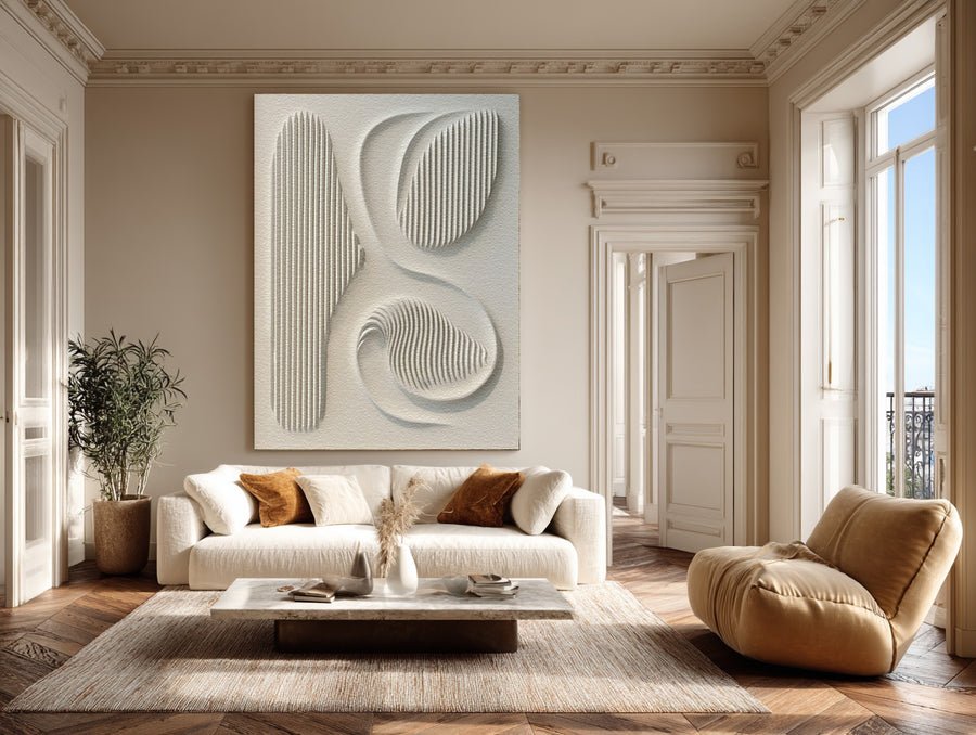
13 standard sizes · Made to order
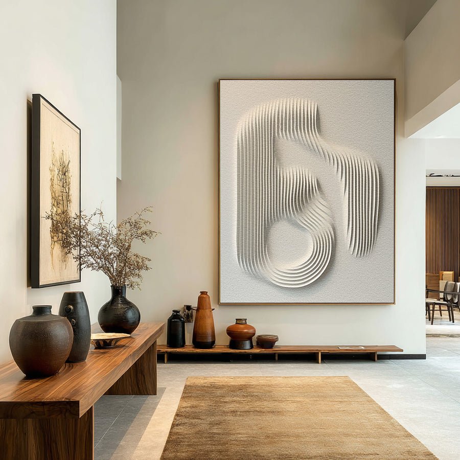
13 standard sizes · Made to order
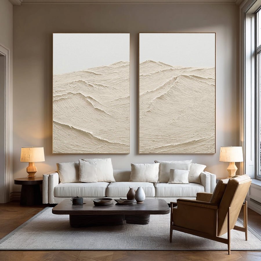
15 standard sizes · Made to order
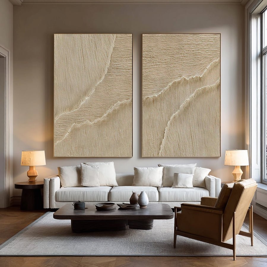
15 standard sizes · Made to order
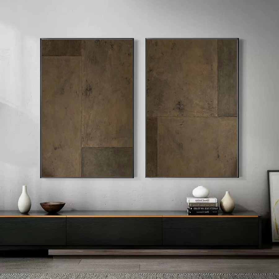
15 standard sizes · Made to order
Share wall sizes, palette, quantity, market and deadline. We will curate a focused hand-painted proposal and confirm samples, tolerances, lead time and packing.
Compare beige undertones with your stone, wood and upholstery references. Agree how much relief should remain visible under the intended lighting rather than relying on a screen color alone.
Send your wall dimensions, room image, palette, budget and preferred references. XM can review size, custom details and finishing together, then propose the approval route for your shortlist.
Confirm the actual medium and surface, artwork and framed dimensions, delivery format, quotation inclusions and required arrival date. Photo, video or physical sample review is agreed for the selected work.
Request a shortlist for your space → · Review custom options · See the quality checks