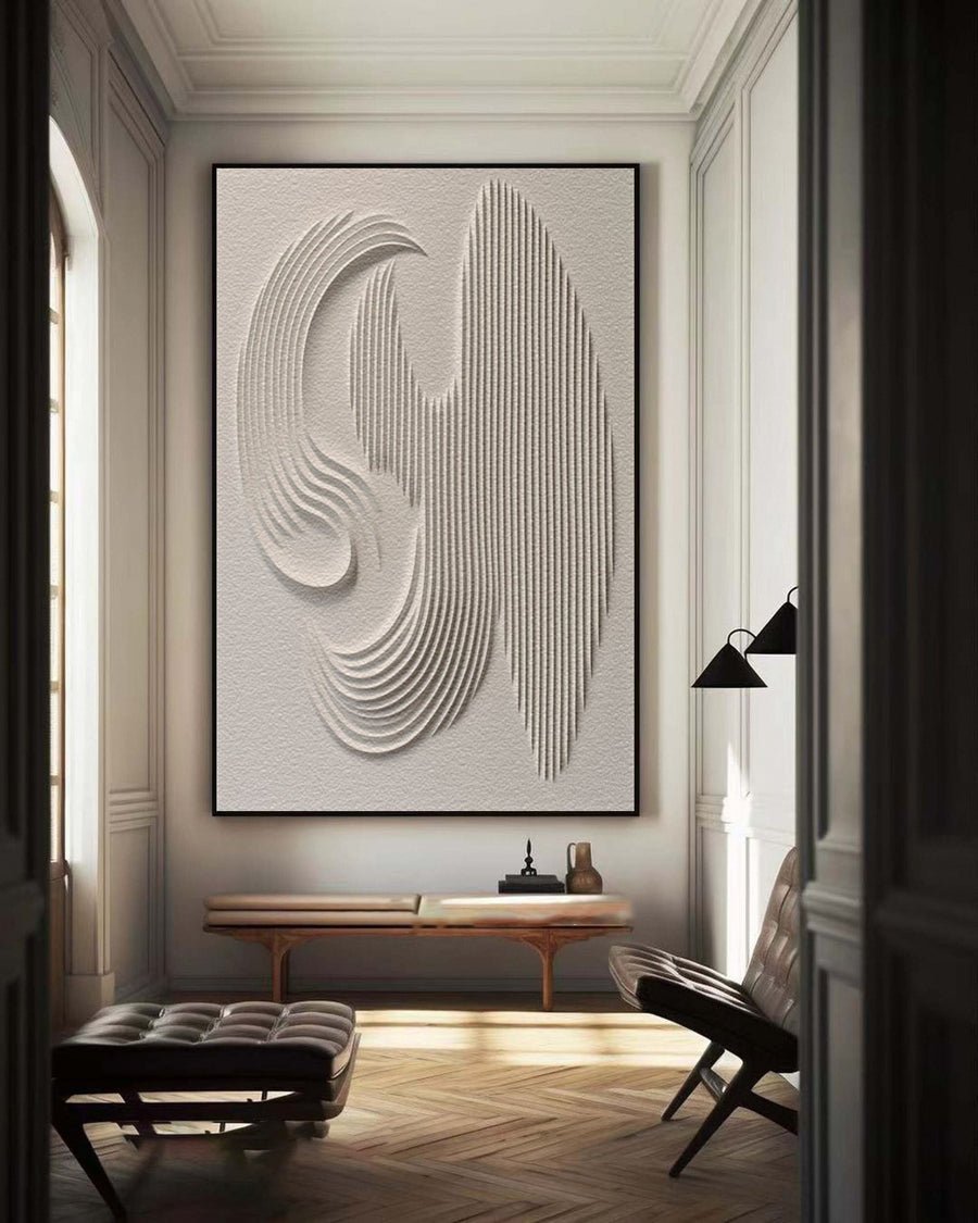
Artist-painted · BBM 022
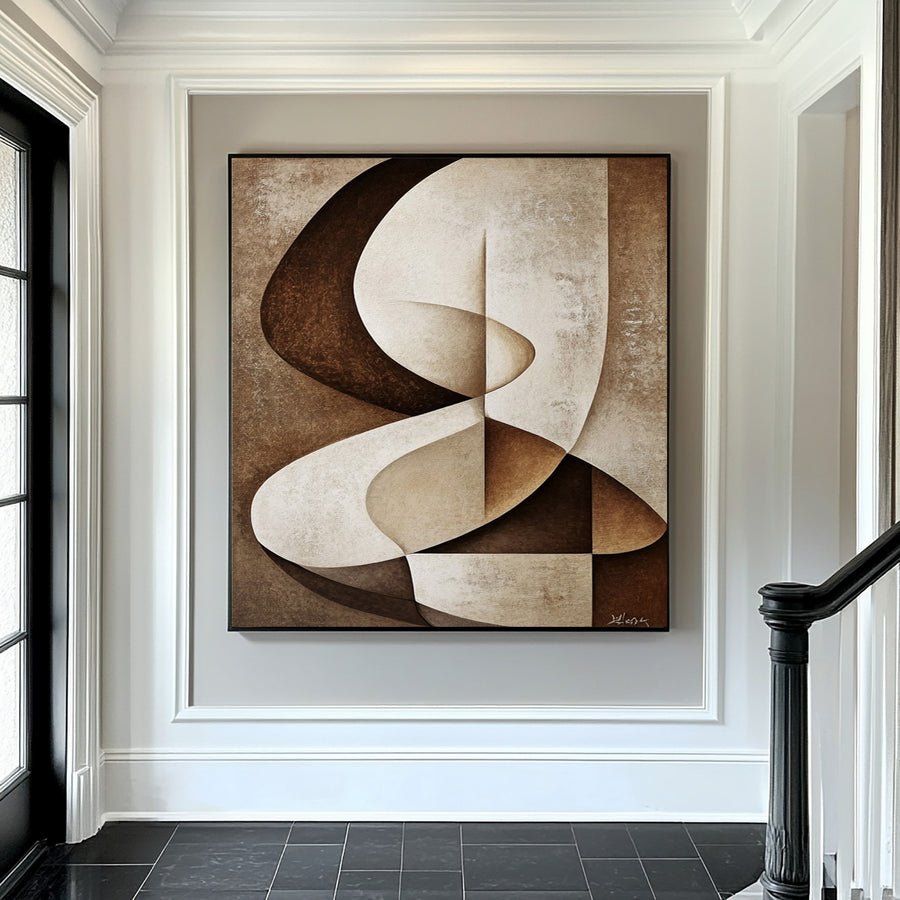
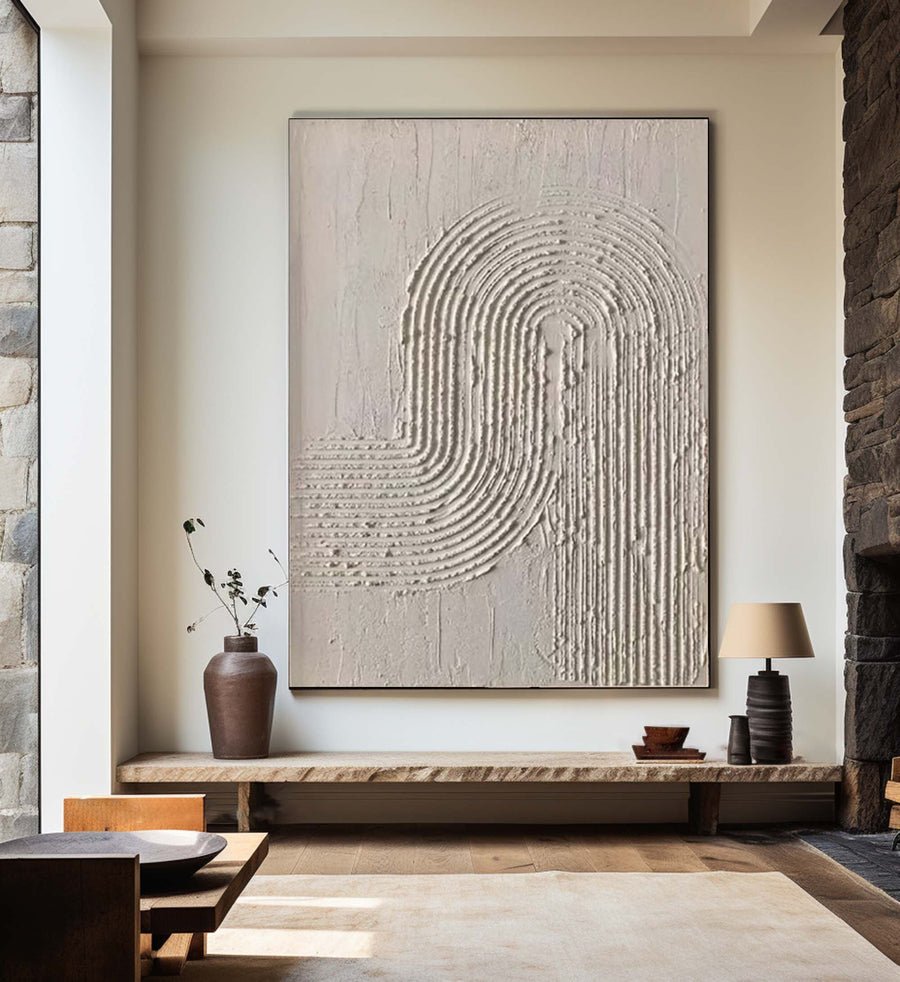
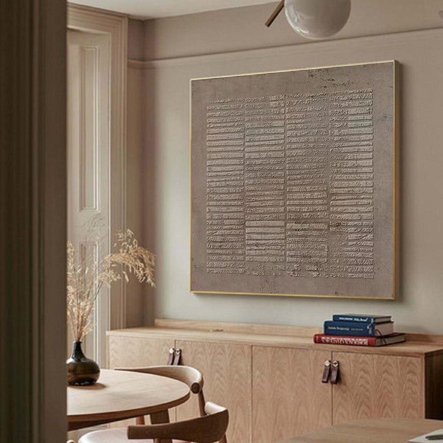
3D Textured Wall Art with Organic Waves in Minimalist Neutral Tones #BBM 022
13 standard sizes · Made to order
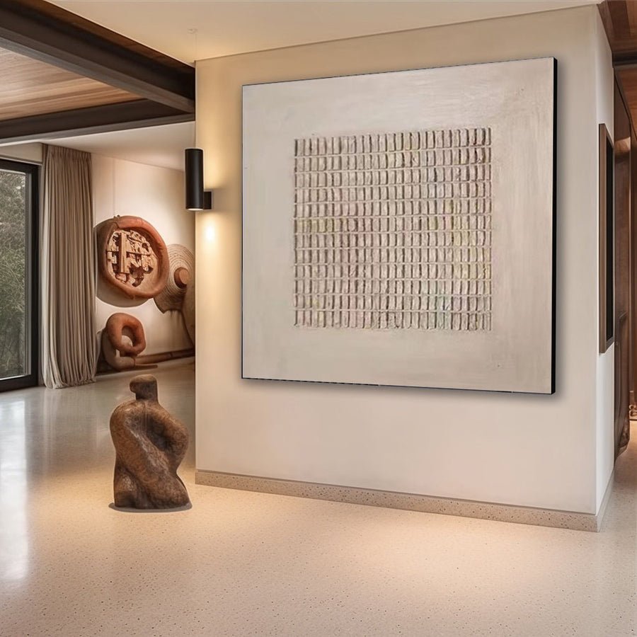
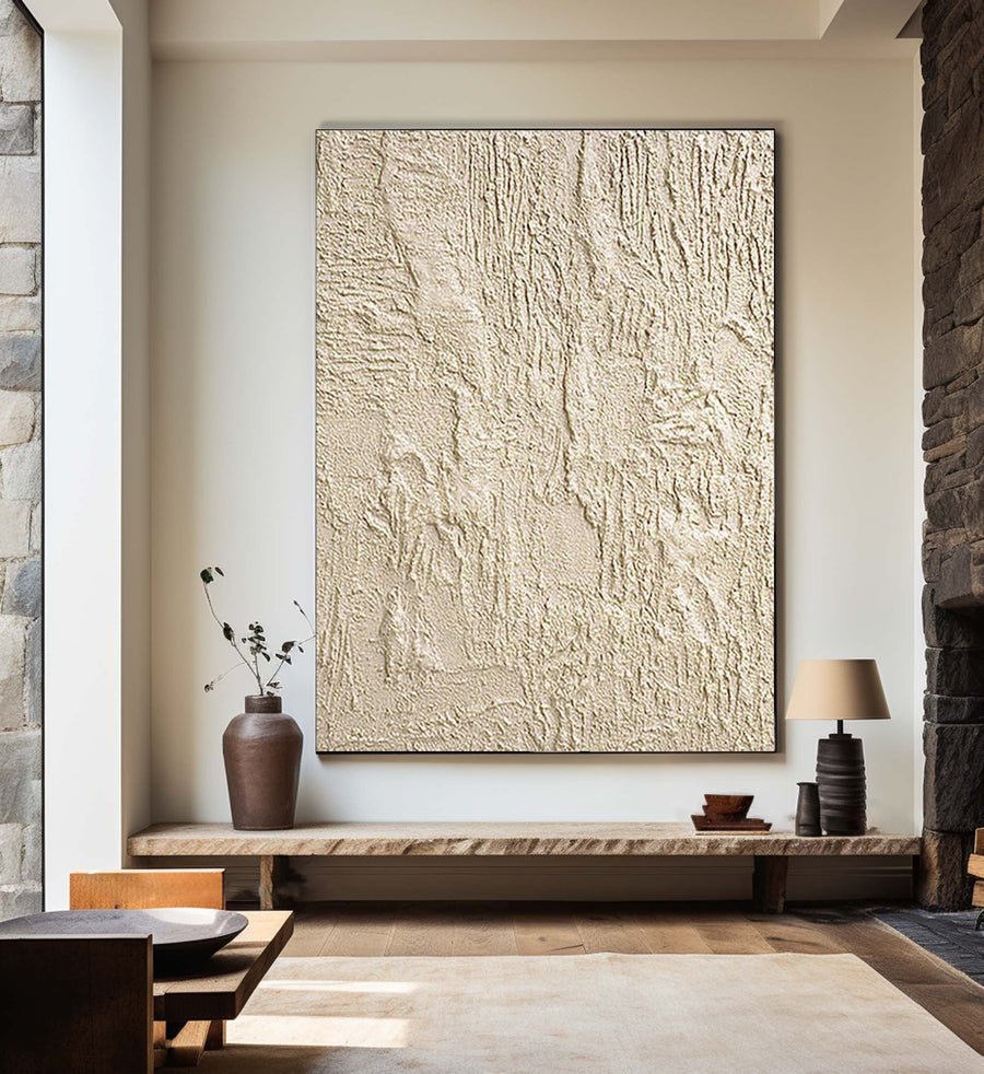
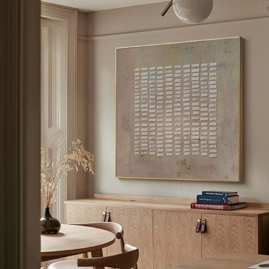
Wabi-sabi wall art emphasizes restraint, irregular texture and the beauty of surfaces that feel weathered rather than polished. This hand-painted collection brings muted earth tones, imperfect marks and quiet composition to residential, retail and hospitality interiors without claiming that every irregularity is accidental.
3D Textured Wall Art with Organic Waves in Minimalist Neutral Tones #BBM 022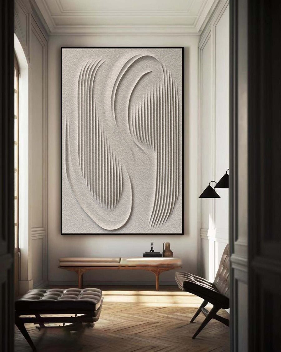 3D Textured Wall Art with Organic Waves in Minimalist Neutral Tones #BBM 023
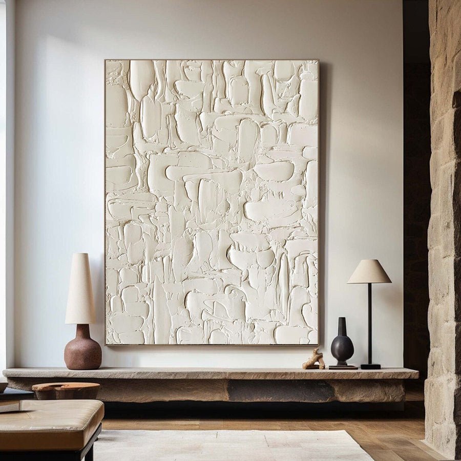
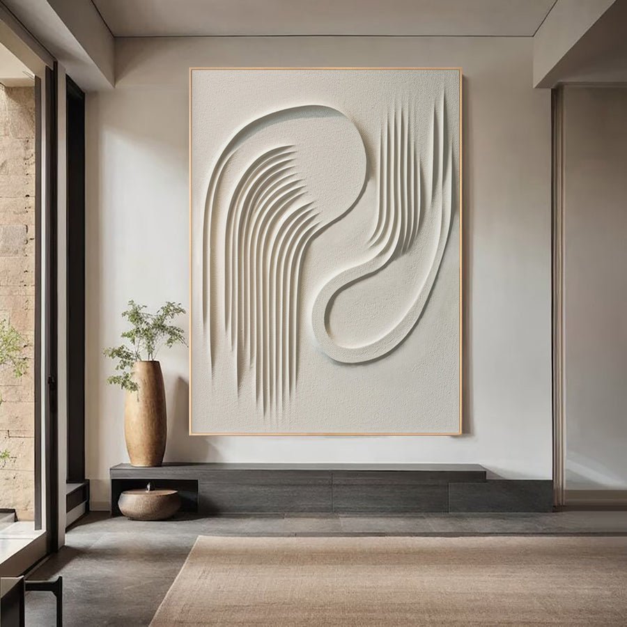 Abstract 3D Wall Art | Modern Plaster Relief Painting #WG 093
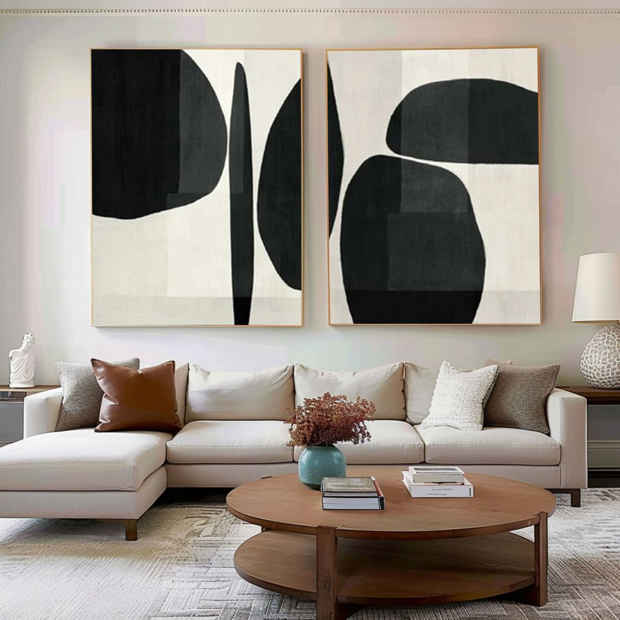 Abstract Geometric Canvas Art Black and White Painting Set of 2 #BWS 001
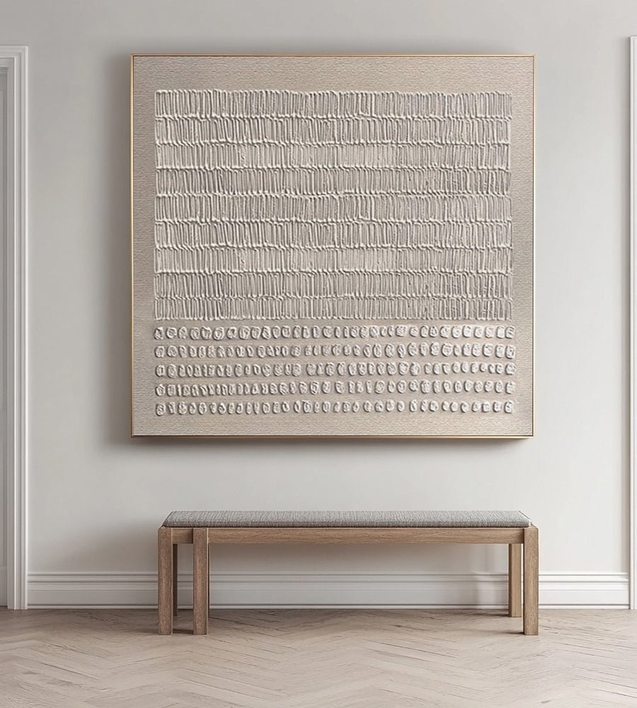
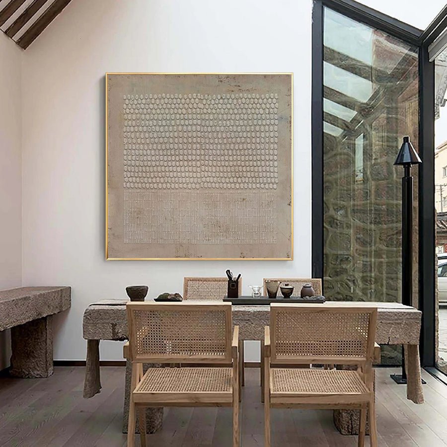
 Abstract Modern Beige Painting #BBA 044
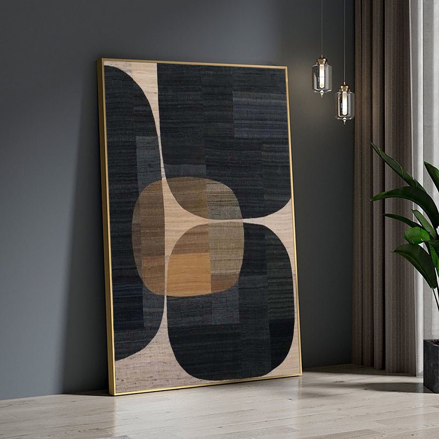
 Abstract Neutral Composition with Organic Vertical Textures #BGA 222
13 standard sizes · Made to order
13 standard sizes · Made to order
13 standard sizes · Made to order
15 standard sizes · Made to order
11 standard sizes · Made to order
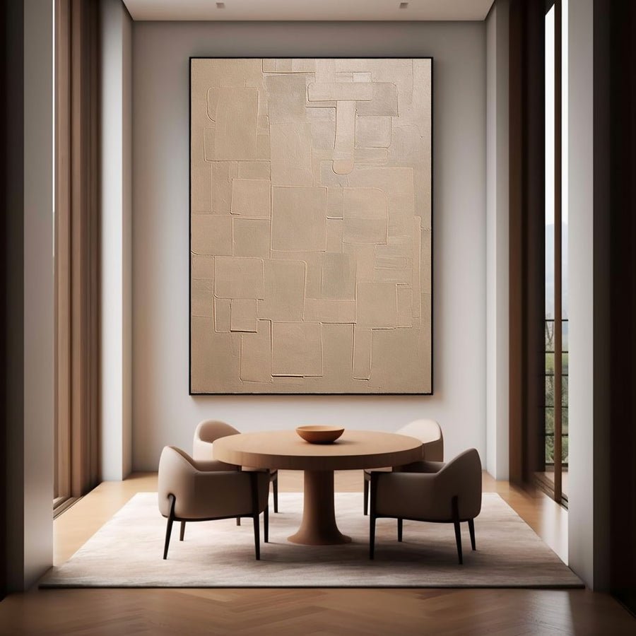
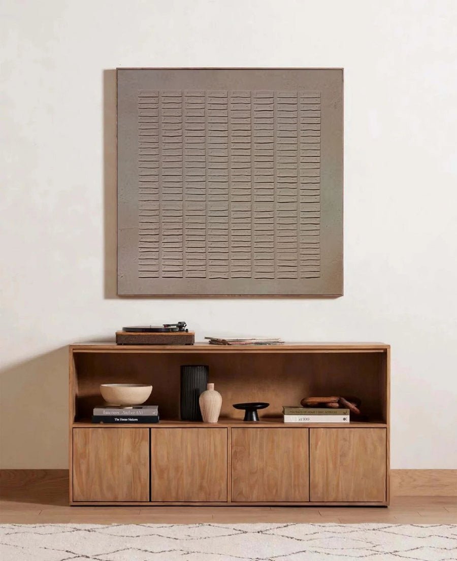
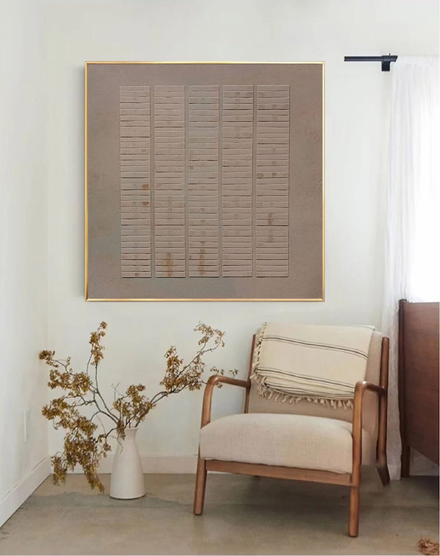
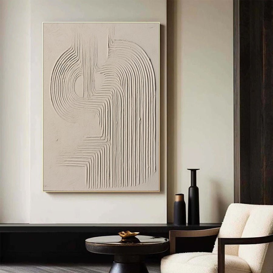
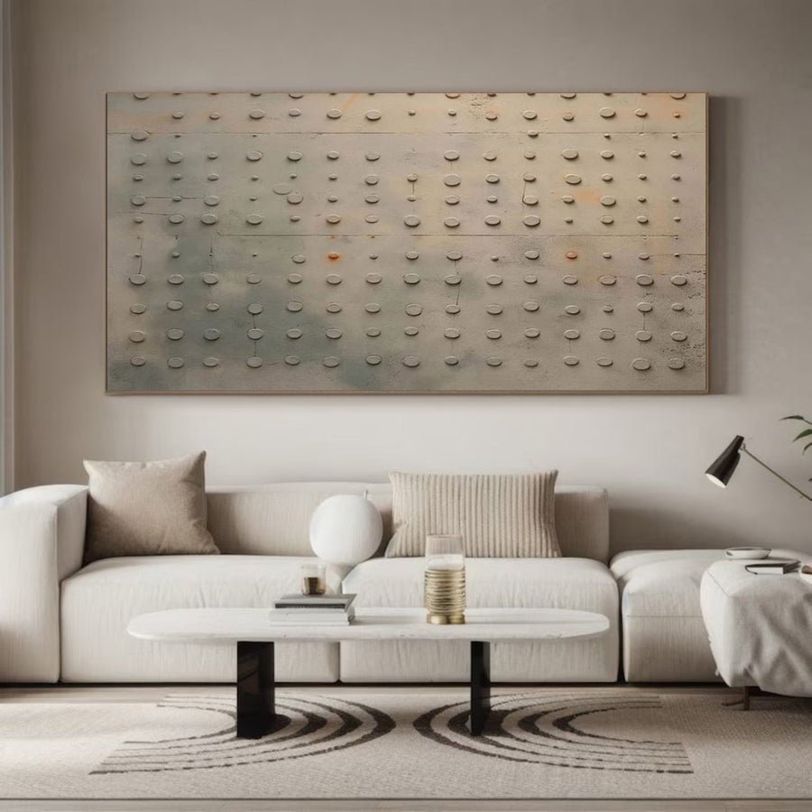
16 standard sizes · Made to order
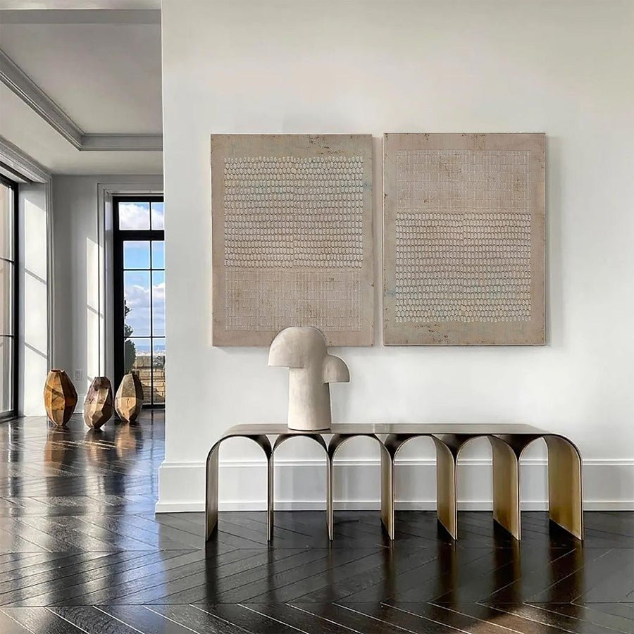
15 standard sizes · Made to order
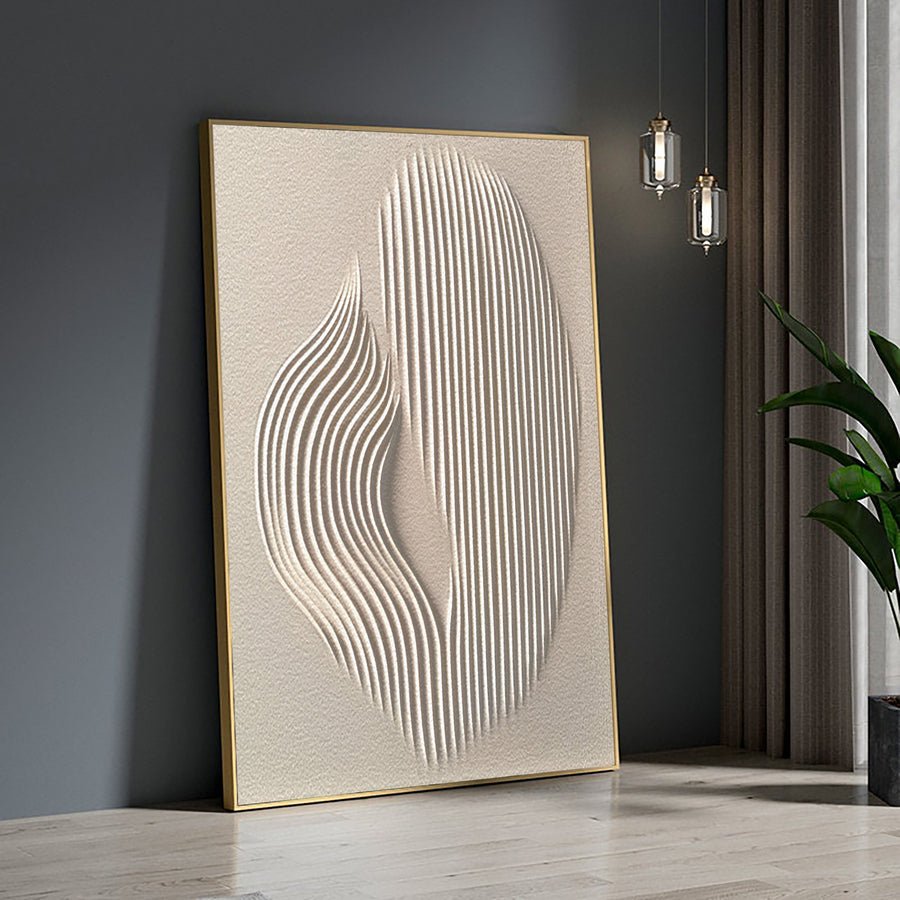
13 standard sizes · Made to order
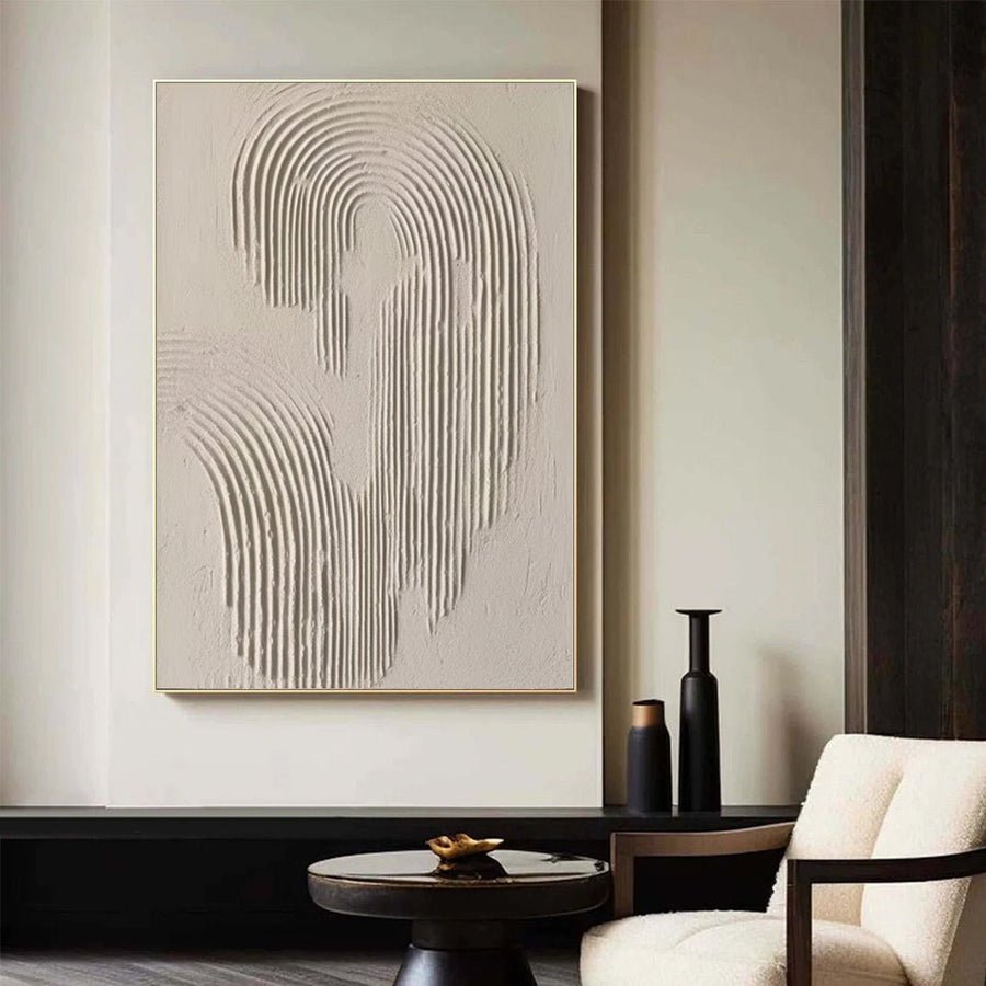
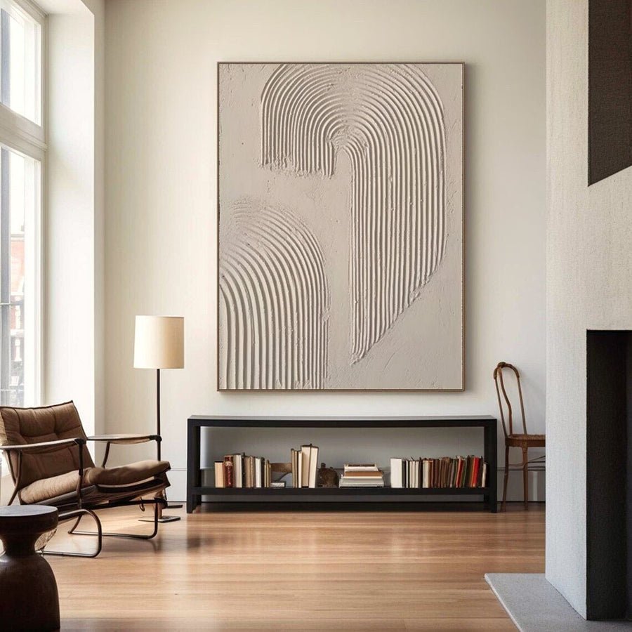
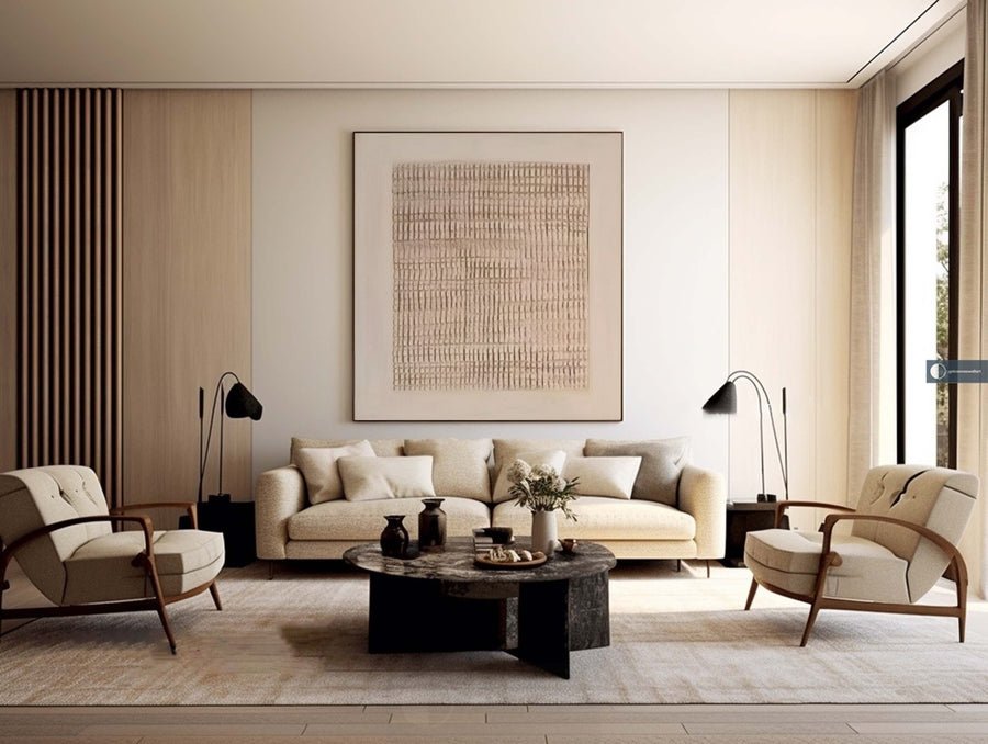
Share wall sizes, palette, quantity, market and deadline. We will curate a focused hand-painted proposal and confirm samples, tolerances, lead time and packing.
Compare restrained palettes, open space and uneven surfaces with your room materials. Specify the irregular character you like and the details that must remain controlled in the approved reference.
Send your wall dimensions, room image, palette, budget and preferred references. XM can review size, custom details and finishing together, then propose the approval route for your shortlist.
Confirm the actual medium and surface, artwork and framed dimensions, delivery format, quotation inclusions and required arrival date. Photo, video or physical sample review is agreed for the selected work.
Request a shortlist for your space → · Review custom options · See the quality checks