Should I choose a realistic or expressive painted portrait?
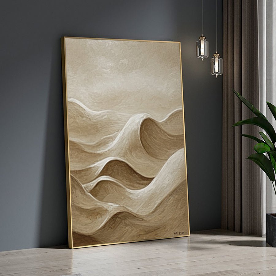
I can love both sharp portraits and loose brushwork, then ask one painting to do everything. An unclear style choice may weaken the result I wanted most.
I choose realism when precise visible features matter most and an expressive approach when interpretation and brushwork are central. I compare examples at similar subject and size. I define which likeness details must stay recognizable and where I welcome a looser treatment.
I treat style as a set of visual choices rather than a contest between labels. I compare the face, surface, reference quality and display purpose before deciding.
What do I want the portrait to preserve most?
I can ask for realism because it sounds safer, even when I want a lively painted surface. The label may not match my actual priority.
I decide whether the main goal is precise visible likeness, an expressive mood or a balanced mix. I identify the features that carry recognition. I ask the artist how the proposed style will preserve those features at the chosen size.
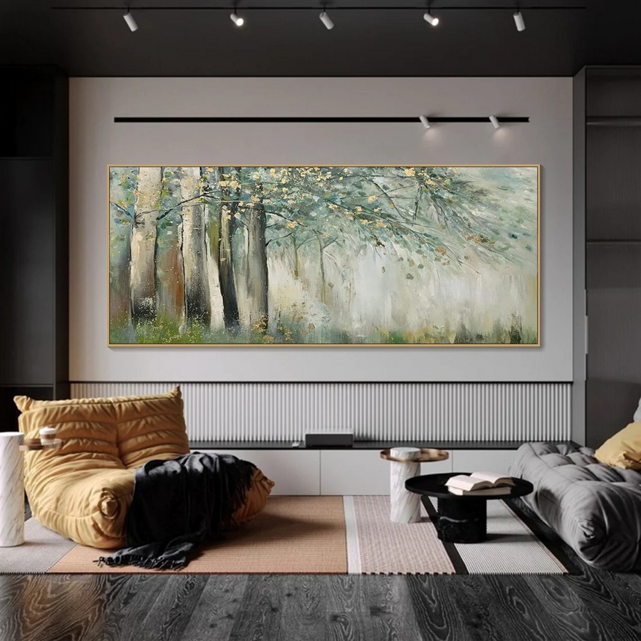
I name the purpose before choosing the label
I begin with what I want the viewer to recognize. A memorial portrait may depend on a familiar gaze. A fashion-inspired figure may depend more on posture and color. I do not assume that every portrait has the same goal. I list the features that would change the meaning if they drifted. I then decide which areas can be simplified without losing that purpose. A face may need clearer structure while the surrounding clothing can remain looser.
I look at realism as an approach to visible information, not a promise that paint will become a photograph. I still expect choices about edges, color and emphasis. I ask how closely the offered technique follows the source and which parts may be interpreted. I use the same questions for an expressive approach. Loose brushwork can still preserve head shape and eye direction. I do not assume that expressive means careless or that realistic means every detail must have equal attention.
I compare actual examples when the supplier provides them, preferably with a similar subject and scale. I avoid choosing from a small abstract work and expecting that evidence to explain a detailed family portrait. I discuss the goal in the custom artwork brief before the quote settles the scope. I keep the word realistic or expressive beside a direct description, so the label supports the decision rather than hiding it.
| Decision | My check |
|---|---|
| Recognition priority | I name essential features |
| Looser background | I state where simplification is welcome |
| Style label | I add a direct visual description |
How should I compare brushwork and texture?
I can choose an expressive preview for its energy and overlook the physical surface. Thick marks may read differently under the light in my room.
I compare edge softness, visible strokes and actual surface texture separately. I ask whether raised areas use thick paint or another material. I view texture examples under more than one light angle where available, and I connect that choice to the intended display.
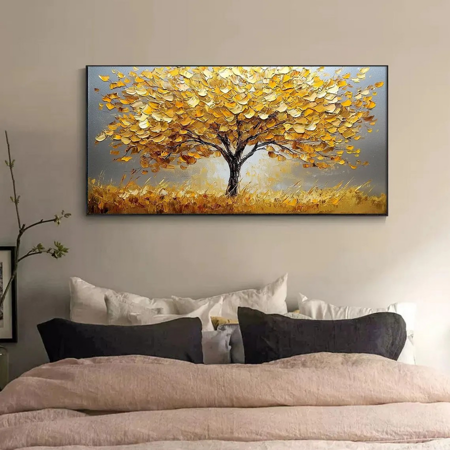
I distinguish visible marks from raised material
I inspect how the artist handles edges. A crisp boundary can separate the face from the background clearly. A softer edge can make the subject feel more integrated with the scene. I decide where each treatment would help the portrait. I do not ask for every edge to be sharp simply because I want recognition. The most useful contrast may sit around a few important features while other areas remain quieter.
I compare brushwork with physical texture. A broad painted stroke can look expressive without standing far above the surface. Thick paint can create relief that casts small shadows. The National Gallery defines impasto in terms of thick paint application.[1] I use that distinction to ask what the offered artwork actually uses. I do not assume a textured listing always means oil paint or that every raised effect will match the style reference.
I consider the room’s light. Strong side light can make raised marks more visible, while a flatter light can soften their shadows. I ask for useful surface views where available rather than judging texture from a front-facing image alone. I decide whether that changing surface supports the portrait or competes with the face. I also ask for the work’s supplied care instructions because the actual materials matter after delivery.[3] I let the surface decision remain connected to the medium and the display, rather than treating expressive as a free pass for any texture.
| Decision | My check |
|---|---|
| Edge softness | I choose where contrast matters |
| Raised texture | I ask what creates the relief |
| Side lighting | I compare the surface response |
How does reference quality affect the style choice?
I can request exact facial detail from a blurred photo and expect realism to repair it. A style name cannot recover information the reference does not show.
I ask the artist to review the source quality before choosing a detailed treatment. I add labeled references for missing features where possible. I consider a softer interpretation when evidence is limited, without treating that style as a guarantee that uncertainty disappears.
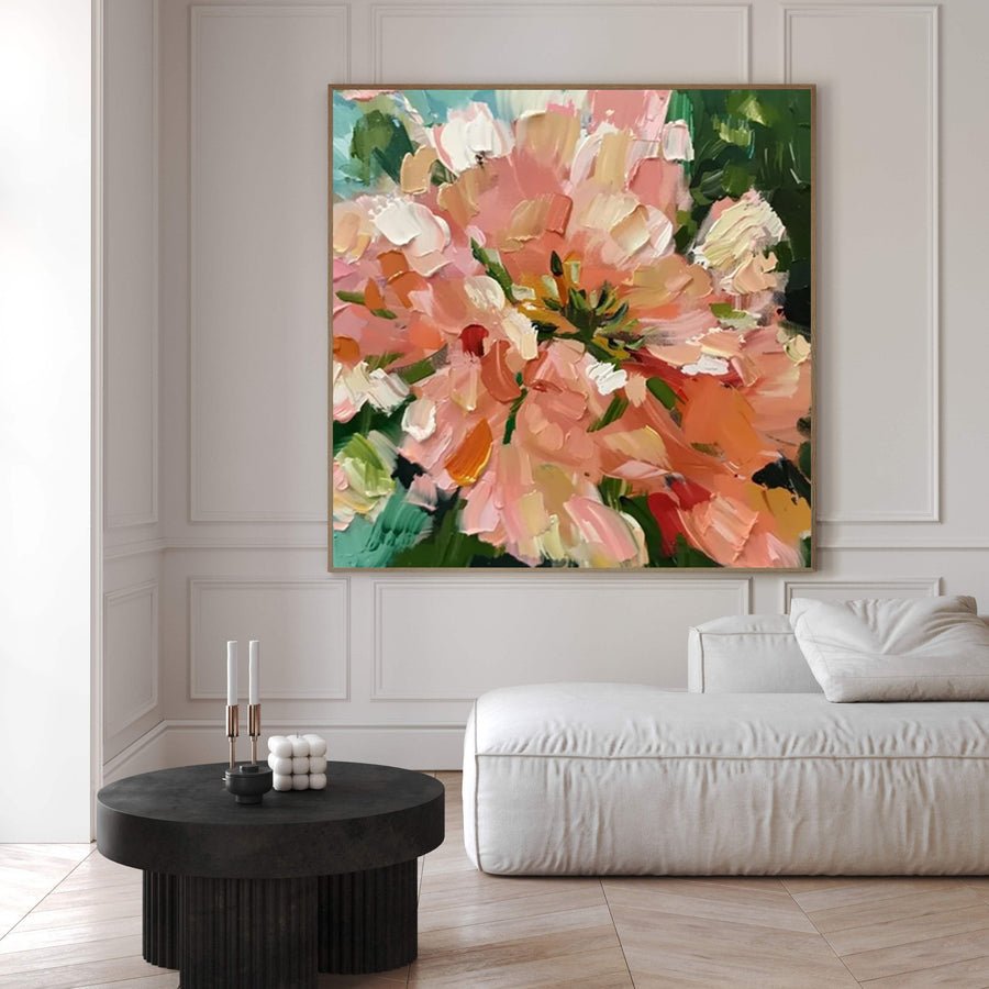
I match the request to the available evidence
I inspect the original reference rather than a small message preview. I look for the eye shape, mouth and head outline at a useful scale. I also check whether heavy editing has changed the face or colors. A sharp file can still contain an unrealistic filter. I provide the original when I can and explain which version reflects the appearance I want. I do not assume that a high file size means the image contains strong detail.
I identify missing information before making a style choice. If one eye is hidden or the face is blurred, I look for a supporting photograph from a similar age and angle. I label what that image clarifies. I avoid blending several expressions without discussing the resulting pose. If no better reference exists, I ask what level of interpretation is needed. A looser style may suit the available evidence, but it still requires an agreed direction. I do not use expressive as a way to conceal a concern about likeness.
I check permission for references made by another photographer.[2] I keep that rights question separate from the technical review. I can use the photo layout section to explore crop and frame options, but I remember that its illustration does not prove the source supports fine brushwork. I ask the artist to connect the proposed style, visible face size and reference quality before I approve the commission.
| Decision | My check |
|---|---|
| Blurred face | I ask for a reference review |
| Supporting image | I label the missing feature |
| Edited file | I compare the original |
How do I record a balanced style decision?
I can say I want a mix of both styles and leave the artist to choose the balance. Later feedback may then judge an approach that was never agreed.
I state which areas need clearer likeness and which can use broader interpretation. I choose one main style reference and explain its role. I confirm the approach in writing, including texture and color priorities, before treating a preview as approval.
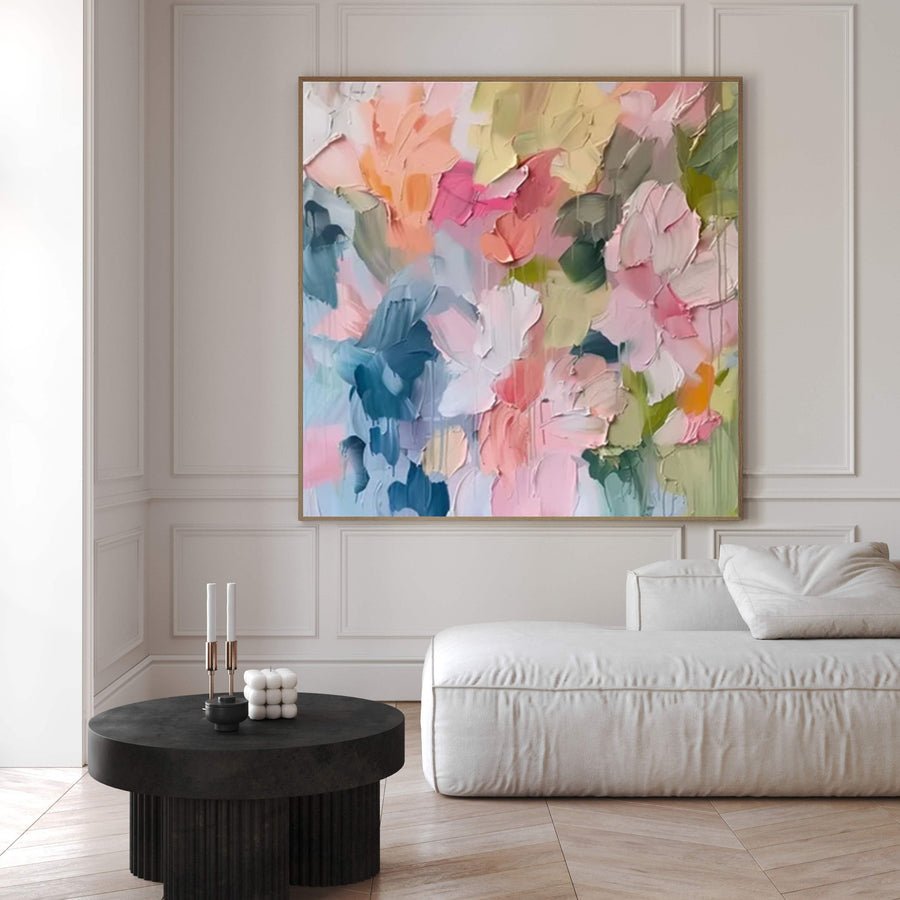
I define the mix in practical terms
I write a short style instruction that names the parts of the portrait. I might ask for a clear head shape and familiar expression with a quieter, more loosely handled background. I avoid demanding an exact photographic face and heavily distorted proportions at the same time. If I want both, I ask the artist to explain the trade rather than assuming the conflict can be solved without a choice. I keep the main purpose visible in that conversation.
I select one reference as the primary guide to the overall approach. I can add another for a color or background feature, but I label that limited role. I do not create an unranked mood board that points in several directions. I ask the supplier to confirm which example controls the face, brushwork and texture decisions. I also make clear whether I want a specific visual feature adapted rather than a direct copy of someone else’s artwork.
I review the approval evidence against those written choices. I name a concern as a likeness issue, a surface issue or a style preference. I do not change the meaning of the brief because I notice another painting online. I ask how a new direction affects the scope and timing before requesting it. I save the agreed style with the reference set and physical size. That gives the final review a stable basis while leaving room for the human interpretation that makes a hand-painted work a painting.
| Decision | My check |
|---|---|
| Balanced approach | I assign priorities by area |
| Several references | I choose a main guide |
| New direction | I ask about scope before changing it |
Conclusion
I choose the style around the portrait’s purpose. I protect key likeness details, define where interpretation is welcome, and confirm the approach before production.