How do I choose artwork above a console table?
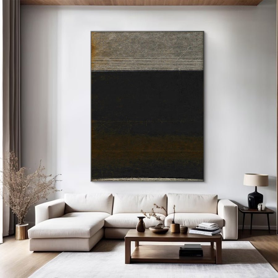
I can put a painting above a console and still make the entrance feel crowded. Lamps, keys and passing people all affect the final arrangement.
I plan console artwork around the furniture width, everyday objects and the entrance view. I measure the full framed size and test it with the items I will keep. I leave practical access for the console and safe clearance along the route.
I think of the console and painting as one working corner. These checks help me keep the art clear without turning the furniture into a display-only surface.
Should I center the painting on the console or the wall?
I can center a painting perfectly on the wall and make it look off-center above the console. The strongest visual relationship needs a deliberate choice.
I usually start with the console as the visual base, then test the complete wall. I adjust only when doors, stairs or another major feature change the balance. I keep the chosen center clear in the installation drawing.
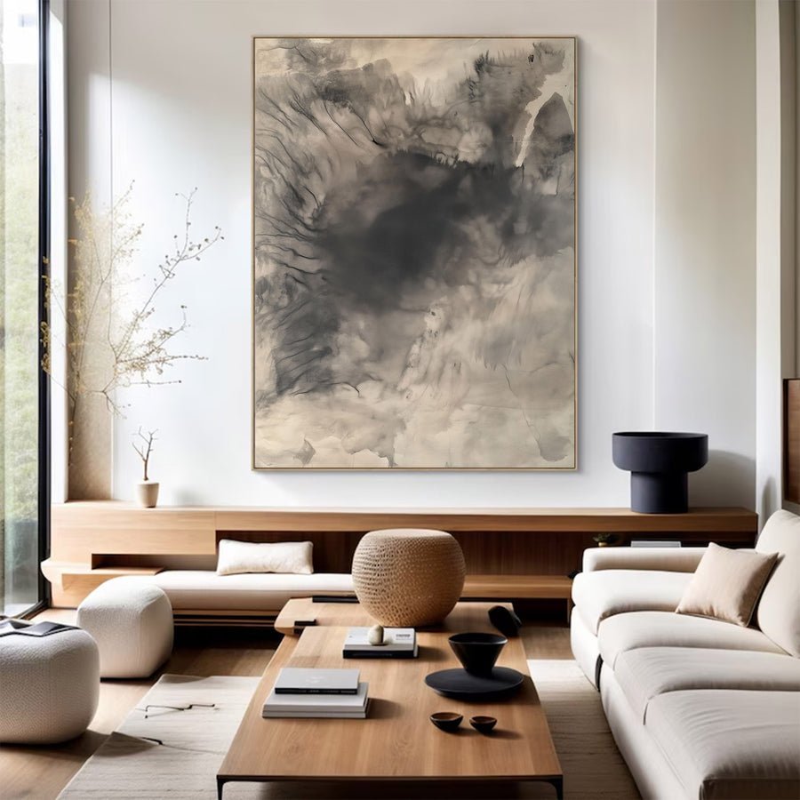
I choose the center that people will read
I photograph the whole entrance wall before making a decision. I include the console, doorway and any nearby stairs. I then mark the console center and the clear wall center. These points may be different. I do not assume that the wall center must win just because it is easy to measure.
I put a paper artwork outline above the console center first. I look from the entrance and from the room beyond it. If the console forms the main base, this arrangement often reads clearly. I then move the outline toward the wall center to see whether the surrounding architecture gives it a stronger reason to sit there.
I avoid tiny unexplained shifts. A painting that is almost centered can look like an installation mistake. If I choose an offset arrangement, I make it intentional through the objects below or the nearby wall features. I also keep practical reach in mind if the console holds daily items.
I write the selected center on a front-view drawing. I include the finished frame dimensions because framing changes the edges people see.[1] I do not send an installer only a canvas width and expect the whole corner to align correctly.
I can share this drawing through the custom art service. I explain whether the console will stay in its current position so a suggested layout does not depend on furniture that I plan to move.
| Decision | My check |
|---|---|
| Console center | I test it as the first visual anchor. |
| Wall center | I compare it with doors and major wall features. |
| Chosen offset | I show the exact position in a drawing. |
How much space do lamps and objects need below the artwork?
I can approve the painting on an empty console and then cover its lower edge with a lamp. Everyday objects belong in the first trial.
I test the painting with the normal lamps, trays and tall objects in place. I keep the main image visible from the entrance. I leave enough access to use and clean the console without touching the painted surface.
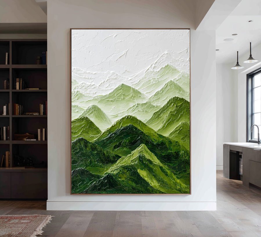
I include the objects I actually use
I start with the objects that have a real job. A lamp gives light. A tray collects keys. A vase may be part of the room for much of the year. I keep these in the layout rather than replacing them with tiny props that would only work in a photograph.
I measure the tallest normal object and mark its top on the wall template. I then look from the entrance. A small overlap at the edge may feel deliberate, but a lamp shade across the focal point can hide the part of the painting I chose it for. I test this with a printed reference rather than trusting an empty outline.
I also think about reach. I do not want to lift a tall object toward a fragile surface every time I move the key tray. I leave a practical route for hands and objects. If the console is shallow, I may choose a flatter frame profile or a different location after checking the actual artwork details.
I treat the artwork as separate from the furniture cleaning routine. I do not spray cleaner toward the wall or rest objects against the painted face. Display guidance gives useful context for avoiding contact and unsuitable environments.[2] It does not provide one universal decorative gap above every console.
I keep a photograph of the approved arrangement with the regular objects in place. That record helps me resist adding more tall items later just because the console still has a small empty corner.
| Decision | My check |
|---|---|
| Lamp | I check shade overlap from the doorway. |
| Daily tray | I leave a clear route for hands and keys. |
| Tall decoration | I test normal use rather than a staged empty console. |
What artwork shape works above a narrow console?
I can buy a wide painting for a narrow console and make the furniture seem lost beneath it. Shape and frame weight change that relationship.
I compare a tall single piece, a compact wide piece and a small group at their full outer sizes. I choose the arrangement that balances the console and wall. I do not use console width as an absolute limit.
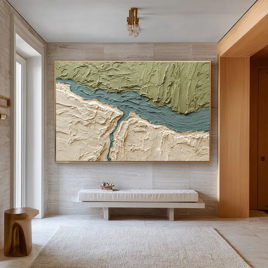
I compare shape and visual weight together
I measure the console width and the usable wall beside it. I then note its height and visual weight. A slim open-legged console feels different from a solid cabinet of the same width. I use those differences to choose candidate shapes rather than following a single width ratio.
I test a vertical painting when the wall is narrow or interrupted by a doorway. I test a horizontal painting when the console sits on a wider open wall. I also consider whether a group would add too many edges to a small entrance. The answer comes from the whole arrangement, not from the furniture name.
I include the frame color in the trial. A thick black frame can give a pale painting much more weight. A light wood frame can connect with the console, but the woods do not need to match exactly. I compare them beside the actual furniture rather than relying on similar online color names.
I check the composition inside the painting too. A large dark area near one side can make a centered frame feel visually offset. I may choose a different artwork rather than shifting it into an unexplained position. A paper image test helps me notice this before installation.
I browse the collections after I narrow down the shape and outer size. I keep the shortlist practical. I also ask whether the listed image shows the exact finished framing option or only a style example.
| Decision | My check |
|---|---|
| Vertical piece | I test narrow wall space and ceiling clearance. |
| Wide piece | I compare its weight with the furniture below. |
| Small group | I check whether extra edges crowd the entrance. |
How do I avoid damage in a busy entrance?
I can forget how often coats, bags and parcels pass the console. A good-looking placement can still sit in the busiest contact path.
I check the full frame depth and the normal entrance route before installation. I keep the artwork clear of routine knocks and unsuitable heat or moisture. I use installation hardware chosen for the wall and finished weight.
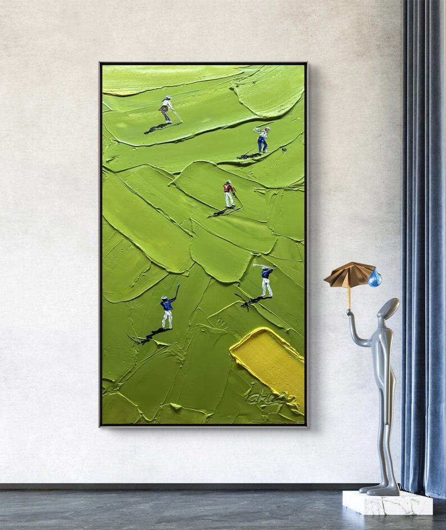
I walk through the entrance with real objects
I walk through the entrance carrying the things that normally enter the home. A shoulder bag, a coat and a parcel each take different space. I do not deliberately brush them against an artwork. I use the paper outline and a depth marker to identify possible contact before the painting arrives.
I check whether the console projects into the path. Moving it slightly may improve the whole arrangement, but I do not make that decision without checking door movement and household access. A painting that sits above the console can still be vulnerable if its frame extends into the turn beside it.
I ask for the finished artwork weight and depth. I also confirm how it should be supported. A professional installer can assess the actual wall and select suitable fixings. I do not treat a decorative hook pictured online as proof that it is appropriate for this piece.
I arrange handling space before installation. The Canadian Conservation Institute discusses basic handling of paintings.[3] I use that guidance to avoid carrying a large work by an exposed canvas edge or placing it face-down on a household surface. I seek specific help when the piece is difficult to manage.
I keep the final area easy to use. I want the console to work for daily arrivals without putting the painting at risk each time someone comes home. That practical fit matters more to me than a perfectly staged entrance photograph.
| Decision | My check |
|---|---|
| Bags and coats | I test the normal path with a paper outline. |
| Frame depth | I confirm projection into the entrance route. |
| Installation | I match support to the wall and finished artwork. |
Conclusion
I plan console art with the furniture, regular objects and entrance route. I test the complete framed arrangement before installing it in a busy everyday space.