Should I choose a black, gold or wood frame for my painting?
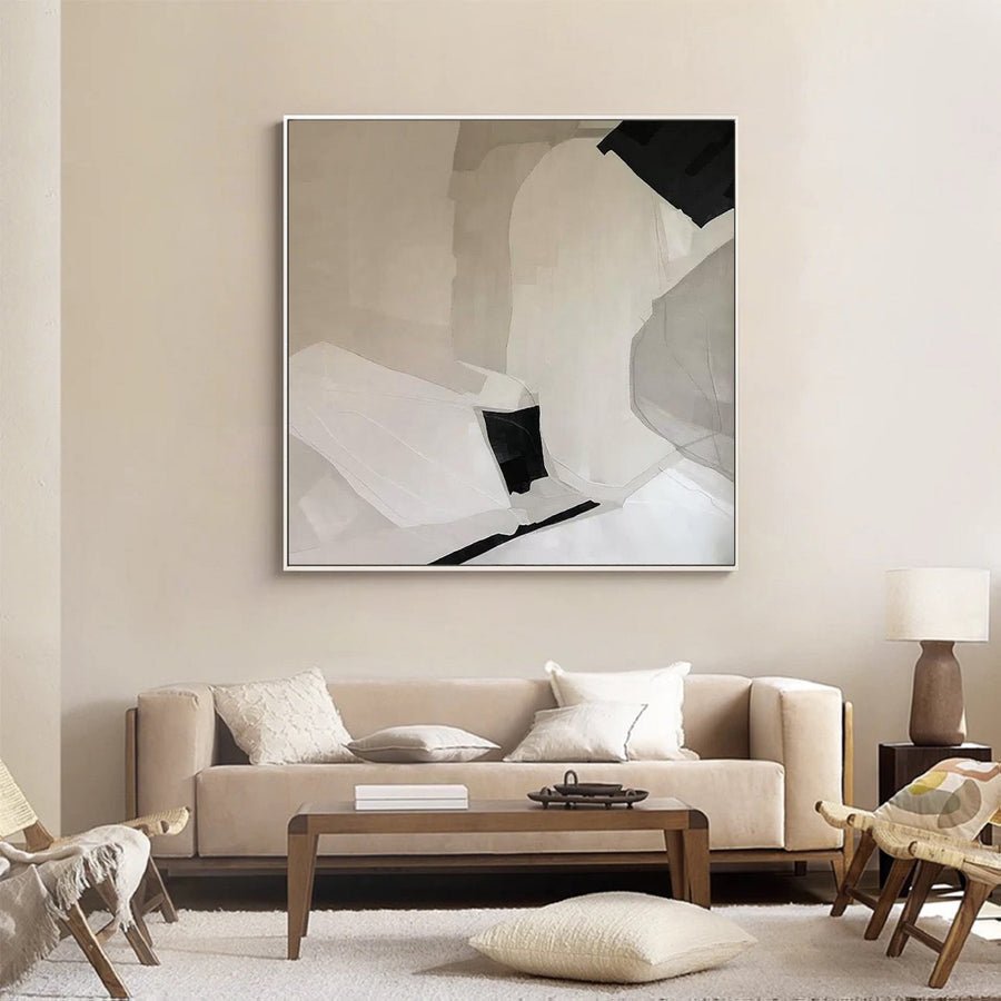
I can choose a frame color that matches one detail and still overwhelms the painting. Black, gold and wood names do not explain the full effect.
I compare each finish by contrast, undertone, sheen and face width beside the actual painting. I also check it against the wall and nearby furniture. I choose the frame that supports the work while confirming suitable construction separately.
I use three simple comparisons instead of a fixed rule about matching metals or wood. The painting, the frame and the room each affect what I see.
When does a black frame support the painting?
I can use black to make a work look sharper and accidentally add too much weight. The border's width matters as much as its color.
I test black when I want a clear boundary or a link to dark details. I compare narrow and wider faces, and I check whether the frame draws attention away from the painting's lighter or quieter areas.
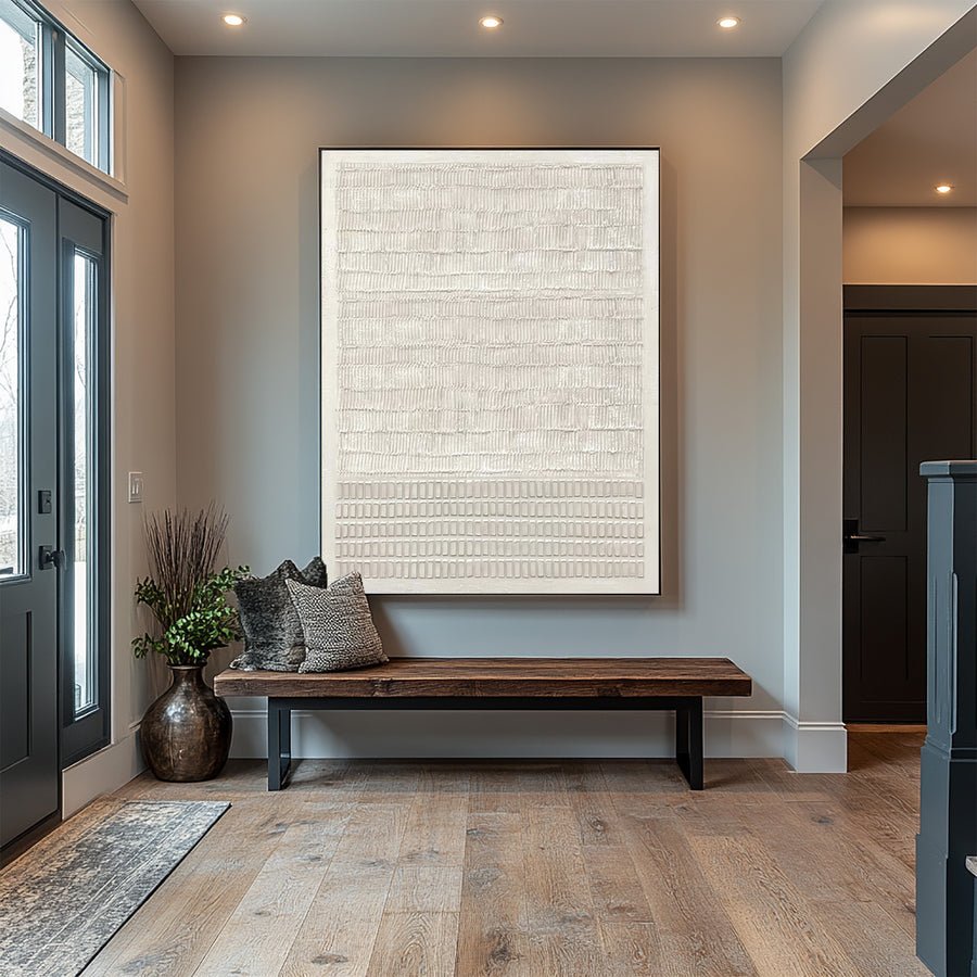
I judge the dark border from the normal viewing point
I look at the painting before I add the frame. I identify its darkest area and the direction of the main shapes. A black border may connect with those areas and make the image feel contained. It may also introduce a heavier outline than the composition needs. I compare the effect rather than assuming black always looks refined.
I test face width separately. A slim black edge can be a quiet boundary. A wide face can become a strong shape in its own right. I use a corner sample or a clearly labeled preview to compare them beside the image. I step back because a close view may exaggerate the importance of a small surface detail.
I also check the wall and nearby furniture. A dark cabinet below the painting can make a black border feel connected. Several black objects may instead make the arrangement feel crowded. I do not need every finish in the room to match. I want the framed work to have a clear role in the overall arrangement.
The Canadian Conservation Institute's framing guidance reminds me that a frame also supports and protects a painting.[1] I ask a qualified framer about fit after I choose the visual direction. I discuss the artwork's supplied form through the custom-art service when planning a commission. My black-frame choice remains a design decision, with construction checked on its own terms.
| Decision | My check |
|---|---|
| Dark painting detail | I test whether black repeats it usefully. |
| Face width | I compare the visual weight from a distance. |
| Nearby furniture | I check the whole wall arrangement. |
When should I consider a gold finish?
I can hear gold and picture one color, then receive a warmer or brighter finish. The name hides a wide range of appearances.
I compare the actual gold-tone sample for warmth, brightness, sheen and detail. I choose it when its contrast supports the painting and room, rather than treating gold as a single finish or a material guarantee.
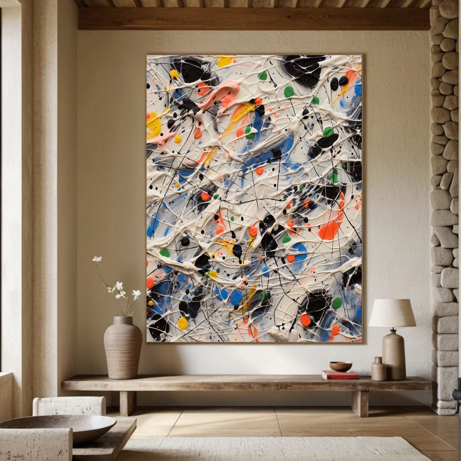
I inspect the finish instead of the label
I ask to see the actual finish that would be supplied. Gold-tone frames can look pale, warm, muted or bright. Surface detail can also change how light catches them. I do not assume that a generic room photograph shows the same finish as the quoted frame. I request a clear reference or sample where available.
I put the sample beside the painting's warm and cool areas. A warm frame may connect with ochre or beige. It can also make a cool gray area appear different by contrast. I judge the relationship directly rather than using a rule that warm paintings always need warm frames. The image's mood and the border's strength both matter.
I check the sheen under the room's light. A bright frame near a strong lamp may draw more attention than it did on the product page. A less reflective finish may make a gentler boundary. The Canadian Conservation Institute's display guidance supports thoughtful placement away from unsuitable conditions.[2] I keep that care decision separate from the decorative use of reflected light.
I ask what the finish and underlying frame material actually are. Gold as a color name does not establish a particular metal content or process. I do not turn an appearance preference into an unsupported material claim. I choose the finish after I see its relationship with the work, then confirm the description in the order so that the chosen appearance is not replaced by an ambiguous label.
| Decision | My check |
|---|---|
| Gold tone | I compare the actual warmth and brightness. |
| Surface sheen | I test reflections under room light. |
| Material description | I ask what the supplied frame is made from. |
How do I choose a wood finish without overmatching?
I can try to match every wood in a room and make the frame choice unnecessarily hard. A useful relationship does not require identical finishes.
I compare the wood finish's lightness, undertone and grain with the painting and nearby furniture. I look for a clear relationship, but I do not require a perfect match or infer the material from a wood-look label.
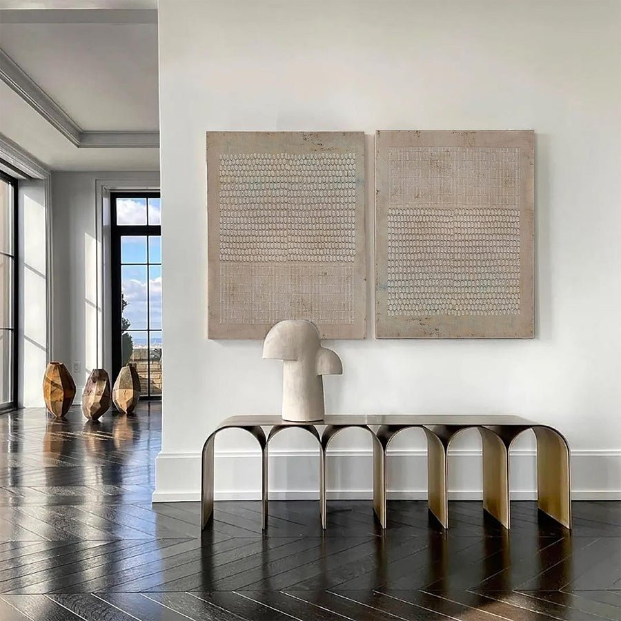
I compare undertone and visual texture
I begin with lightness. A pale wood finish can create a softer edge around a light painting. A dark finish may add a stronger boundary. I compare those broad effects before I debate small grain details. The frame still needs to work from across the room, not only in a close photograph.
I then look at undertone. Some finishes appear warm and yellow, while others feel redder or cooler. I place the reference beside the wall and the furniture closest to the painting. I do not need every wood surface to match. I want the frame to look intentional rather than almost matching one large piece in a way that feels accidental.
I also judge grain as a visual pattern. Strong grain can compete with delicate marks or a detailed portrait. It may work well beside a simpler composition. I ask for a representative finish view because natural materials and applied finishes can have variation. I do not assume that every frame will repeat a sample's exact pattern.
I request the actual construction description. Wood-look appearance does not automatically establish solid wood or a particular species. I discuss coordinated frames through the trade program when several rooms need a related finish. I keep an agreed reference and acceptable visual range in the record. That gives me a more practical way to coordinate the work than chasing a finish name shared by unrelated furniture products.
| Decision | My check |
|---|---|
| Lightness | I compare a soft edge with a strong border. |
| Undertone | I check the closest furniture and wall. |
| Grain | I judge whether its pattern competes with the image. |
How can I make the final comparison fair?
I can compare a wide gold frame with a narrow black one and mistake width for a color effect. I need to isolate the choices.
I compare finishes with similar face widths first, then test the width I prefer. I review the result at normal distance and confirm outside dimensions, actual materials and suitable fitting before ordering.
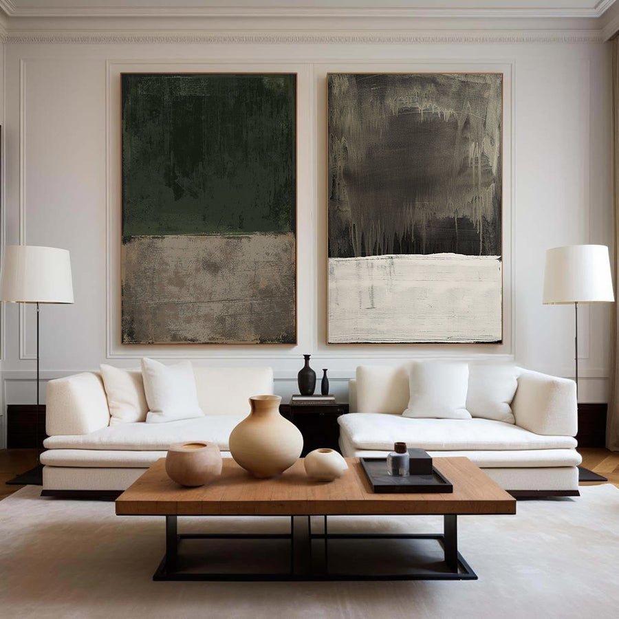
I change one visible choice at a time
I keep the painting in the same position and light while comparing samples. I start with a similar face width in each finish. This helps me see the color relationship without a much wider frame dominating one option. I then compare widths within the finish that works best. The process stays simple enough that I can remember why I prefer it.
I review the painting from the place where I will usually see it. A frame that looks interesting close up may become too strong from a sofa or doorway. I also inspect it from an angle because sheen and surface detail can change. I do not rely only on a cropped image that excludes the surrounding room.
I check the final outside dimensions before I commit. A wide face changes the footprint on the wall. I make sure the framed work still fits between furniture, switches or other fixed features. I use temporary layout marks on the wall where appropriate, without putting the painting itself at risk.
The Canadian Conservation Institute's basic care guidance supports careful treatment of the object during display decisions.[3] I ask a framer to confirm the final fit and support. I retain the finish reference, dimensions and supplied material description with the order. My decision combines a tested visual relationship with a suitable frame, rather than asking a color name to answer every decorative and practical question.
| Decision | My check |
|---|---|
| Fair color test | I hold face width and lighting steady. |
| Final footprint | I check the outside framed dimensions. |
| Suitable fitting | I confirm support with a qualified framer. |
Conclusion
I compare real finishes beside the painting and room. Contrast, undertone, sheen and width guide my choice more reliably than black, gold or wood labels alone.