How do I choose a painting for a dining room wall?
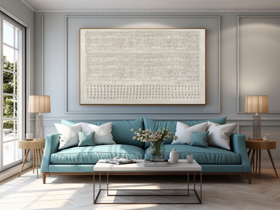
I can love a painting online and still find it awkward beside my dining table. A crowded wall can make every meal feel visually busy.
I choose dining room art around seated views, the table position, nearby lighting and the full framed size. I test a paper outline before buying. I also check that the painting sits away from heat, splashes and regular chair contact.
I treat this room as a place that changes through the day. These four checks help me choose a painting that works during a quiet breakfast and a full dinner.
Which dining room wall gives the painting a useful view?
I can fill the largest blank wall and miss the view that people actually enjoy. The best wall depends on where the seats face.
I compare the view from the entrance and from the seats I use most. I choose a wall that stays visible without placing the painting near steam, food preparation or a chair back.
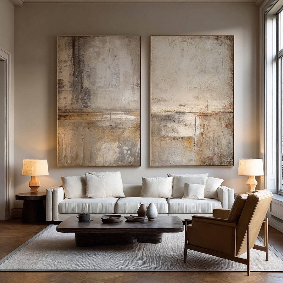
I map the room from a seated position
I start with the table in its normal position. I sit in each regular seat and take a simple room photo. I also stand in the doorway. These views often tell different stories. A wall behind the host may look strong from the entrance but remain hidden from most guests. A side wall may offer a better shared view.
I draw the wall boundaries on paper. I mark door openings, switches, serving furniture and the highest point of a pulled-out chair. I leave these practical features visible. I do not use a cropped listing room image to decide where my own painting belongs.
I also consider how the room works during a meal. In a hypothetical narrow dining room, a large canvas beside the serving route could receive repeated contact. I would test another wall before increasing the canvas size. A painting does not need to fill the widest surface to feel well placed.
I keep conservation advice separate from style preference. The Canadian Conservation Institute discusses display conditions and risks to paintings.[1] I use that guidance to question a position near a heater or a damp external wall. I do not treat it as a promise that one location is safe in every home.
I can share wide room photos through the custom art service when I need to discuss placement. I include the seats and nearby doors so the conversation starts with the real space.
| Decision | My check |
|---|---|
| Entrance view | I check whether the painting reads from the doorway. |
| Seated view | I check at least two regular chairs. |
| Serving route | I leave room for people and chair movement. |
How large should the painting be beside my dining table?
I can mistake an artwork size for its finished wall footprint. A frame and a tight corner can change the whole balance.
I measure the usable wall and compare two or three full outer sizes. I judge each paper outline from the chairs and doorway. I use table width as a visual reference, not a fixed sizing rule.
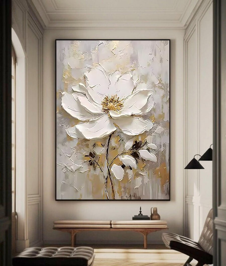
I compare complete outer measurements
I write down the wall width between interruptions. I then note the table length, ceiling height and sideboard width if there is one. These numbers describe the room. They do not produce one automatic answer. A long table placed near a short wall may need a tall artwork rather than a matching wide piece.
I make paper outlines for two candidate sizes. For example, I might compare a finished width of eighty centimeters with one of one hundred centimeters. I label both outlines clearly. I leave them in place during a meal so I can notice whether the upper edge feels crowded beneath a light fitting.
I include the frame in every comparison. A listed canvas width does not necessarily include the frame. I ask for the complete outer width, height and depth. The Canadian Conservation Institute explains several framing considerations.[3] I use that source to ask informed questions about support and fit, rather than to design a frame from a photo.
I also compare the painting with any sideboard below it. A narrow sideboard and a broad painting can work when the wall has enough clear space. I do not reject that arrangement just because it breaks an online proportion rule. I look for a stable visual center and an uncluttered edge.
I write the winning dimensions beside a room photo. That record prevents a later order discussion from switching between canvas size and framed size.
| Decision | My check |
|---|---|
| Canvas measurement | I identify whether the quoted size excludes a frame. |
| Finished measurement | I request outer width, height and depth. |
| Paper trial | I compare more than one size from the table. |
How do I choose color when the room changes at dinner?
I can choose a calm beige painting in daylight and find it yellow under evening lamps. Dining rooms need more than one light check.
I compare the artwork palette with the wall, table and chairs in both daylight and normal dinner lighting. I keep one clear relationship between them and avoid matching every surface.
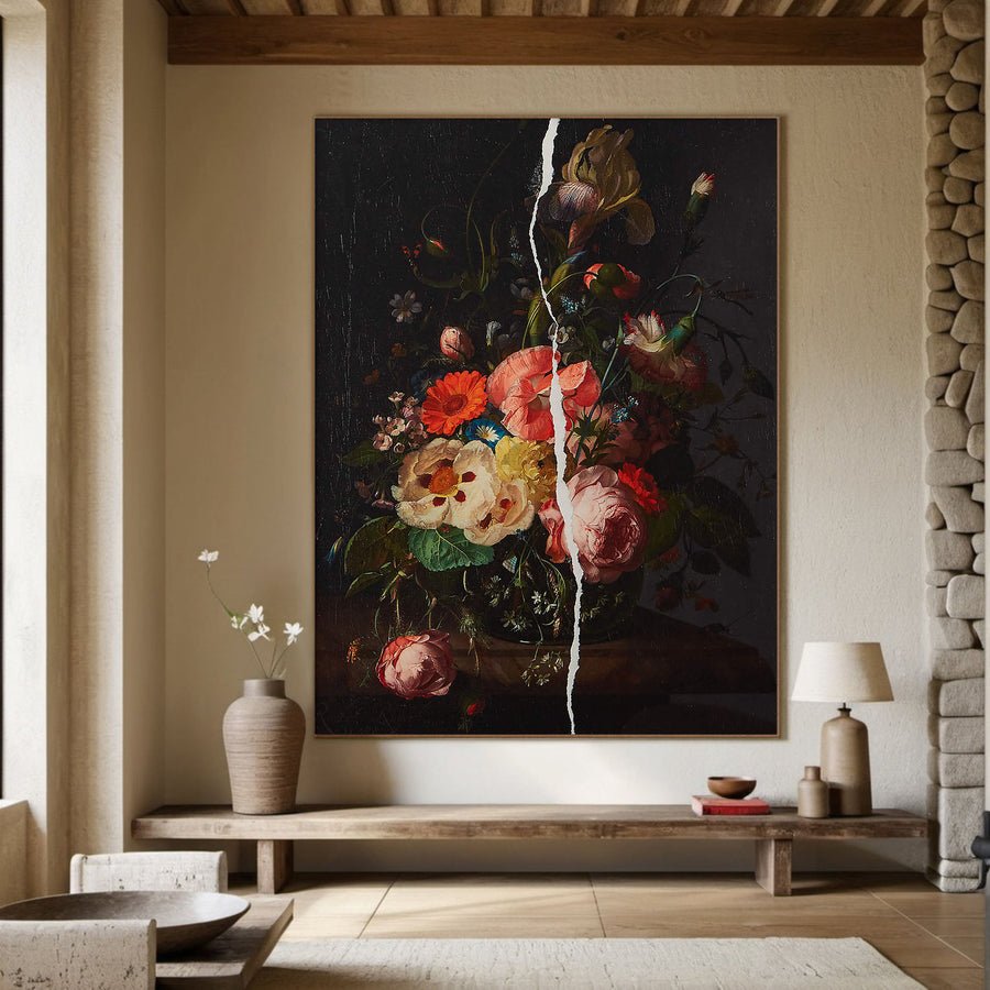
I test the colors I will actually live with
I start with the room features that will stay. A warm wood table, a blue upholstered chair and a white wall create different starting points. I choose one of them as the main link to the painting. I do not try to repeat all three at the same strength.
I view the candidate image on the same screen while standing near the dining wall. I turn off automatic screen color adjustments for this comparison where possible. I still treat the screen as a guide. The photograph, display settings and actual light can each change how I read a color.
I ask for a straight-on view and a close view of the surface. I also ask how the artwork was lit for the photograph. A dramatic side light can make pale texture look darker. A very bright room photograph can make a dark painting look lighter than I expect.
I check the evening scene with the lights I normally use for dinner. I move the paper size outline rather than moving an actual painting into an unsuitable trial position. Basic care guidance is useful when I think about light and the room environment.[2] It does not tell me which decorative color I should prefer.
I browse the wall art collections with these room facts in mind. I keep a short list based on undertone and contrast. I do not choose only because the listing uses a popular color name.
| Decision | My check |
|---|---|
| Daylight | I compare the painting with the wall and wood. |
| Dinner lighting | I check whether warm lamps shift my color judgment. |
| Surface photograph | I ask whether side lighting exaggerates shadows. |
How do I keep the dining wall clear after installation?
I can approve an empty-wall mockup and later surround the painting with lamps, bottles and seasonal decorations. The arrangement needs room for normal life.
I plan the painting together with the sideboard objects, chair movement and cleaning access. I keep delicate surfaces out of routine contact. I choose hardware and installation help for the actual wall and artwork weight.
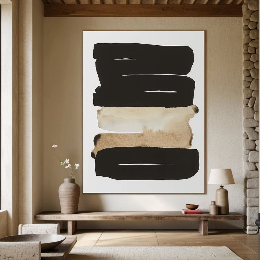
I plan around ordinary use
I draw the items that normally sit below the painting. A tall vase may cross its lower edge. A lamp shade may cover one corner. I do not remove those items only for the mockup if I expect to keep using them. I would rather change the artwork position while the plan is still on paper.
I ask for the finished weight and mounting details before arranging installation. The installer needs to know the wall construction and the fixing system. I do not recommend one screw or anchor for every dining room. I also avoid giving a loaded frame a trial hang on an unconfirmed hook.
I think about cleaning the surrounding furniture. A sideboard often needs wiping after meals. I leave enough access so that a cloth, spray bottle or lifted object will not regularly touch the painting. I do not spray cleaner toward the artwork. If the painted surface needs attention, I follow specific care advice rather than treating it like furniture.
I check the room again when the chairs are pulled out. The painting may be above them, but a projecting frame can still sit in an awkward path. I pay attention to children, bags and serving trays if those are common in the household.
I keep a photo of the final position and the installation details. That simple record helps if I later replace the table, move the sideboard or ask a professional to relocate the painting.
| Decision | My check |
|---|---|
| Sideboard objects | I include normal lamps and vases in the mockup. |
| Installation | I confirm weight, wall type and appropriate fixings. |
| Everyday care | I keep sprays and moving objects away from the surface. |
Conclusion
I choose dining room art by testing seated views, full framed dimensions and dinner lighting. I leave space for ordinary meals, movement and careful installation.