How do I compare oil, acrylic and mixed-media wall art?
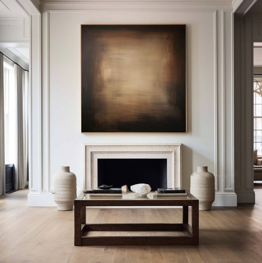
I can find oil, acrylic and mixed-media paintings that look similar online. Choosing by the label alone can leave me unclear about the surface and care.
I compare the actual materials, support, visible finish and intended display conditions. Oil, acrylic and mixed media describe different material choices, but none of those labels alone proves quality, texture, durability or suitability for my wall.
I start with what I can inspect and what the seller can confirm. That gives me a fairer comparison than ranking materials before I understand the individual work.
What should the material description include?
I cannot judge a painting from a broad medium label. Missing support and surface details make two similar listings difficult to compare.
I ask for the paint medium, support, any added materials and the supplied surface finish. I also ask whether the description refers to the exact item or a future made-to-order version.
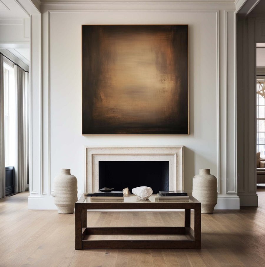
I request an object description rather than a quality slogan
I begin with the support because the painted surface is only one part of the object. Canvas, board and other supports can create different handling and framing needs. I ask the seller to describe the support plainly. I do not assume that every painting sold as canvas has the same construction or is supplied on a stretcher.
I then ask what the medium label covers. Oil can refer to the main paint layer without describing every material used. Mixed media is broader and needs more detail. It may involve several paints or added elements. I ask for a list that is useful for care and display rather than a promise that all materials share one behavior.
The Canadian Conservation Institute explains that paintings are layered objects and that their materials affect their care.[1] I use that principle to ask focused questions. I do not try to identify a full material system from a marketplace photograph. A supplier's clear record is more useful than my guess about the appearance of a ridge or a shiny patch.
I keep decorative preferences separate from factual material checks. I may prefer a quiet matte appearance or a lively surface. Those choices do not tell me whether oil or acrylic was used. I ask about the specific finish I see in the photographs. The quality-control service gives me a useful place to discuss photographs and material descriptions before I commit to an order.
| Decision | My check |
|---|---|
| Medium | I request the actual paint description. |
| Support | I check canvas, board or another base. |
| Added material | I ask what mixed media includes. |
Does thick texture prove that a painting uses oil?
I can mistake visible ridges for proof of a medium. That can make a convincing photograph support a claim it cannot actually establish.
I use texture photos to judge appearance, not to identify paint chemistry. Thick application can occur with different materials. I ask for a material description and inspect the relief as a separate design choice.
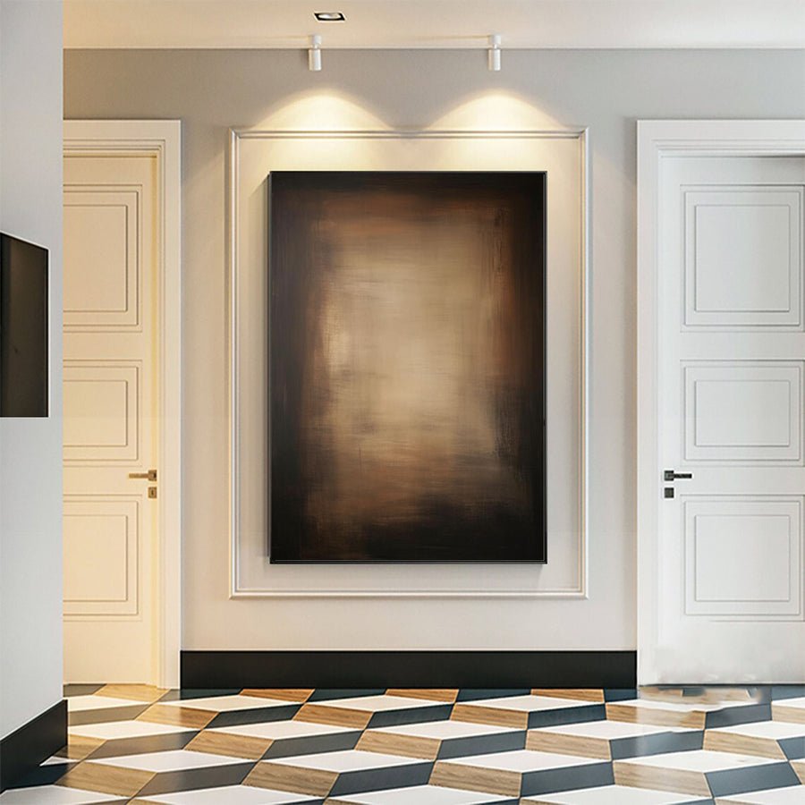
I judge relief under useful light
I look at a direct photograph and an angled view of the same area. The direct view shows the color arrangement. The angled view can reveal raised marks and shadows. I want both because dramatic side lighting can make a modest surface seem much deeper than it will look on my wall.
The National Gallery defines impasto through thickly applied paint.[2] I use that term to talk about the visible treatment. I do not use it as a certificate of oil paint, authorship or long-term condition. A descriptive technique word should make the discussion clearer rather than carry several claims at once.
I consider my viewing distance. A raised stroke that is attractive close up may have little effect from across a large room. Strong relief may also cast visible shadows under a nearby wall light. I compare that effect with the room's actual lighting instead of judging only the listing's most dramatic photograph.
I ask for a detail view with a recognizable scale, but I do not ask anyone to touch or press the surface for a demonstration. Paint can be vulnerable, and a test for my curiosity should not risk the object. Basic care guidance from the Canadian Conservation Institute supports a cautious approach to handling.[3] If I want a different surface effect, I discuss the visual aim through the custom-art service. I describe the desired depth and lighting response without assuming that one medium guarantees them.
| Decision | My check |
|---|---|
| Visible relief | I compare direct and angled photographs. |
| Medium claim | I ask for written material details. |
| Wall light | I judge the shadow effect in my room. |
How should I compare the care requirements?
I do not want a beautiful surface to become a care puzzle. A vague instruction such as wipe clean can invite the wrong treatment.
I request care guidance for the actual materials and construction. I protect the surface from handling, heat and poor placement, and I seek qualified advice for damage or cleaning rather than using a household treatment.
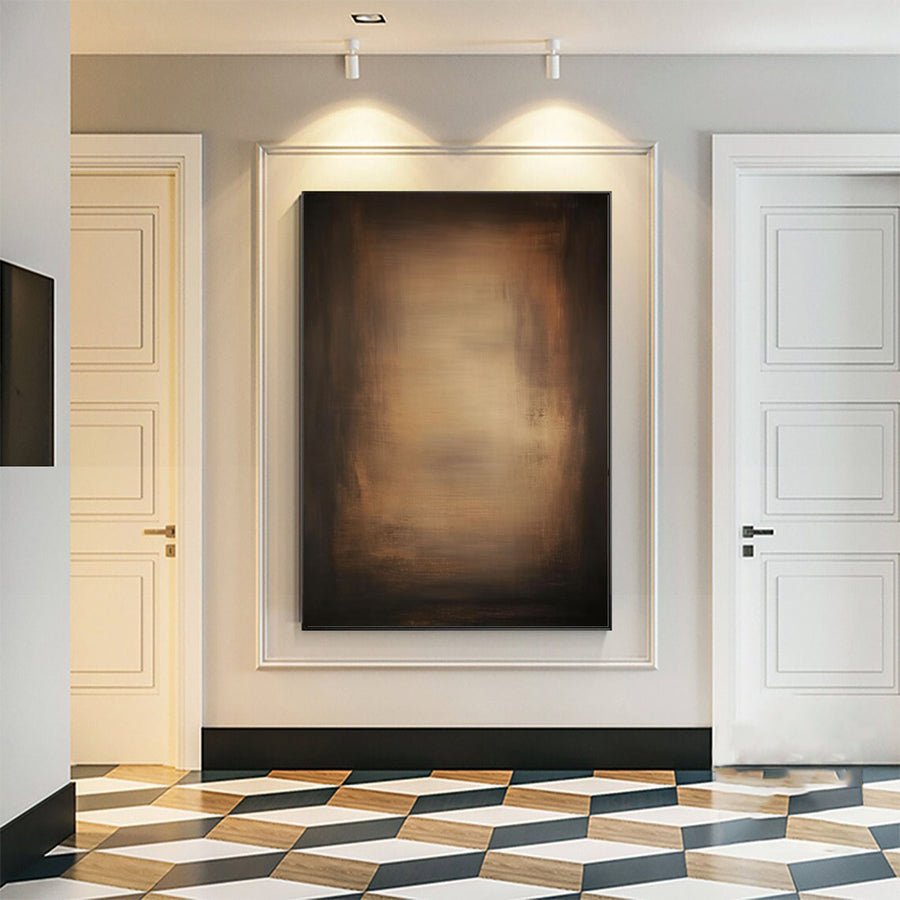
I plan display before I plan cleaning
I first think about where the work will live. A wall near a heat source, a damp area or a patch of direct sun is a more useful concern than whether I can dust the painting quickly. I check the location before I choose the object. This helps me avoid asking the material to solve a poor display choice.
I ask the seller whether added materials create special handling needs. A smooth-looking painted canvas and a heavily built mixed-media work may need different care. I do not assume that a protective finish makes every surface safe to wipe. I keep cleaning advice specific to the actual object, and I avoid solvents, sprays or water based on general internet tips.
I record the supplied frame and hanging arrangement as part of care. A frame can provide an edge for handling, but it does not remove every risk. I want the weight and the support method understood. I ask a suitable framer or installer if the construction is unclear rather than treating a small catalog image as installation guidance.
I keep useful documents with the order. These include the material description, any condition photographs and the seller's care instructions. If a mark, crack or loose area appears later, those records can help me explain what changed. I do not promise that any medium will remain unchanged indefinitely. I choose the work whose material information and display needs I can understand and manage in the intended room.
| Decision | My check |
|---|---|
| Display location | I avoid heat, direct sun and damp risks. |
| Cleaning question | I request object-specific advice. |
| Added elements | I check whether handling needs differ. |
Which medium should I choose for my room?
I can spend too long debating medium names and miss the painting's actual role. The right comparison begins with the effect I want to live with.
I choose by the individual work's color, surface, scale, material clarity and care needs. I use medium as part of that decision, rather than treating oil, acrylic or mixed media as a fixed quality ranking.
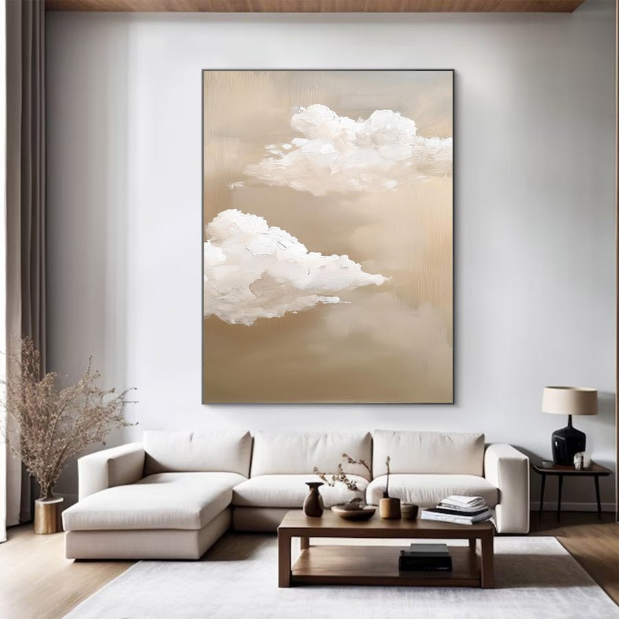
I compare the finished object against one brief
I describe the room's purpose in a short brief. I may want a calm focal point behind a sofa, a close-view textured work in a hallway or a clear color link in a dining area. I compare each candidate against that brief. This prevents the material label from becoming the only reason for buying.
I put photographs in a consistent order. I inspect the full front, an angled detail, the edge and a view that shows scale. I use the same checks for every medium. If one listing provides much better evidence, I acknowledge that difference rather than awarding another option credit for information it has not supplied.
I also compare what arrives. A stretched canvas, an unmounted canvas and a framed board are not equivalent packages. I include any local framing or installation discussion in my decision. These practical differences can matter more to the room and budget than a broad oil-versus-acrylic debate.
I leave space for taste. I may simply prefer one composition or the way a specific surface catches the room's light. That preference is enough when the factual description is clear. I do not need to claim that one medium is always superior to justify it. I keep unanswered material questions visible, ask them before ordering and choose an object whose appearance and care fit my intended use. My comparison stays grounded in the individual painting rather than a slogan about the medium.
| Decision | My check |
|---|---|
| Room purpose | I choose the visual effect first. |
| Supplied form | I include framing and installation needs. |
| Final preference | I compare evidence and appearance together. |
Conclusion
I choose the individual painting, not a medium ranking. Clear materials, useful photographs and suitable display conditions make the comparison more reliable.