What can a photo-to-painting preview show before I order?
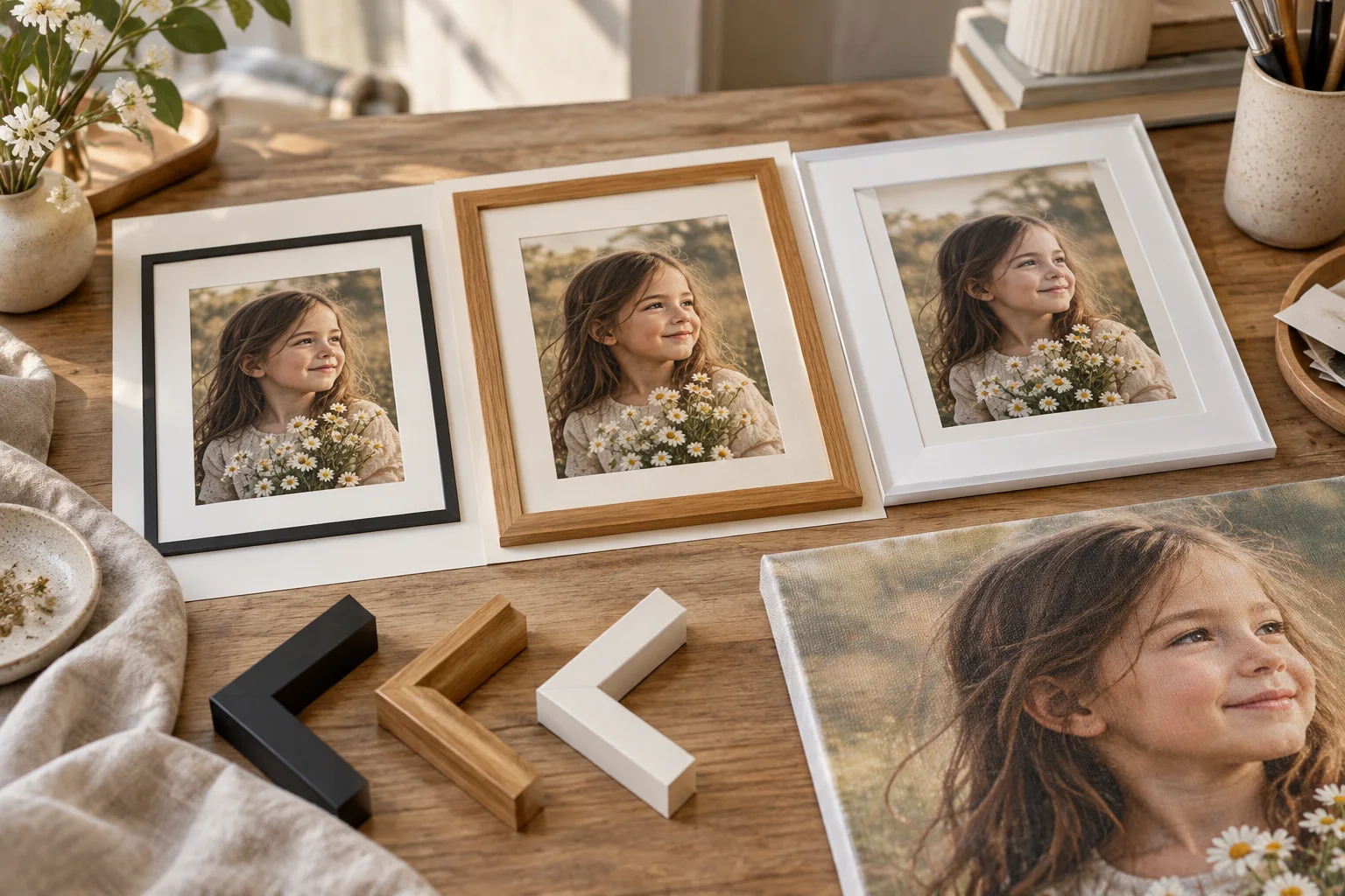
I can see a polished preview and expect the finished painting to match every screen detail. That assumption can blur the difference between layout and hand-painted surface.
I use a photo-to-painting preview to compare composition, crop, size and frame choices. I do not treat it as a guarantee of final brushwork, exact color or likeness. I confirm the actual artwork brief and approval process separately with the supplier.
I get more value from a preview when I know which decisions it supports. I separate those decisions from the parts that only a real painting can show.
What can a composition preview show reliably?
I can compare a preview’s overall look and miss a crop that removes an important hand or ear. Attractive presentation can distract from the image boundaries.
I check what remains inside the selected canvas shape, where the subject sits and how much background appears. I compare fit and crop options. I use the preview to choose the intended layout, while asking for a review of any missing or altered detail.
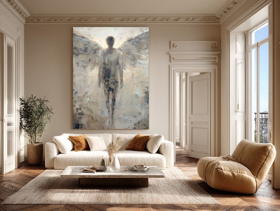
I inspect the rectangle before the effect
I start with the plain composition. I look at the top, bottom and side boundaries before judging any visual effect. I check whether the preview preserves the full photograph or fills the selected rectangle by cropping it. These routes can create different results from the same source. I ask which route is active when the interface does not make that clear. I do not approve an image only because the face remains visible if the crop removes a meaningful gesture.
I compare subject placement at the same canvas size. A face close to one edge may feel more cramped than a centered version with the same head scale. A wider background can help explain a place, but it can also make the subject smaller. I decide which relationship serves the painting’s purpose. I use the photo painting preview as a way to explore those visible options, not as a claim that every background extension has already been accepted by an artist.
I save the chosen layout with the source image and size. I note any requested change that the preview cannot actually show. If I want a removed object, a different pose or a new person added, I place that request in the written brief. I ask the supplier to review it. I do not assume that a tool’s smooth display means the change is simple, included in the price or possible from the available reference.
| Decision | My check |
|---|---|
| Fit or crop | I check the active mode |
| Important edge detail | I inspect all boundaries |
| Change not shown | I add a written review request |
What does a frame preview leave uncertain?
I can like a digital frame and overlook its real width, finish or assembly. A screen border may not describe the object that reaches my wall.
I use the frame preview to compare broad visual relationships, then confirm the actual frame option, outer dimensions and assembly. I ask how the frame meets the canvas. I do not infer wood type, finish quality or hanging hardware from the preview alone.
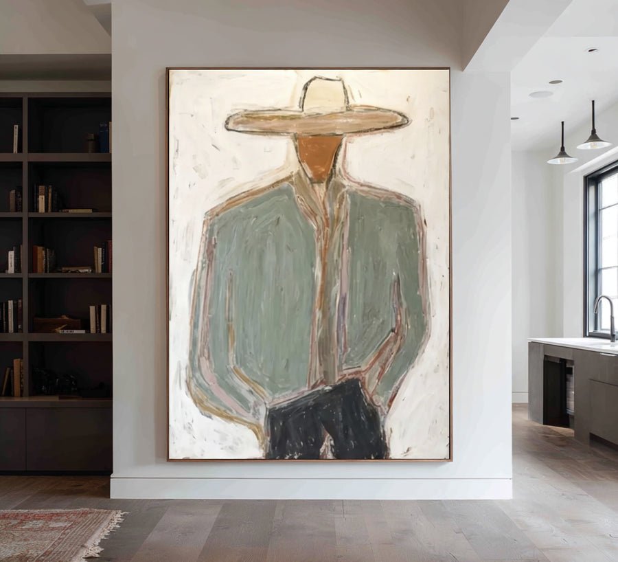
I separate the illustrated frame from the specification
I compare how each frame color changes the relationship between the image and the wall. A dark border can give a light portrait a stronger edge. A lighter finish can make the same composition feel less enclosed. I use those observations to narrow my preference. I do not treat a small on-screen sample as evidence of the frame’s exact surface, grain or sheen. I ask for the description and available reference images of the actual option.
I confirm the outside dimensions. A frame can increase the physical width and height beyond the painted face. I test that finished outline on the intended wall. I also ask whether the selected construction surrounds the canvas, overlaps its edge or leaves a visible gap. Framing guidance explains why support and fit matter beyond decoration.[2] I use that information to ask about the offered assembly, not to design a protective system from a digital illustration.
I record the frame choice in the custom artwork request. I include the finish name and any relevant outside measurement. I ask whether hanging hardware is included and what the recipient still needs to arrange. I do not assume that a framed preview means a ready-to-hang package. If I choose rolled canvas instead, I ask a local framer about the intended assembly before approving edge details. The preview helps me make a visual comparison, while the specification explains what is actually supplied.
| Decision | My check |
|---|---|
| Frame color | I compare broad visual balance |
| Outside size | I confirm the real dimensions |
| Assembly and hardware | I ask what is supplied |
Why can final brushwork and color differ from the screen?
I can zoom into a preview and expect that same smooth detail in oil paint. A real surface responds to light in ways the screen cannot reproduce.
I expect a hand-painted interpretation rather than a pixel-for-pixel copy. I ask about the intended painting style and texture. I review physical surface references where available and avoid using one screen view as proof of exact color under every room light.
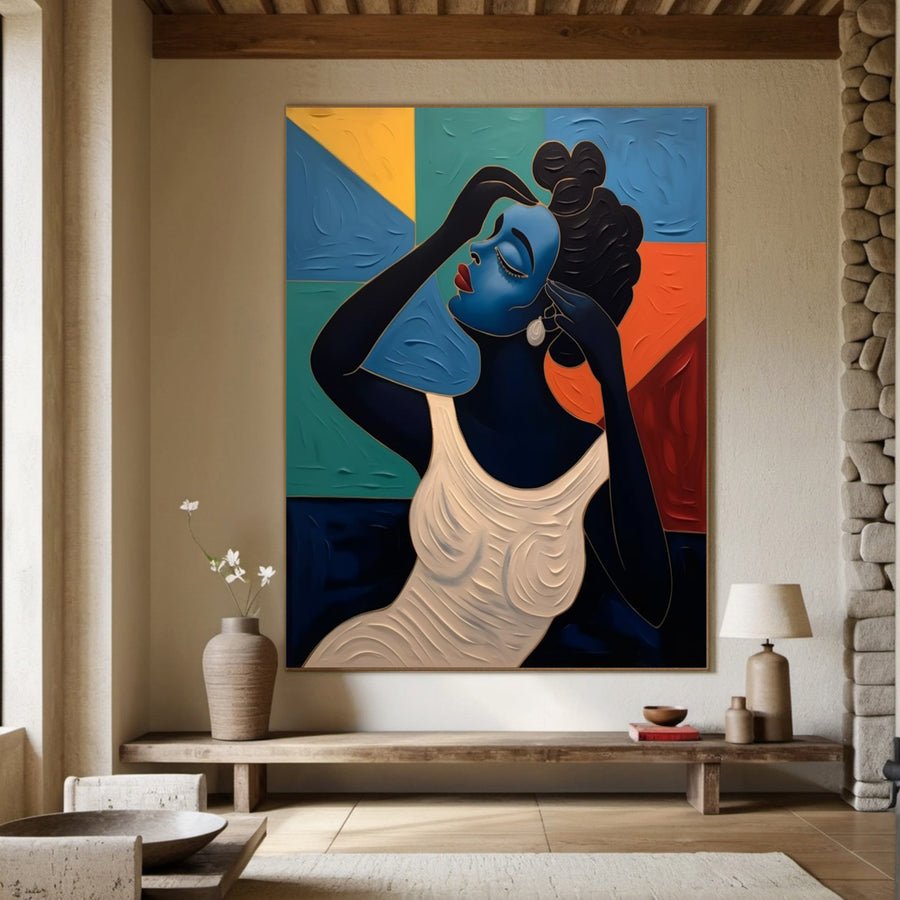
I account for the medium and the display
I separate image composition from paint handling. A photo-based preview can show where the subject sits, but it may not describe the thickness or direction of actual marks. Impasto refers to thickly applied paint, which creates a physical surface.[1] I ask whether the proposed artwork uses that kind of treatment or a flatter approach. I do not assume that an illustrated texture effect matches the material or depth of the finished work.
I also separate the file’s color from the room’s appearance. My phone, laptop and room lighting can present the same image differently. I compare the preview on more than one screen if that helps reveal an obvious concern, but I do not treat agreement between screens as a physical color guarantee. I ask for clear color priorities in the brief. I can describe a warm background or a restrained contrast and point to a reference, while acknowledging that paint and changing light remain part of the result.
I choose which differences matter to the purpose of the portrait. A natural brush edge may be welcome in an expressive work. A changed eye direction may matter more to recognition. I state those priorities before production rather than asking the preview to promise both strict photographic detail and freely expressive marks. I request a style explanation and review examples for the offered approach where available. I keep that conversation separate from the tool’s attractive presentation, because the tool is not the artist’s entire production process.
| Decision | My check |
|---|---|
| Paint texture | I ask about the actual approach |
| Screen color | I avoid an exact-match assumption |
| Recognition priority | I name important features |
What should I confirm before turning the preview into an order?
I can save a favorite preview and assume the supplier knows every decision behind it. An unlabeled screenshot may leave size, permissions and review scope unclear.
I confirm the selected reference, composition, dimensions, format, frame and requested changes in writing. I check photograph permissions and the approval process. I save the preview as a supporting record, with its limits stated, rather than treating it as the full contract.
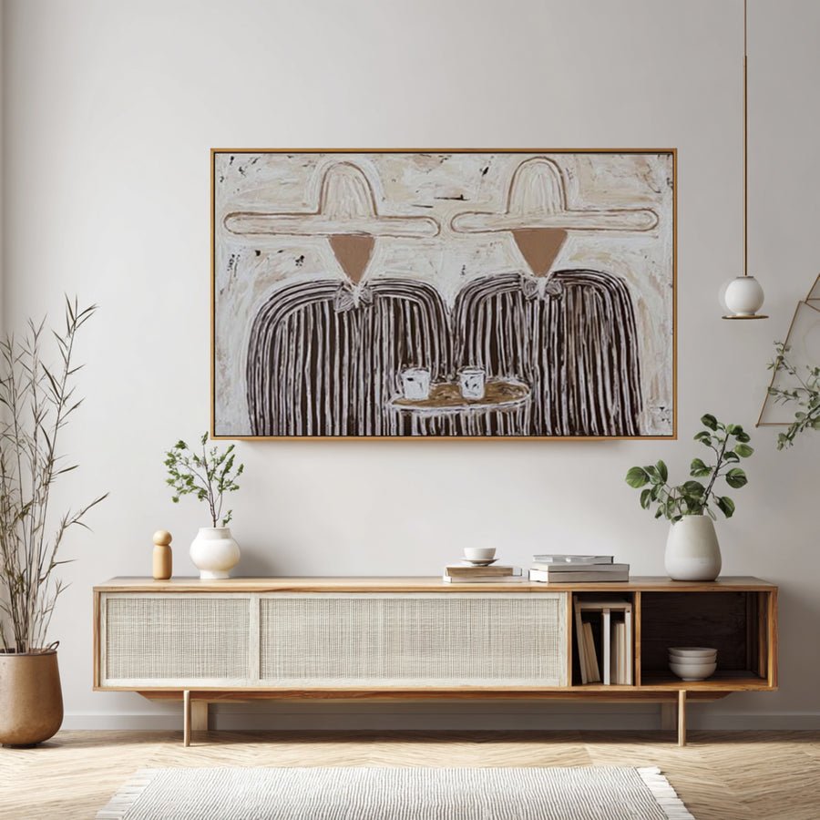
I attach the preview to a complete brief
I prepare a short order record beside the saved preview. I name the source photo, the selected crop and the intended visible dimensions. I include the orientation and whether the work will be rolled, stretched or framed. I list any change that cannot be seen in the screenshot. I avoid vague instructions such as “make it look like the preview” when the preview includes an automatic effect that the supplier has not offered as a painting style.
I confirm permission for the source photograph. The Copyright Office explains that photographer ownership is a separate issue from being shown in a picture.[3] I ask about the intended use when a professional or another person made the image. I also ask separately about private handling and public portfolio use if the photo is personal. I do not treat a successful upload as an answer to either question.
I discuss the approval stages and any revision limits before production. I ask what evidence will be provided, when feedback is invited and how a major change affects the order. I keep the answers specific to the supplier’s actual process. I save the version that was approved along with the written specification. If I later adjust the crop in the tool, I do not assume the order updates automatically. I communicate the change and ask for acknowledgment. That keeps the preview useful as a record without giving it authority over decisions it cannot make.
| Decision | My check |
|---|---|
| Saved preview | I attach size and format |
| Source permissions | I check the planned use |
| Later preview edit | I communicate the change |
Conclusion
I use the preview for layout and framing decisions. I confirm surface, color and review expectations separately before approving the hand-painted commission.