Should I choose vertical or horizontal art for a small room?
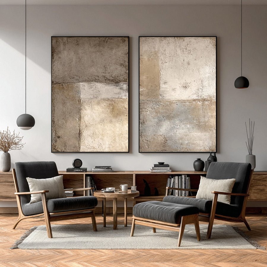
I can choose a small painting to avoid crowding a small room and still make the wall feel weak. Shape matters as much as size.
I choose vertical or horizontal art by comparing the clear wall shape, furniture line and main viewing angle. I test both orientations at full outer size. I do not assume that a vertical painting always makes a room look taller.
I focus on the wall I actually have. A few simple trials show whether a tall shape or a wide shape gives the room a clearer center.
What wall shape am I working with?
I can judge a room from its floor area and miss the narrow wall beside a door. The usable wall gives me the better starting point.
I measure the uninterrupted wall rather than the whole room. I mark doors, windows, furniture and fixtures. I choose an orientation that works inside that clear area without hiding useful features.
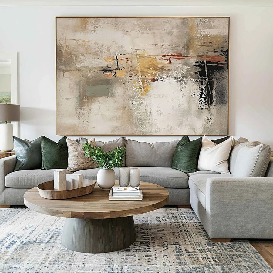
I measure the clear rectangle
I start with a front-facing photograph of the wall. I keep the camera level and include the corners. I then mark the width and height of the clear space. I leave door trim, switches and shelves in the picture. A wide-angle photo can distort the room, so I rely on measurements rather than the image alone.
I compare the wall with the furniture below it. A compact sofa can sit against a broad wall. A tall cabinet can leave a narrow strip beside it. Those two arrangements call for different trials even if the rooms have the same floor area. I avoid turning a general small-room tip into a rule for every wall.
I use paper outlines for one vertical and one horizontal option. I keep their approximate area similar for the first comparison. This helps me judge shape rather than simply favoring the larger option. I then compare a second size if the first pair feels too weak or too dense.
I look for usable breathing space around each outline. I do not need perfectly equal gaps on every side, but I want the placement to look deliberate. Display guidance reminds me to consider the room environment as well as the visual fit.[1]
I can send the measured wall through the custom art service. I explain which fixtures will remain so the suggested orientation is based on the real room.
| Decision | My check |
|---|---|
| Narrow wall strip | I test a tall shape before filling the entire height. |
| Broad low wall | I compare a wide shape with the furniture line. |
| Interrupted wall | I keep doors and switches in the trial drawing. |
How does my furniture change the orientation choice?
I can match the wall shape and ignore the furniture below it. The painting may then feel disconnected from the part of the room I use.
I compare the painting with the furniture that forms the main visual base. I test a wide piece over a long sofa and a tall piece near upright furniture. I let the complete arrangement decide.
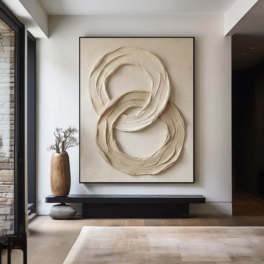
I connect the painting to a useful base
I identify the strongest furniture line first. A bed headboard creates a broad horizontal base. A narrow desk between two shelves may create a compact vertical space. I do not treat the furniture as a ruler that dictates one exact artwork width. I use it to understand where the eye already travels.
I consider the room from the usual seat. In a small living room, a horizontal painting above the sofa may feel calm from the opposite chair. A vertical piece on the same wall may create a sharper focus. Neither result is automatically better. I choose the one that fits how I want to use that corner.
I also check objects that sit on the furniture. A table lamp or a tall plant can block part of a vertical painting. A row of books can make the lower edge of a wide piece look crowded. I include these objects in the paper test instead of removing them for a perfect photograph.
I ask for the complete framed dimensions before deciding. A substantial frame can change the balance of a narrow canvas. Framing guidance helps me understand why outer dimensions and support details belong in the order conversation.[2]
I browse the collections after I know the likely orientation. That keeps my shortlist focused on paintings that can fit the arrangement. I still leave room for a composition that surprises me in a useful way.
| Decision | My check |
|---|---|
| Long sofa | I compare the artwork with its horizontal base. |
| Narrow desk | I test the clear space above practical objects. |
| Tall furniture | I avoid squeezing a canvas into a leftover gap. |
Will a vertical painting make my room feel taller?
I can expect a tall canvas to solve a low ceiling and feel disappointed when it crowds the wall. The effect depends on the whole room.
I treat visual height as a possible effect, not a guarantee. I check the ceiling gap, frame weight and nearby lines. A vertical painting works when it has enough clear space to feel intentional.
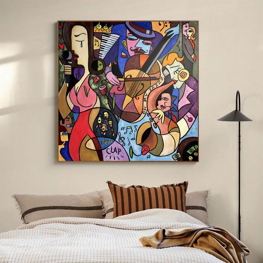
I test the claim instead of trusting it
I do not choose a vertical painting only because a style article says it makes ceilings feel higher. A tall shape can draw attention upward, but that attention may also reveal a low ceiling or a heavy beam. I test the complete view before assuming the effect will help.
I compare the top gap with other nearby features. A painting that almost touches the ceiling can look squeezed in a compact room. A slightly shorter vertical piece may keep the same upward movement while leaving more visible wall. I judge this from the floor and from a seated position.
I look at the design within the artwork. Vertical stripes, a tall figure and a broad block of color do not feel identical even when their canvases have the same shape. The image can carry its own direction. I keep that in mind when choosing between two vertical candidates.
I also consider frame weight. A thick dark border around a tall pale image may make it feel more solid and contained. A slim light frame may make the same image read more softly. I test a paper border rather than guessing from the canvas alone.
I check the proposed location against care concerns.[3] I do not move a painting closer to a heat source or direct sunlight just to create a decorative height effect. The room has to support both the artwork and the way I use it.
| Decision | My check |
|---|---|
| Ceiling gap | I inspect the top edge from a seat and the doorway. |
| Image direction | I check whether the design itself leads upward. |
| Frame weight | I compare the complete outline rather than bare canvas. |
How do I compare both options without buying twice?
I can keep switching between product thumbnails and never reach a decision. A simple test in my own room makes the choice more concrete.
I make labeled paper templates for both orientations and photograph them from the same positions. I keep lighting and furniture constant. I compare clear wall space, visual focus and practical contact risks.
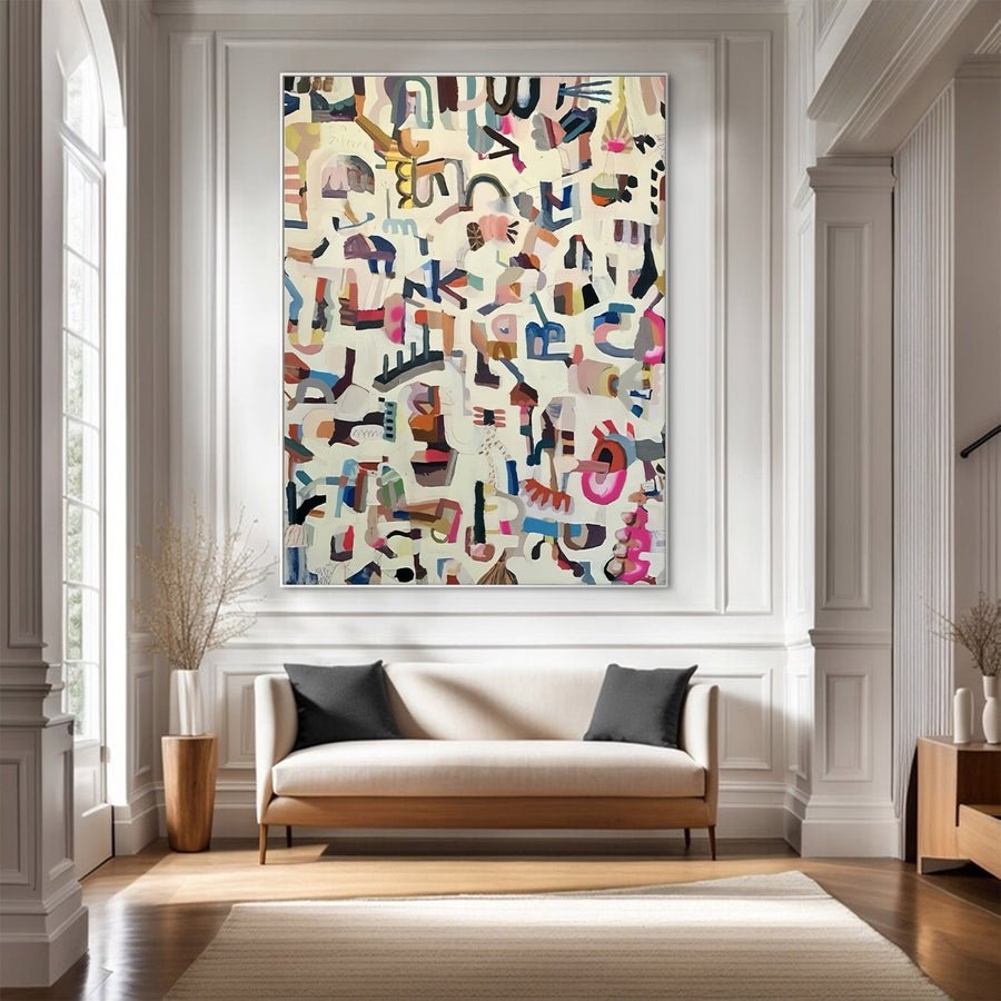
I use a controlled room trial
I choose two realistic candidates rather than ten unrelated paintings. I write the outer dimensions beside each one. I then make plain paper templates with those measurements. I do not need to reproduce the artwork perfectly. The first test asks whether the shape and size belong on the wall.
I place each template in the intended position. I photograph the room from the entrance, the main seat and any narrow path nearby. I keep the furniture in place and use the same camera position. This makes the comparison fairer than switching between listing images with different styled rooms.
I spend time with each option. A shape that looks exciting in a quick photograph may feel distracting during ordinary use. I notice whether the painting would compete with a television, block a useful shelf or dominate a small workspace. I write those observations in simple words.
I then add a rough color image inside the preferred outline. I remember that this remains a composition illustration. It cannot show exact paint texture, depth or final color in my room. I use it to discuss the layout rather than to demand a perfect screen match.
I finish by checking access and installation. A small room may still have a tight delivery turn or an awkward hanging position. I confirm those details before ordering so the selected orientation is practical from the front door to the final wall.
| Decision | My check |
|---|---|
| Fair comparison | I photograph both templates from the same position. |
| Daily use | I notice distraction and contact around furniture. |
| Final decision | I confirm delivery access and mounting requirements. |
Conclusion
I choose orientation from the clear wall, furniture and real viewing angles. I test both shapes before deciding which one gives my small room a useful focus.