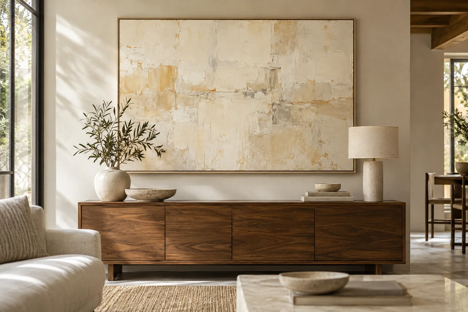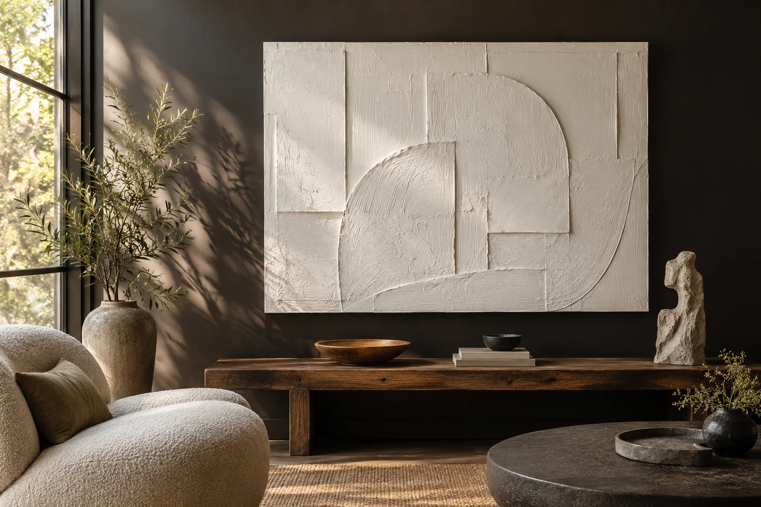
Color & texture
How Should I Choose Textured Wall Art for My Room's Lighting?
I choose textured wall art by reviewing relief depth, side-light views, viewing distance, and the room's daylight and evening lighting. I ask which…
Compare undertones, contrast, relief and room lighting so the selected artwork reads well in your space.
Compare the artwork with the room under the light you normally use. Warm and cool neutrals can look similar on a screen but feel different beside wood, stone and fabric. Texture also changes with light and distance, so a close studio photograph cannot describe every view in your room.
Share the room materials, the desired palette and any colors you want to avoid. Ask which sample or reference can answer the main concern before you request changes. XM reviews the selected design, surface and finish through the brief. Confirm the actual medium, approval route and scope of customization in the quotation.
I choose textured wall art by reviewing relief depth, side-light views, viewing distance, and the room's daylight and evening lighting. I ask which…
I choose neutral wall art by comparing its warm or cool lean with the wall, floor, fabric, and lighting. I review more than one photograph and test a…