How Should I Choose Textured Wall Art for My Room's Lighting?
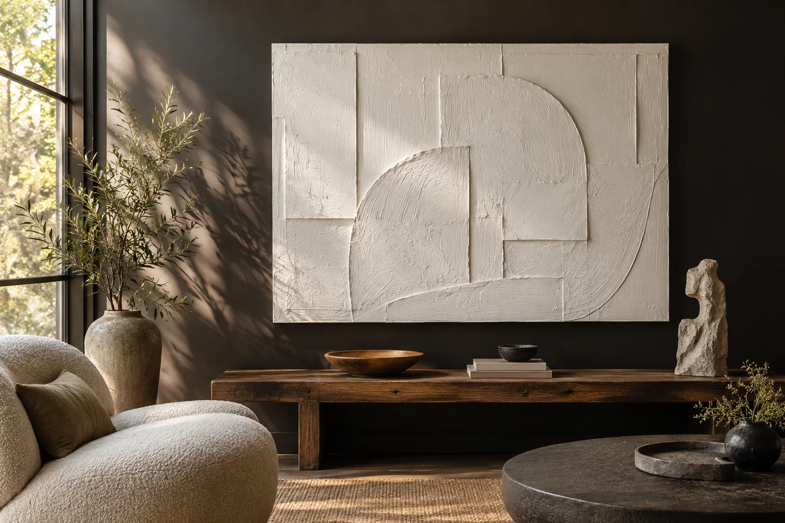
I can admire deep texture online and barely see it at home. Flat lighting hides the detail. I check the surface with my room's light before ordering.
I choose textured wall art by reviewing relief depth, side-light views, viewing distance, and the room's daylight and evening lighting. I ask which materials create the surface. I approve a relevant sample or visual benchmark when texture is central to my choice.
I use texture as a relationship between the artwork, the light, and the viewer. I work through those parts before I let one dramatic photograph decide the whole purchase.
What does texture add that color alone cannot show?
I can choose a calm palette and worry that the work will feel plain. Extra depth can help. I first ask what that depth contributes to the composition.
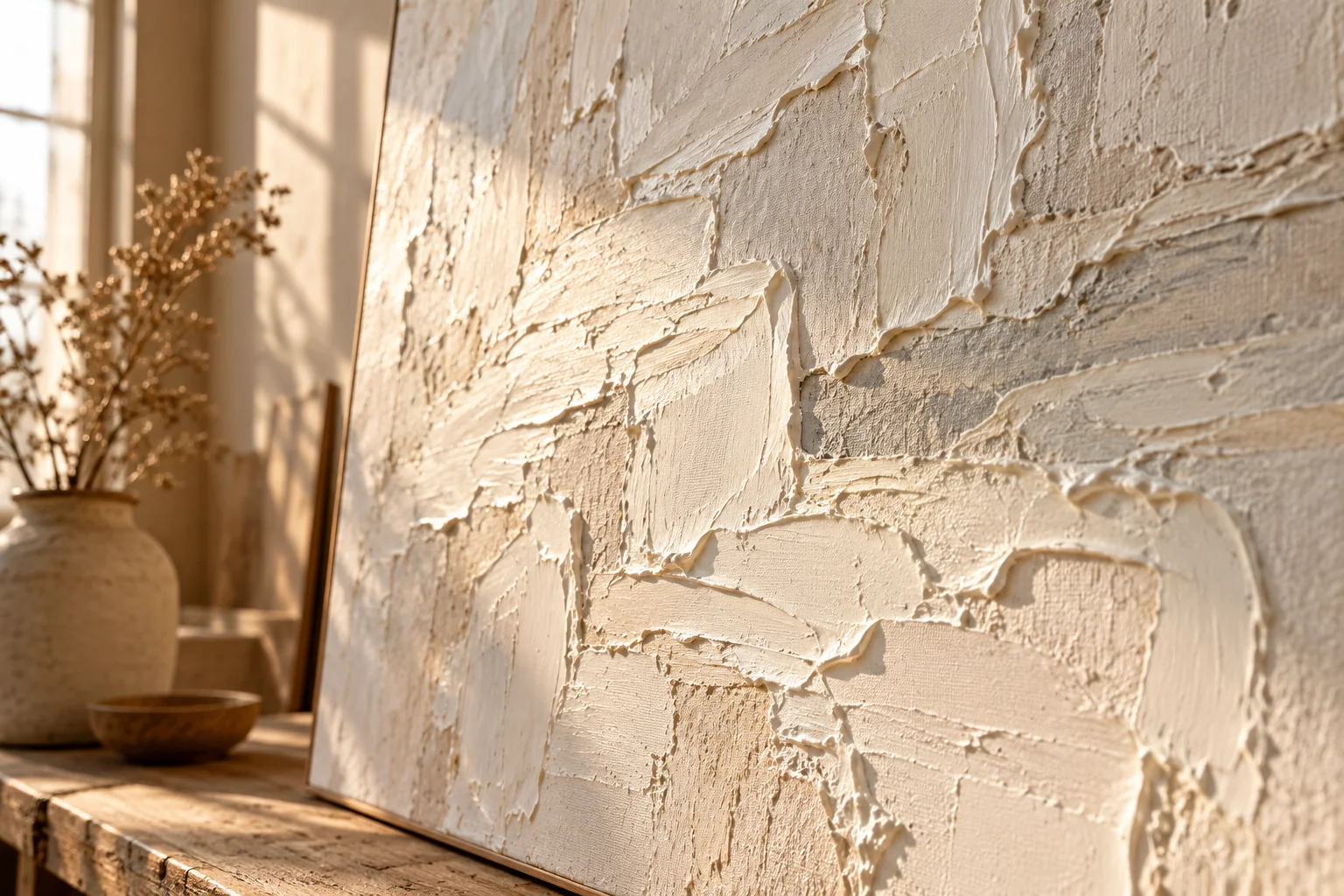
I use texture to create changing highlights, shadows, and marks as light and viewing angle shift. I still judge the whole image. Thick paint is useful when it supports the composition, and I do not treat thickness alone as proof of quality or value.
I read the surface as part of the image
I look at where the raised marks appear and where the artist leaves quieter areas. I want the surface to guide my eye rather than make every part compete for attention. A textured horizon can draw me across a landscape. A few strong marks can give a quiet abstract a clear focus. I ask whether the texture helps that focus or simply covers the canvas.
I also consider the work from different distances. A detail that looks exciting in a close photograph can disappear across a room. A broad raised form can remain visible from a doorway. I do not expect every fine mark to carry the same effect in a large lobby and a small bedroom.
I ask what creates the relief
I ask whether the surface uses oil paint, acrylic paint, a textured ground, or a mixed-material method. I avoid using the word oil as a shortcut for every raised surface. The medium affects what I need to know about handling, finish, and care. I want that information in the quotation for the chosen design.
| Feature I compare | Question I ask |
|---|---|
| Raised marks | I ask where they guide my eye. |
| Quiet areas | I ask whether the image has breathing room. |
| Material | I ask what builds the surface. |
I use the National Gallery definition of impasto as a useful starting point for thickly applied paint.[1] I then return to the actual artwork. I can review XM's textured wall-art collection, but I confirm the method for each work I shortlist.
How do daylight and evening light change the same painting?
I can approve a sample in bright daylight and dislike it after dark. The room changes around it. I compare both lighting states before making texture a key requirement.
I compare front light, light from the side, and the room's normal evening light. Side light often makes relief more visible, while broad front light can soften its shadows. I request views under useful lighting and avoid assuming a studio photograph predicts my room exactly.
I start with the light I actually have
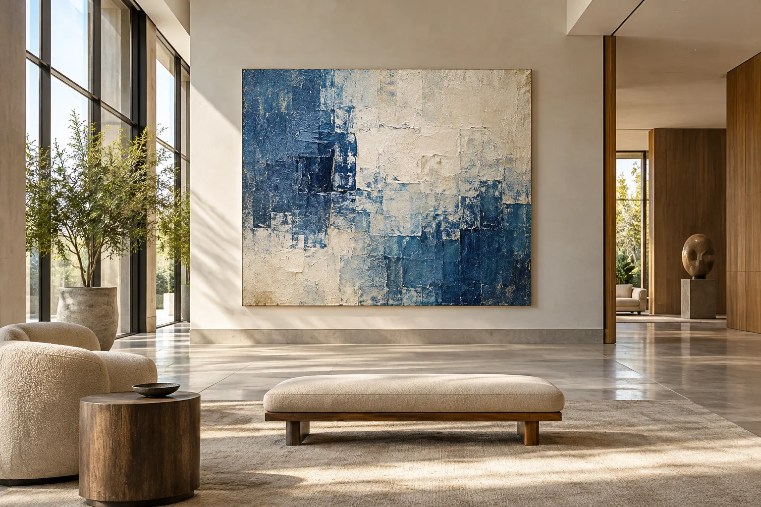
I note where the windows are and when daylight reaches the wall. I check whether a lamp or ceiling light falls across the artwork or straight onto it. I do not redesign the room's lighting just to copy a seller's photograph. I first choose a work that can read well under the conditions I normally use.
I ask for more than one lighting view when the surface matters. A full front photograph helps me judge color and composition. An angled view helps me understand depth. A short moving view can show how shadows change. I look for useful information rather than a dramatic film with a dark background and one narrow beam.
I avoid a lighting solution that creates another problem
I consider glare and direct sun as well as visible texture. I do not place a painting in harsh sun just because the ridges look stronger there. The Canadian Conservation Institute discusses light and environmental risks for paintings.[2] I use that guidance to keep display conditions part of the decision, while following the maker's instructions for the selected materials.
| Lighting state I test | What I watch |
|---|---|
| Daylight | I compare color and shadow direction. |
| Evening lamps | I check whether relief remains visible. |
| Angled light | I check glare and strong highlights. |
I record a simple lighting note with my brief. I might say that the wall receives soft afternoon light and warm lamps at night. I give the supplier that context before asking for a texture benchmark.
How much texture works at my normal viewing distance?
I can buy fine surface detail for a wall that I only see from far away. That detail then adds little. I match the texture's scale to the room.
I compare the artwork from the entrance, normal seating position, and close viewing point. I choose broad forms for distant reading and finer marks when people can approach. I balance the texture with the artwork's size, contrast, and quiet areas rather than choosing maximum relief everywhere.
I identify the important view
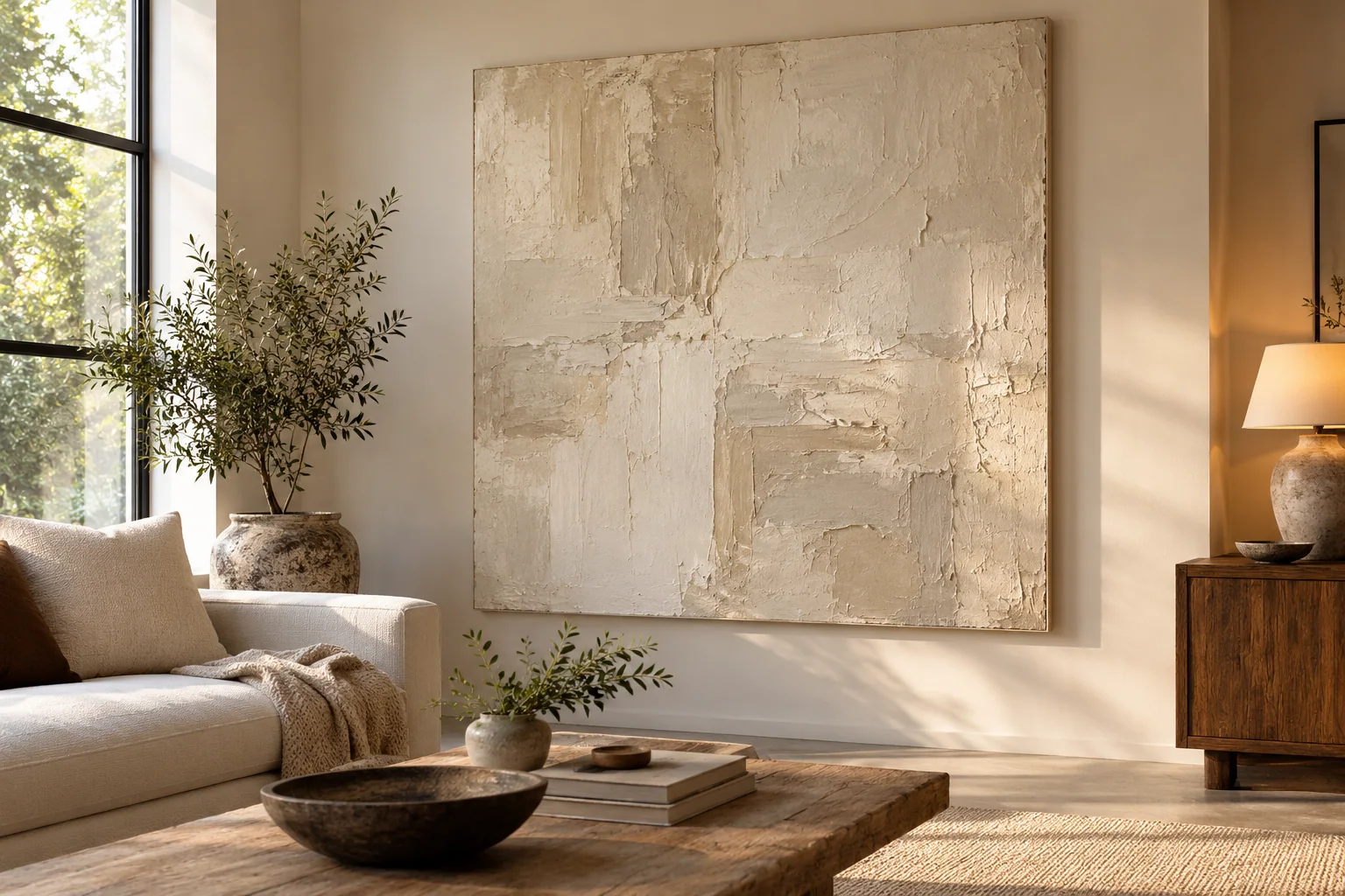
I ask where I will see the artwork most often. A painting behind a dining table has a different role from a piece beside a chair. A hotel lobby work may need to read from the entrance before a guest ever approaches it. I choose one main view, then check the other views as supporting conditions.
I make a rough wall outline at the planned finished size. I place a small surface sample nearby when one is available. I do not expect the sample to show the whole composition. I use it to judge how its relief responds to the wall's light. I use the outline to judge scale and the reference image to judge the larger shapes.
I compare texture with contrast
I look at color contrast and the direction of marks. A low-contrast white work can need helpful light to stay active. A dark-and-light abstract can remain readable with less surface depth. I avoid describing every pale painting as dull or every textured painting as strong. I compare the actual composition with the intended room.
| Viewing point I check | Decision I make |
|---|---|
| Entrance | I assess the broad forms. |
| Seating position | I assess calmness and balance. |
| Close view | I assess marks and finish. |
A community discussion about finding artwork large enough for a neutral room shows why size and presence matter together.[3] I use that concern to ask better questions. I do not use a forum preference as proof that one medium will work in every space.
What should I approve before a textured artwork is made?
I can ask for heavy texture without defining what that means. The finished surface may surprise me. I agree on a useful visual standard before production begins.
I approve the composition, palette, texture reference, dimensions, and delivery format. I ask how natural variation will be reviewed and which evidence belongs to my order. I also confirm packing and care needs for the specified surface instead of relying on a generic texture promise.

I use a benchmark that answers my real concern
I describe the effect I want in plain words. I might want broad visible ridges, a quieter center, or a matte-looking surface under the room's lamps. I avoid asking for the most texture possible because that instruction can conflict with the image's balance. I also identify the parts of the reference that must remain recognizable.
I ask what a sample can confirm. A small sample can show a material and a mark, but it cannot prove that the final large composition will feel balanced. A photograph can show a composition, but it cannot give me the same view as a physical sample. I choose the approval route according to the risk I need to reduce.
I connect the surface to the delivery plan
I ask whether the finished work can be rolled or needs rigid support. I do not assume that a deeply textured painting can travel in the same way as a thin painted canvas. I confirm the packing route with the supplier and, when needed, a qualified framer or art handler. I leave enough time for that decision before the shipment is arranged.
| Approval item I record | What it protects |
|---|---|
| Surface reference | I define the intended relief. |
| Variation range | I separate normal marks from major changes. |
| Packing route | I keep the approved surface in the delivery plan. |
I use XM's quality-control page to ask how the selected work will be reviewed. I treat samples and inspection as project-specific steps. I confirm their scope, cost, and timing in the quote before I depend on them.
Conclusion
I choose texture by testing light, distance, and material together. I approve the surface I want and connect that standard to the finished size and delivery route.