How Can I Choose Neutral Wall Art Without Getting the Undertones Wrong?
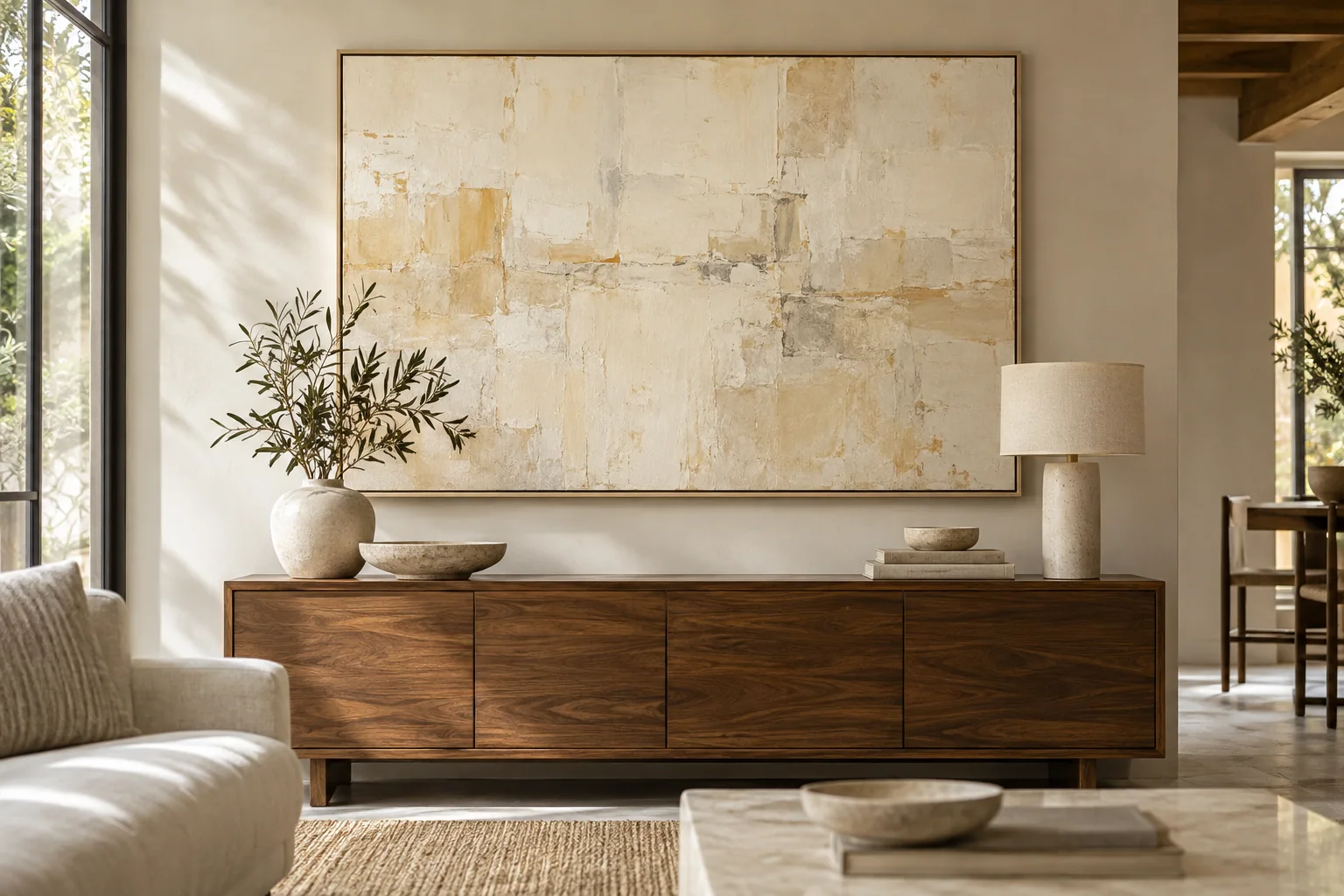
I can order a beige painting and discover that it looks pink or gray beside my sofa. That mismatch feels avoidable. I compare undertones in the real room.
I choose neutral wall art by comparing its warm or cool lean with the wall, floor, fabric, and lighting. I review more than one photograph and test a relevant sample when needed. I also check contrast and texture so a matching color does not disappear on the wall.
I do not expect one neutral to suit every interior. I use the following checks to build a clear palette brief while leaving the artwork enough freedom to have its own character.
How do I identify the room's main undertones?
I can call every pale finish beige and miss the differences. The artwork then makes those differences stronger. I compare materials side by side before choosing a palette.
I compare the wall, floor, sofa fabric, and main wood or stone finish under the room's normal light. I look for a warm, cool, or mixed lean. I use a plain white reference to make small differences easier to see, then judge the materials together.
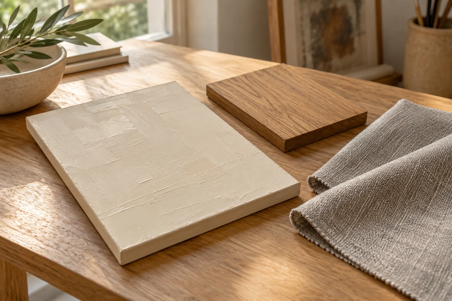
I compare fixed finishes first
I start with materials that I cannot easily change. A floor, a large sofa, and a stone surface usually matter more than a small cushion. I place available samples together instead of relying on memory. I can use clear photographs when physical samples are unavailable, but I know that a phone can alter their color.
I look for the direction of each neutral. A cream can lean warm, a gray can lean blue, and a beige can lean pink or green. I use those simple descriptions to communicate rather than claiming that I can measure an exact pigment from a screen. I also note whether the room already mixes warm and cool finishes successfully.
I decide what the artwork should do
I ask whether I want the painting to blend with the room or create a quiet contrast. I do not assume that matching every finish produces the best result. A slightly cooler image can give a warm room useful depth. A warm earth-tone painting can make a cool room feel less severe. I still want the choice to look deliberate.
| Finish I compare | Note I make |
|---|---|
| Wall | I record its warm or cool lean. |
| Large fabric | I record its dominant neutral. |
| Wood or stone | I record the strongest color shift. |
A Reddit discussion about choosing artwork for a neutral room raises the risk of a space feeling flat when every object follows the same palette.[1] I use that concern to ask what the artwork adds. I can browse XM's wabi-sabi references after I describe that role.
Why does the same artwork look different across photographs?
I can mistake a warm photo for a warm painting. The delivered work then surprises me. I compare image conditions before turning a screen color into a specification.
I check the light, camera angle, exposure, and surrounding room in each image. I ask for a plain front view and useful daylight or evening views of the selected work. I treat a room scene as placement help, and I use the agreed approval record for the actual palette.
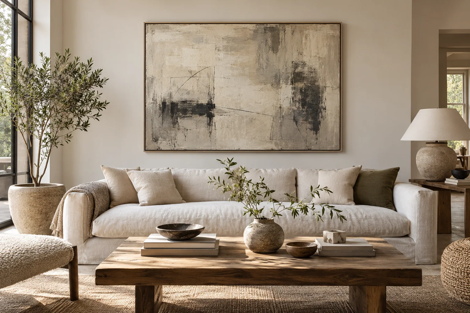
I look beyond the room scene
I use a styled interior image to judge mood and scale. I do not use it as the only color reference. A room photograph can include warm lamps, colored walls, and camera settings that change the artwork's appearance. A digitally placed painting can also look different from a photograph of the actual surface.
I ask for a straight view with even light. I compare that view with a detail and a second lighting condition when the palette is important. I look for consistent relationships between the colors rather than expecting my screen to show the exact final result. I keep the approved reference with the selected design and size.
I make samples answer one clear question
I can ask for a sample when an undertone mismatch would be difficult to accept. I state the question clearly: does this pale ground work beside the room's warm stone, or does this gray read too cool under the evening lamps? I do not expect a small sample to predict the whole composition or every lighting state.
| Image or sample I use | What I judge |
|---|---|
| Room scene | I judge placement and mood. |
| Plain front view | I judge color relationships. |
| Material sample | I judge a specific surface or undertone. |
I find marketplace phrases such as neutral, beige, and textured useful for discovery, but they are broad labels.[2] I translate them into a more specific brief. I also confirm whether a sample, new reference view, or palette change has a separate cost and approval stage.
How do I keep neutral artwork from disappearing on the wall?
I can match the wall so closely that the painting loses its presence. The room still feels empty. I add a clear boundary, contrast, or surface change.
I compare light and dark areas, edge definition, frame contrast, and surface texture. I choose one or two features that keep the painting visible without making the room busy. I do not rely on a pale color match to create a finished composition.
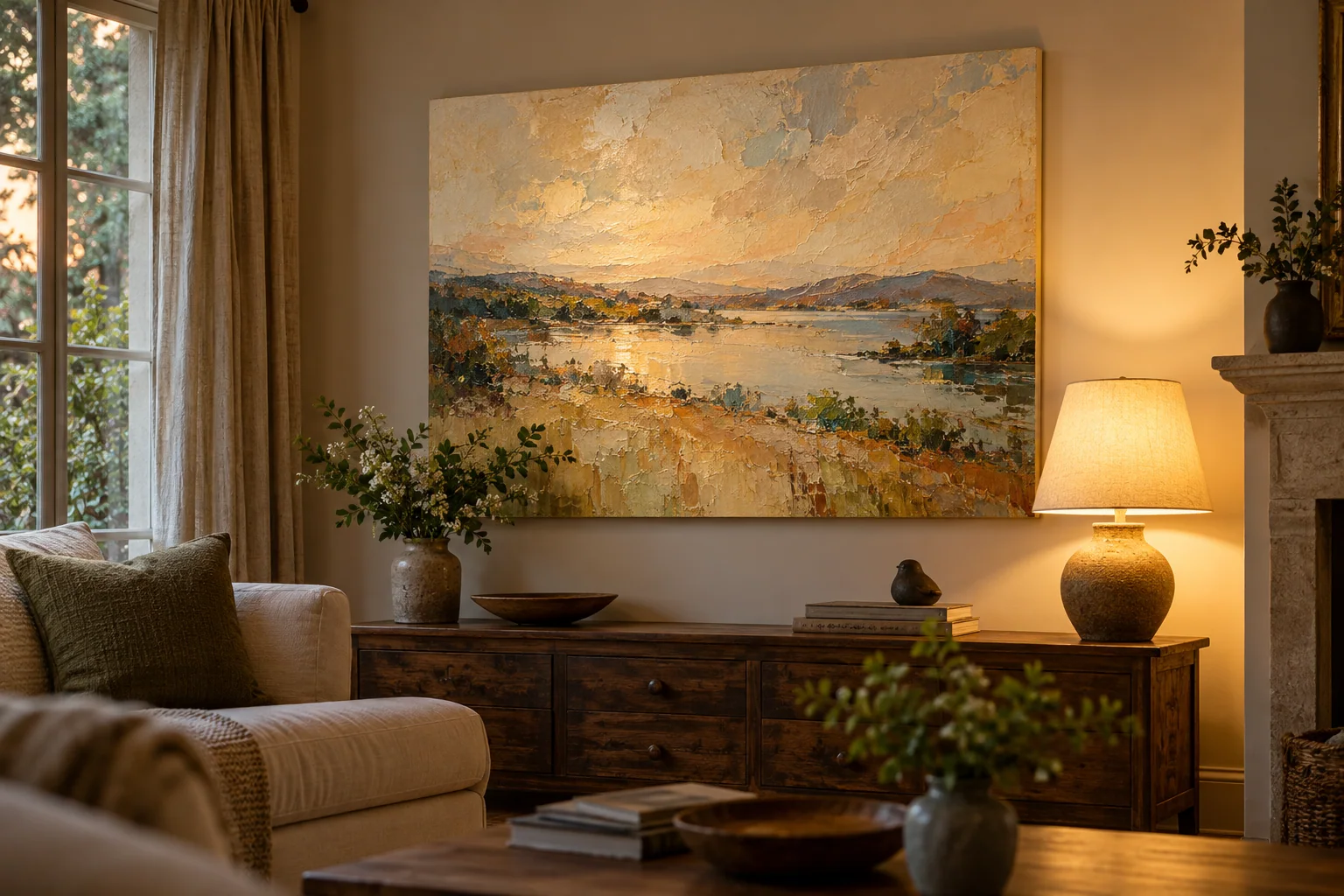
I check value before adding more color
I look at the painting's light and dark structure. I can have a restrained beige palette and still create clear movement through darker marks or a deeper edge. I view the reference from a distance and ask whether I can still see its main shape. I do not need strong contrast everywhere. I need enough structure for the work to hold its place.
I compare the image with the wall color. A pale image on a pale wall may need a visible frame or a stronger internal form. A dark edge can make the work easier to read, but it can also add too much weight in a small room. I test the complete framed outline rather than judging the canvas alone.
I use texture with the room's light
I ask whether the normal light will reveal the surface. I do not choose deep relief only because a studio detail looks dramatic. I compare the work under broad front light and light from the side. I also consider display conditions because strong sunlight is not a sensible way to keep a delicate painting visible.[3]
| Feature I test | Effect I look for |
|---|---|
| Dark marks | I look for a clear visual path. |
| Frame boundary | I look for separation from the wall. |
| Surface relief | I look for useful changing shadows. |
I can use XM's showroom to narrow the mood and proportion. I still check the chosen artwork's actual palette and finish before approval. I treat the illustrated room as a selection tool rather than a color guarantee.
How do I write a palette brief that an artist can use?
I can request a calm beige painting and leave too much open. The artist then has to guess. I name the room's finishes and the changes that matter most.
I share a room view, finish references, the desired warm or cool lean, and any colors I want to avoid. I identify the selected design and explain whether I want blending or contrast. I agree on the palette approval route before asking for changes.
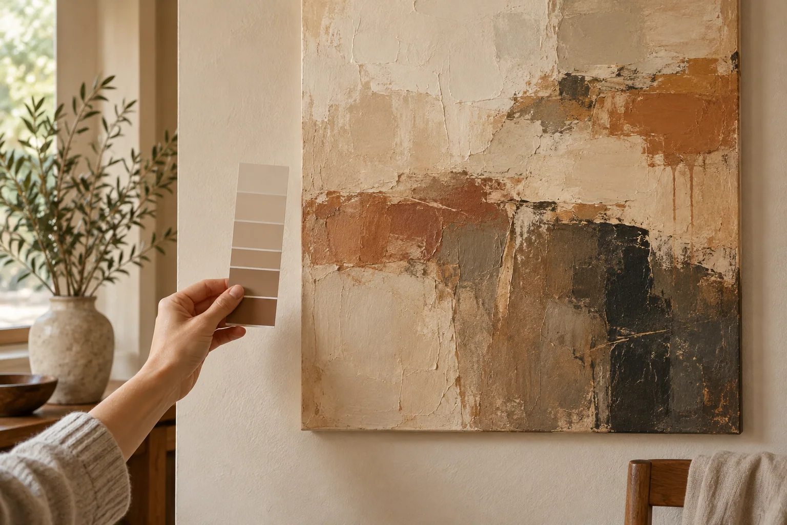
I describe priorities in plain words
I keep the brief short enough to act on. I might write that the room has warm oak, cream linen, and a gray stone table, and that I want a quiet image with a clear dark mark. I state if I want to avoid pink-looking beige or a cold blue-gray. I include a photograph that shows those materials together.
I also say which part of the reference I want to preserve. I can ask for a warmer ground without asking the artist to remove every cool accent. I do not treat customization as a simple screen-filter change. A palette shift can affect balance, texture, and the work's overall character. I ask the supplier to review that change before quoting it.
I agree on a decision point
I ask when I can review the palette and what form that review will take. I need to know whether I will see a sample, a planned reference, or progress photographs. I confirm the revision scope so I understand which changes remain possible at each stage. I keep the approved image with the final dimensions and finish.
| Brief detail I send | Why it helps |
|---|---|
| Room materials | I give the palette a real context. |
| Colors to avoid | I make the main concern clear. |
| Reference priorities | I protect the work's character. |
I judge the final proposal against those priorities rather than against every small object in the room. I give one clear round of feedback when possible. I want the artwork to belong in the space while still feeling like a work chosen for its own visual strength.
Conclusion
I choose neutral artwork by comparing undertones, contrast, and light together. I give the artist a clear room brief and approve the palette before production.