Can black and white art work in a warm neutral home?
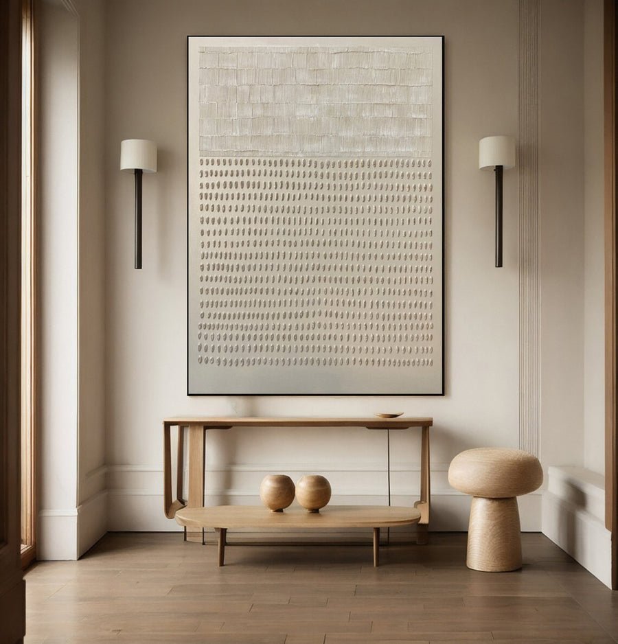
I can worry that black and white art will feel cold beside warm wood and cream fabrics. The image and frame can change that result.
I can use black and white art in a warm neutral home by controlling contrast, background tone and frame weight. I compare the complete piece with wood and fabrics. I choose a deliberate connection rather than expecting every white to match.
I treat black and white as a range of visual choices. These checks show how a sharp graphic image and a soft painted surface can behave differently in the same room.
How much black should the painting contain?
I can choose a monochrome image and find it much stronger than expected. The amount and position of black shape the whole room impression.
I compare the dark area, pale space and composition at the intended size. I test a quieter image and a stronger image from the usual viewing point. I choose the contrast that gives the room the right focus.
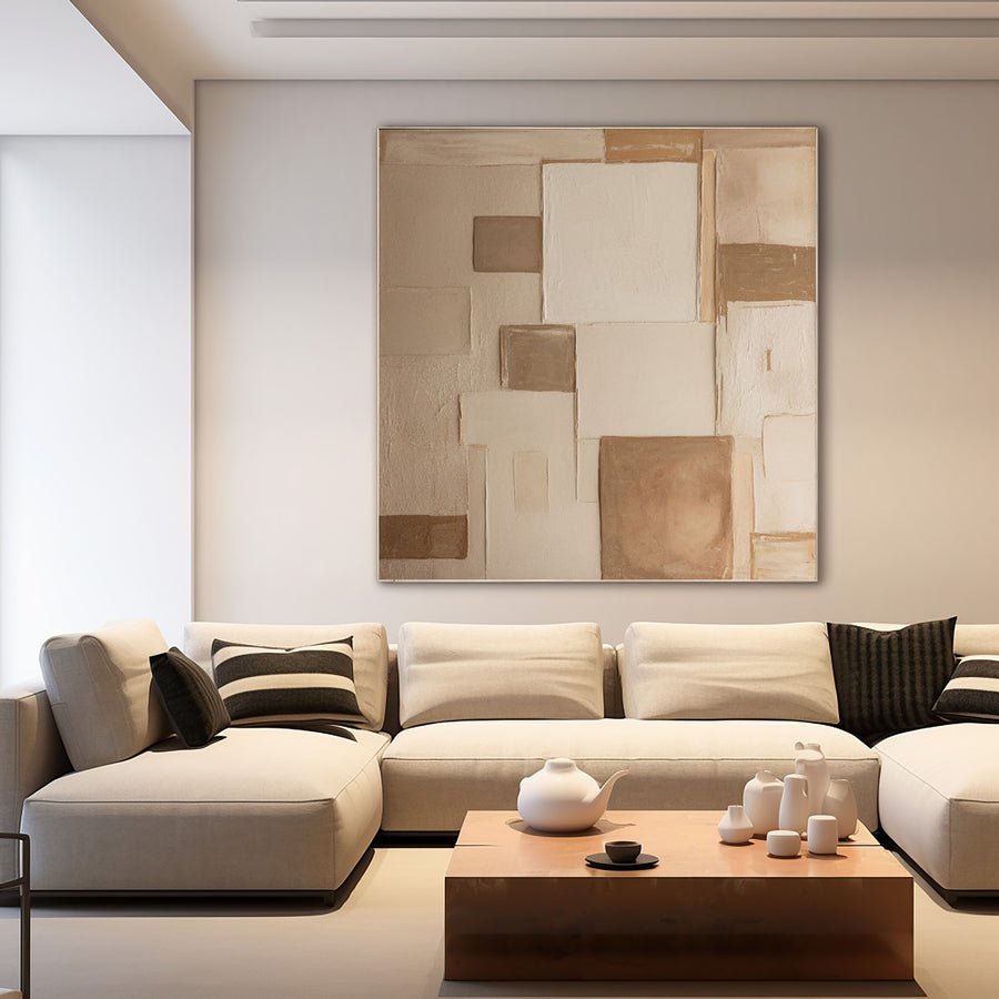
I read the dark shapes before the color label
I do not treat all black and white paintings as one decorative choice. A thin black line across a pale surface has a different visual weight from a large black block. I look at the whole composition and note where the dark shapes sit. Their position can pull attention toward one side of the wall.
I test the image at its planned size. A small online thumbnail can make a strong dark area feel modest. When the image becomes a large painting, that area may become the main feature in the room. I use a rough printed or screen mockup inside a full-size paper outline to judge this effect.
I compare the painting with existing dark details. A black window frame, a dark chair leg or a metal lamp can give the art a useful connection. I do not need to repeat every dark feature. I want the relationship to feel simple and intentional.
I also check the room from more than one position. A graphic painting may look clear from the doorway and more intense from a nearby chair. I decide which view matters most while keeping the other view comfortable for ordinary use. I do not rely on a single staged photo.
I can discuss contrast through the custom art service. I describe the desired balance of dark and pale areas rather than asking only for black and white. That makes the brief more specific.
| Decision | My check |
|---|---|
| Dark area | I compare its size and position within the image. |
| Room detail | I look for one existing dark connection. |
| Viewing distance | I judge both the doorway and a nearby seat. |
Does the artwork white need to match my wall white?
I can expect two whites to match and notice a blue or yellow difference after installation. White surfaces have their own undertones.
I compare the artwork background with the wall and nearby cream fabrics in normal lighting. I can choose a visible difference deliberately. I do not expect screen photographs or color names to guarantee an exact white match.
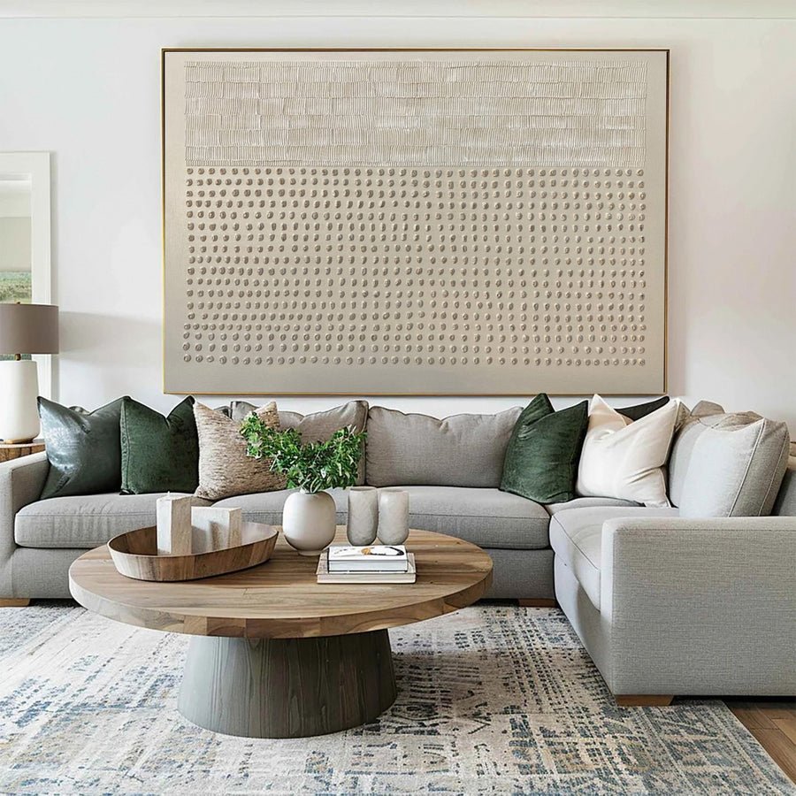
I choose the relationship between pale surfaces
I look at the wall beside the intended painting position. I compare it with a plain white reference and a nearby cream fabric. This helps me notice whether the wall feels warm, cool or muted. I do not assume that a paint called white is visually neutral in every room.
I ask for a clear photograph of the artwork background. I also ask whether the background color is part of the painting or the lighting in the image. Strong shadows and bright exposure can change how a pale surface looks online. I keep that uncertainty in mind when the artwork is mostly white.
I compare a similar warm white with a deliberate brighter white. A brighter ground may give the artwork a crisp edge against cream walls. A warm ground may blend more quietly. I do not call one option correct and the other wrong. I choose the visible relationship that suits the room.
I include the frame in this comparison. A dark border can separate two slightly different pale surfaces. A pale frame may place them closer together and make their difference easier to notice. I test the whole object rather than the painted ground alone.
I check ordinary daylight and evening lamps. I use care and display guidance when deciding where the painting can sit.[2][3] I do not solve a white mismatch by putting the painting in strong direct sun or changing its surface without appropriate advice.
| Decision | My check |
|---|---|
| Warm white | I compare it with cream walls and fabrics. |
| Bright white | I test a deliberate crisp contrast. |
| Frame boundary | I check whether the edge separates or blends pale tones. |
Which frame can connect monochrome art with warm materials?
I can add a black frame and make the painting feel harsher than the canvas alone. The border deserves its own room test.
I compare dark, pale and warm wood frames around the actual image. I choose a frame that connects with the room without overpowering the painting. I confirm proper fit and the complete outer dimensions.
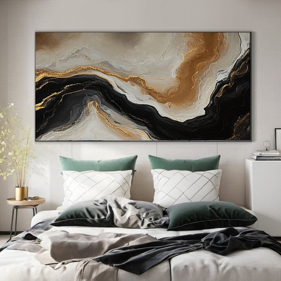
I test the frame as part of the artwork
I begin with the same artwork image in three rough frame options. I keep the image size consistent so the frame comparison remains useful. I test a narrow dark edge, a pale edge and a warm wood edge. I look at them beside the actual room furniture rather than on a blank screen.
I note what each frame adds. A dark frame may connect with metal fittings and strengthen the graphic character. A wood frame may link the painting with a table or floor. A pale frame may make the artwork feel quieter. These are possible visual effects, not promises that one finish will always work.
I compare the wood undertone if I choose that route. A honey frame beside pinkish wood can look less connected than a clear dark contrast. I do not require an exact species match, but I want the difference to be deliberate. Physical finish samples can help when they are available.
I ask about support and fit before choosing the profile. The Canadian Conservation Institute offers background on framing paintings.[1] I use it to prepare questions for a qualified framer. I do not let a decorative match replace the practical assessment of the actual artwork.
I update the paper size outline with the finished border. A broad frame can turn a modest monochrome canvas into a much stronger wall object. I want to see that full footprint before I place the order or choose the installation height.
| Decision | My check |
|---|---|
| Dark frame | I test whether it strengthens contrast too much. |
| Wood frame | I compare actual undertones with room materials. |
| Pale frame | I check the softer edge and full dimensions. |
How do I stop monochrome art from feeling isolated?
I can hang a black and white painting in a warm room and leave it with no visible connection. A small relationship can make the choice clearer.
I connect the painting with one or two existing room details, such as a dark lamp or a pale fabric. I keep the warm materials visible. I do not add a whole new set of matching accessories just to justify the artwork.
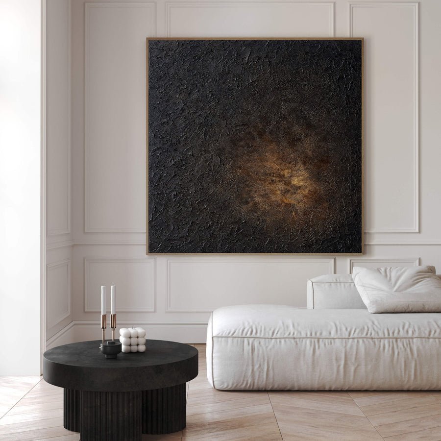
I use the room I already have
I look for existing details before buying anything else. A dark lamp, a pale cushion or a patterned rug may already connect with the painting. I choose one useful relationship and test it in the room view. I do not need to turn every surface black and white.
I keep the warm wood and cream fabrics in the scene. They are part of why I chose the room. The painting can provide a different kind of focus while those materials keep their role. I avoid removing the warmth simply because the artwork introduces a sharper graphic edge.
I check the area immediately below the painting. A console with many unrelated objects can make the artwork feel detached. I may simplify that surface during the paper trial, but I include the practical objects that will return. I want a layout that works during normal use rather than only in a photograph.
I compare the artwork with the room from the entrance. I ask whether the dark shapes now connect with something else or remain a single heavy patch. If the patch feels too strong, I consider a different composition or size rather than buying several black accessories to balance it.
I browse the collections for a monochrome piece only after these checks. I compare the actual dark-to-pale balance and surface character. A listing category tells me where to look, but the individual image tells me whether it belongs in the room.
| Decision | My check |
|---|---|
| Existing detail | I find a connection before buying accessories. |
| Warm materials | I keep their visible role in the arrangement. |
| Final room view | I check whether the painting feels connected or isolated. |
Conclusion
I can use black and white art in a warm home when I test contrast, pale undertones and the frame. I keep the room connection deliberate and simple.