How do I choose a painting for a cool gray room?
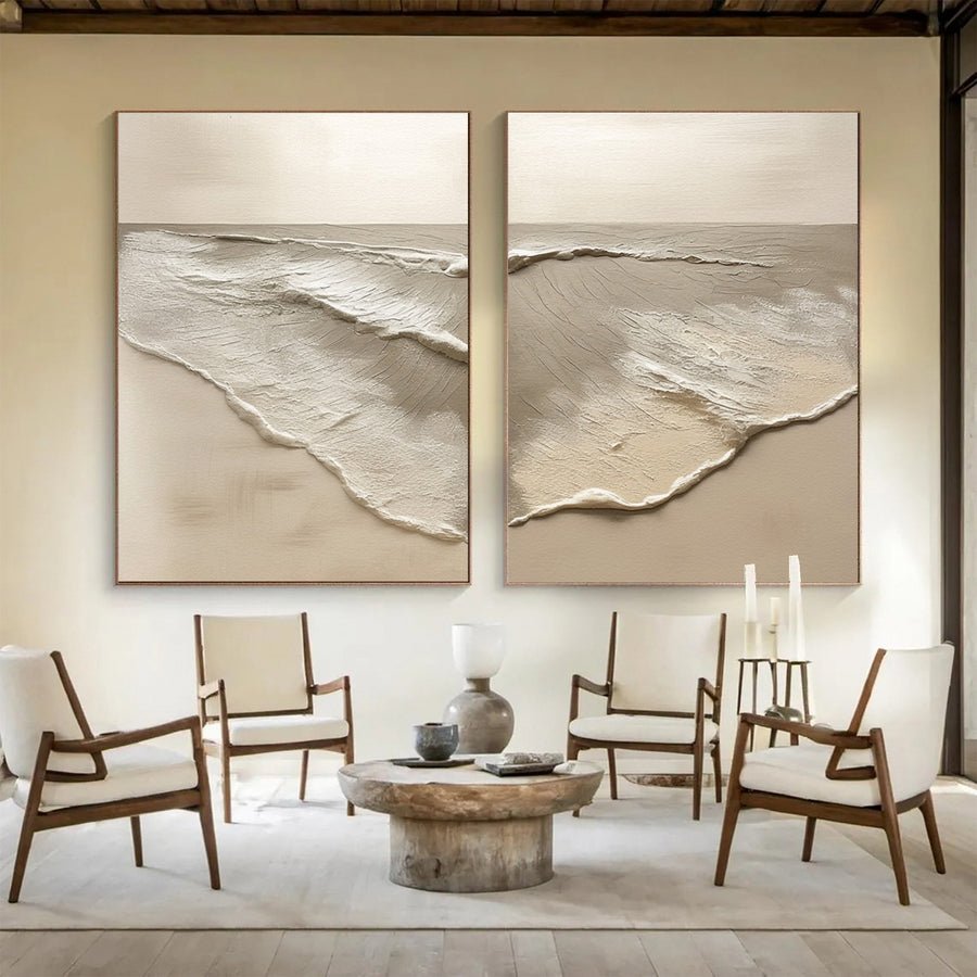
I can add another gray painting to a gray room and still feel that something is missing. The room may need contrast rather than more matching.
I choose art for a cool gray room by checking undertones, light and existing furniture. I compare warm accents, clear dark shapes and varied pale tones. I use the painting to add a useful relationship instead of matching gray exactly.
I start by asking what the room lacks. These checks help me decide whether the artwork should add warmth, focus or a softer surface.
Is my gray room actually cool in every light?
I can label a wall cool gray from its paint name and miss its blue, green or violet cast. The visible room gives me better evidence.
I compare the gray wall with a plain white reference in daylight and evening light. I note visible blue, green or violet shifts. I include the floor and furniture because they change how I read the wall.
I check the gray in context
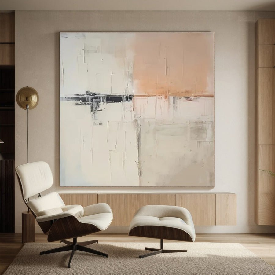
I begin with the wall that will hold the painting. I compare it with a plain white sheet and the nearest permanent furniture. I write a simple description of the visible color. I may see blue-gray in daylight or a softer gray under warm lamps. I do not assume that a paint label describes every lighting condition.
I photograph the wall without a strong filter. I include the floor and any sofa or cabinet below it. These surfaces can make the gray look different by comparison. A warm oak floor and a blue sofa create a different setting from gray stone and white furniture, even when the wall paint is identical.
I repeat the check at the time I use the room most. If I mainly relax there in the evening, the evening scene deserves a place in the decision. I still look at daylight so the painting does not feel unexpectedly different during the day.
I view candidate artwork images on the same device. This does not remove color uncertainty, but it avoids comparing one bright phone image with another dim laptop image. I ask for additional photographs when a subtle neutral is important to the choice.
I can share these observations through the custom art service. I describe the undertone in everyday language and include room references. I do not ask the supplier to make an exact physical match from an uncalibrated photograph alone.
| Decision | My check |
|---|---|
| Wall reference | I compare gray beside a plain white sheet. |
| Room context | I include the floor and main furniture. |
| Useful time | I check the light in which I use the room. |
Should I add warm color to a cool gray room?
I can hear that gray needs warmth and add orange too quickly. A strong warm accent may become louder than the room needs.
I test a small amount of warm color before choosing a whole warm painting. I compare its strength with existing wood, fabrics and metal finishes. I keep warmth as a considered option rather than an automatic cure.
I choose the amount of warmth
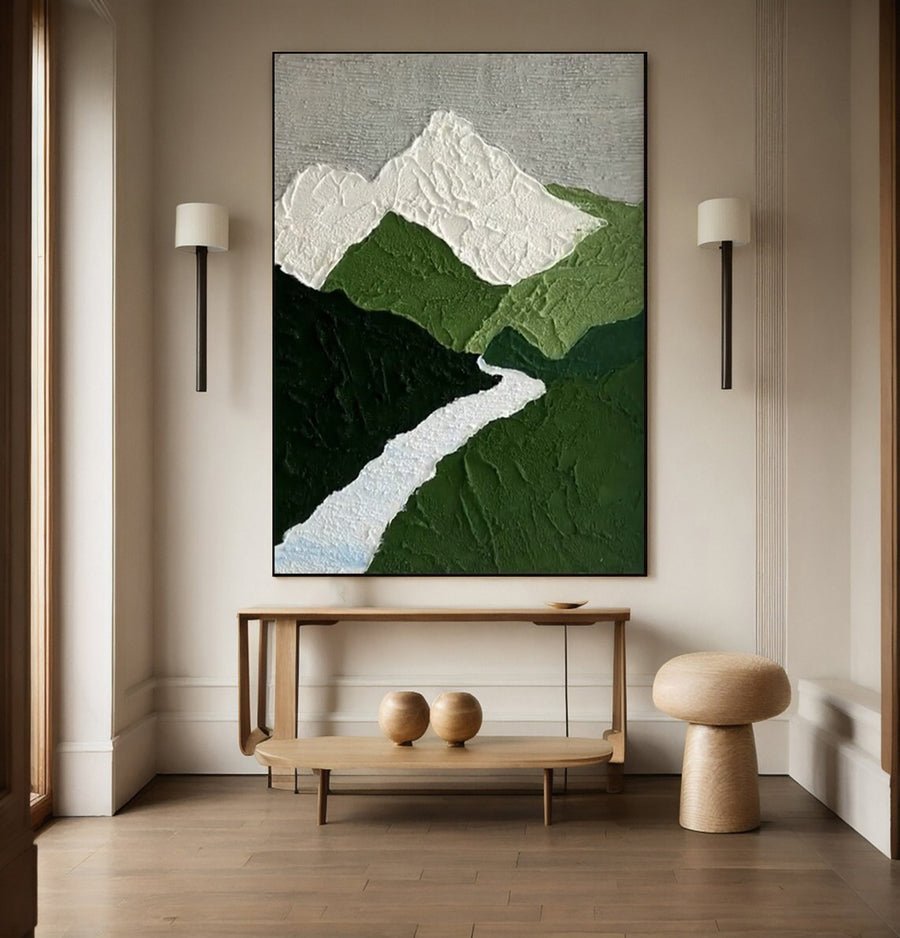
I look for warm elements that already exist. The room may contain a tan chair, a wood table or a brass lamp. If these provide enough warmth, I can let the painting connect with them quietly. I do not need to add a large orange field just because the wall is gray.
I compare a mostly neutral painting with a small warm accent against one with a broad warm area. I test them at the same size. This helps me see whether the difference comes from color quantity rather than shape. I notice which option becomes the first thing I see from the doorway.
I use everyday color descriptions in the shortlist. Muted rust, soft peach and warm brown are more useful than saying warm without further detail. I also check whether the color is light or dark. A deep warm brown can feel calm while a bright peach area may feel more active.
I consider the purpose of the room. I may want a calm reading corner or a lively social space. I do not make claims that a particular painting color will improve mood or health. I describe the visual effect I prefer and let the household decide what feels comfortable.
I browse the collections after I choose the level of warmth. I compare the artwork with the whole room rather than collecting every listing that includes a warm color word. I keep the image composition in the decision as well.
| Decision | My check |
|---|---|
| Existing warmth | I look at wood, fabrics and metal first. |
| Small accent | I test a limited warm area within a neutral design. |
| Broad warmth | I check whether it becomes the desired focus. |
How can contrast help without making the room harsh?
I can add black to a pale gray room and make the wall feel abrupt. Contrast needs a clear role and a sensible amount.
I compare dark and light areas within the artwork rather than choosing by color name alone. I test the full framed image from the doorway and main seat. I repeat a room detail when that makes the contrast feel connected.
I measure visual strength through a room trial
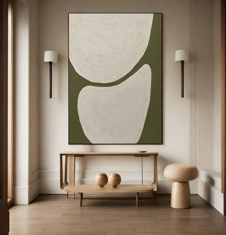
I look at how much of the painting is dark. A thin black line on a pale ground and a broad dark block create very different effects. I compare the full compositions at their intended size. A small thumbnail can hide how strong a dark area will become on the wall.
I mark the artwork outline with paper and place a rough image inside it. I stand in the doorway and sit in the main chair. I ask whether the dark area gives the room a useful center or makes the surrounding pale furniture seem disconnected. I write that observation rather than applying a universal contrast rule.
I check existing dark details. Window frames, chair legs and a television may already create strong edges. A painting can relate to one of those features without repeating all of them. I avoid adding a heavy frame merely to match an object on the other side of the room.
I test softer dark colors too. Deep blue, charcoal and brown can create a clear focus without looking identical to black. The right choice depends on the gray undertone and the other surfaces. I do not call one option universally more sophisticated.
I also consider framing. A dark border may strengthen an otherwise quiet image. I confirm its finished dimensions and suitable fit.[3] The frame belongs in the visual test because it changes both the contrast and the wall footprint.
| Decision | My check |
|---|---|
| Dark area | I compare its amount and position within the image. |
| Room detail | I look for one useful existing connection. |
| Frame edge | I test the complete contrast, including the border. |
Can texture make a gray room feel more varied?
I can add a textured painting and expect instant depth, then barely see the surface under flat room light. Texture needs a practical viewing check.
I compare texture in straight-on and angled views under ordinary lighting. I ask about the actual materials and depth. I choose a surface I can display and care for appropriately, rather than relying on dramatic listing shadows.
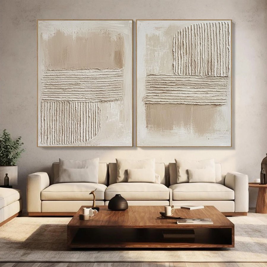
I look beyond a texture label
I ask what the listing means by texture. It may refer to visible brushwork, raised paint, another added material or simply a patterned image. I want a clear description before I compare artworks. I do not assume that a textured appearance proves a particular material or method.
I request a close view and a side view. The close view helps me inspect the surface character. The side view helps me understand how far it projects. I also ask for a straight-on photograph under less dramatic light. Strong side lighting can make small ridges look much deeper than they appear in the room.
I test the proposed position with the normal room lamps. A textured painting near a broad soft light source may look quieter than the listing image. That can suit a cool gray room if I want subtle variation. I do not add a harsh spotlight only to reproduce a marketing photograph.
I check basic care and display guidance before deciding on the location.[1][2] Raised surfaces can collect dust and may be vulnerable to contact, but care depends on the actual work. I do not prescribe a brush, cloth or cleaner without knowing the materials and condition.
I keep texture as one choice among several. A flatter painting with varied marks can also add interest. I choose the visible effect and practical fit together so the gray room gains variety without creating an unnecessary handling problem.
| Decision | My check |
|---|---|
| Material description | I ask what creates the visible texture. |
| Lighting view | I compare dramatic and ordinary photographs. |
| Care needs | I seek advice for the actual surface, not a general label. |
Conclusion
I choose gray-room art by checking undertones and the missing visual role. I test warmth, contrast and texture in the actual room before deciding.