How do I choose wall art for warm oak interiors?
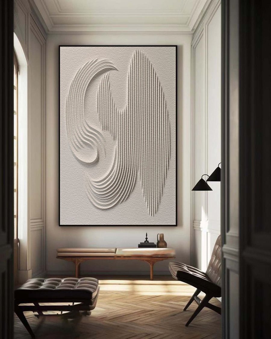
I can choose beige art for an oak room and find that the whole space turns yellow. Similar color names do not mean matching undertones.
I choose art for warm oak by checking the actual wood undertone, room lighting and desired contrast. I compare pale neutrals, cooler accents and darker shapes beside the wood. I do not try to match every brown surface.
I use the oak as a starting point rather than a strict color instruction. These checks help me find a painting that adds depth without making the room feel heavy.
What kind of warmth does my oak actually have?
I can call all oak warm and miss the difference between honey, pink and muted brown tones. The real wood needs a closer comparison.
I compare the oak with a plain white reference in daylight and normal evening light. I note whether it leans yellow, orange, pink or muted brown. I base the palette on that observation, not on the wood name alone.
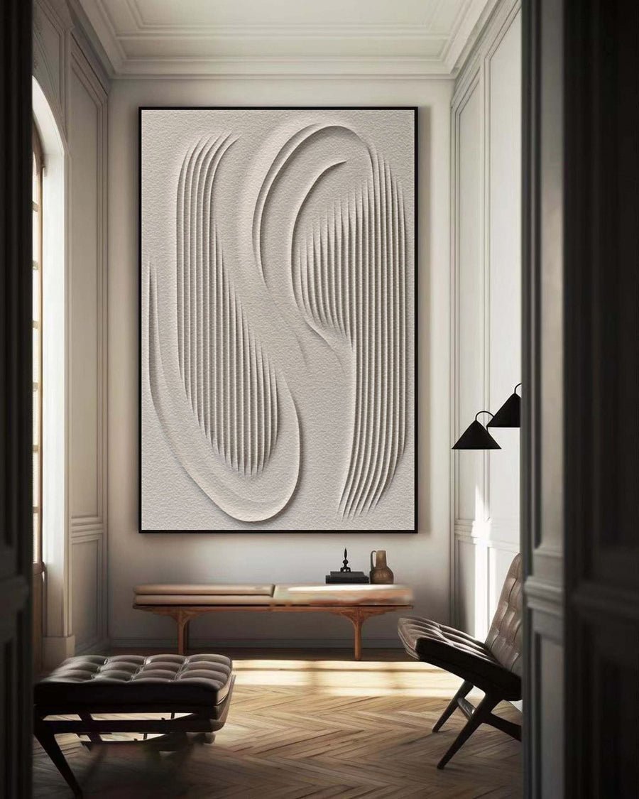
I observe the actual surface
I look at the oak that covers the largest visible area. That might be a floor, cabinet or dining table. I do not use a small decorative object as the only reference when the room contains a much stronger wood tone. I also note whether the finish is light, dark, glossy or matte.
I place a plain white sheet near the wood and take a photograph in ordinary daylight. I avoid direct sunlight for this color comparison. The white reference helps me describe what I see, but it does not turn my phone into a calibrated measuring tool. I write everyday words such as honey, pinkish or muted brown.
I repeat the observation under the room lights. Warm bulbs can make both the wood and a neutral artwork look more yellow. I do not interpret that change as proof that the painting has the wrong pigment. The room lighting is part of the visible result.
I compare the wall beside the oak. A creamy wall and a honey floor can create a different base from a cool white wall and the same floor. I want the painting to work with that combination. I do not choose it from the wood alone.
I share these room photographs through the custom art service if I need palette guidance. I state that photographs are approximate references. I also ask for clear artwork images rather than expecting an exact color match from a single screen view.
| Decision | My check |
|---|---|
| Main wood area | I start with the largest permanent oak surface. |
| Daylight check | I describe its visible undertone beside white. |
| Evening check | I notice how the room lamps alter the balance. |
Should the painting repeat the oak color or contrast with it?
I can repeat warm brown everywhere and make the room feel flat. A useful painting can connect with the wood without copying it.
I choose whether the painting should blend or create a focus. I repeat some warm tones for continuity and test a cooler or darker area for contrast. I keep the contrast level appropriate to the room.
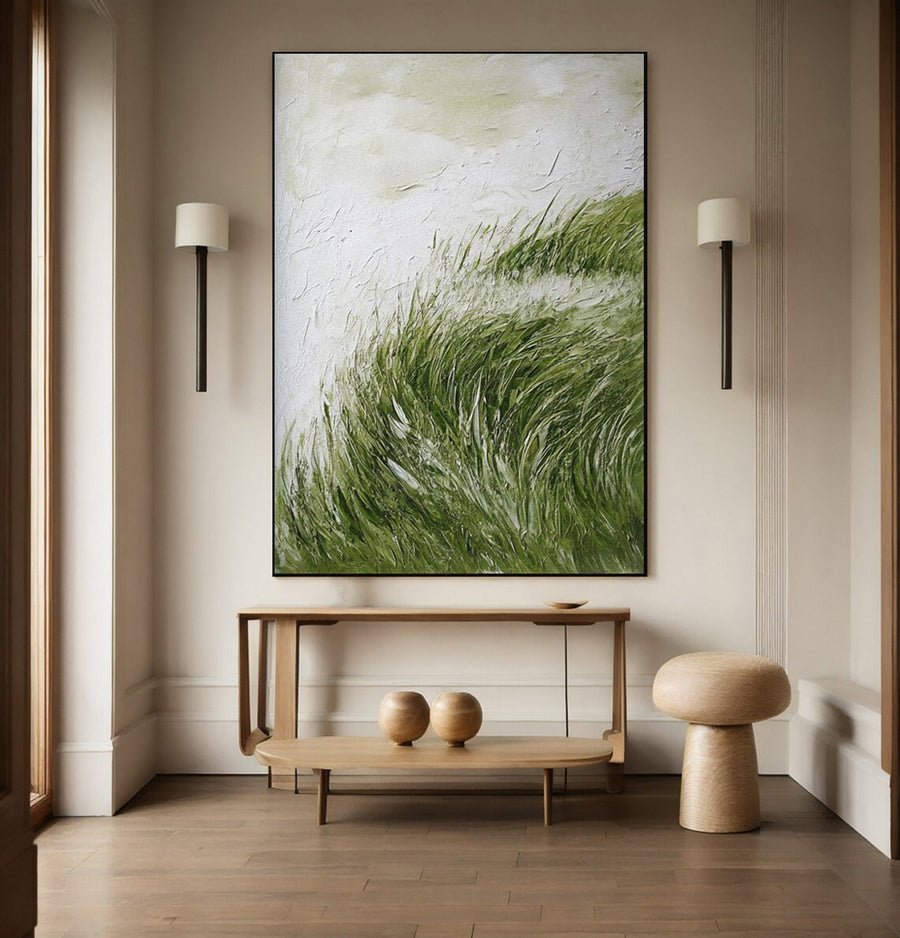
I decide what the artwork should add
I write down what the room already has. If the floor, table and shelving all carry warm oak, I may not need another large brown field. I might want a pale painting with a small dark shape or a muted blue area. This is a design choice, not a rule against warm art.
I compare a blending option with a contrasting option at the same approximate size. I look at both above the actual furniture. A warm neutral painting may make a quiet bedroom feel settled. A cooler painting may give a wood-heavy living room a clearer focal point. I choose based on the role I want it to play.
I check the darkest parts of the painting. A small deep brown area can connect with wood grain while a broad black area creates a stronger statement. I look at the complete composition instead of choosing from one attractive color swatch. The placement of color matters as much as the list of colors.
I also notice existing cool surfaces. A gray stone counter or blue chair may already provide contrast. I can let the artwork relate to that feature rather than introducing another unrelated color. I keep the room relationships simple enough to explain in one sentence.
I browse the collections using words that describe the actual palette. I do not treat beige, earth tone or neutral as guarantees that a painting will suit oak. I check the images and request more information when the tone is unclear.
| Decision | My check |
|---|---|
| Blend | I test warm continuity without repeating every brown. |
| Contrast | I compare a cooler or darker focal area. |
| Existing accent | I look for a useful connection with furniture or stone. |
Which frame finish works beside warm oak?
I can order an oak-colored frame and discover that it clashes with the oak furniture. Two similar woods can expose their differences.
I compare the frame with the actual oak and artwork together. I test a clear contrast or a deliberate wood relationship. I confirm the full framed dimensions and suitable support before selecting the finish.
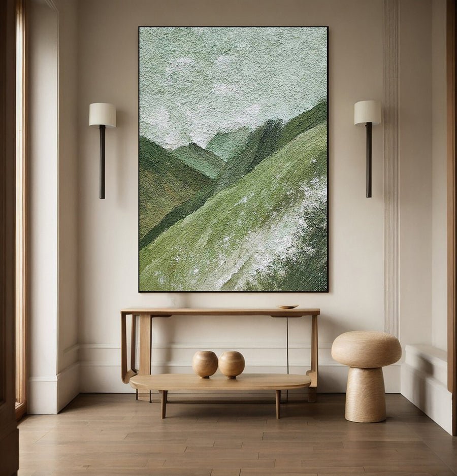
I make the frame a deliberate edge
I do not require the frame to be the same wood as the furniture. A close match can work, but a slightly different orange or pink tone may stand out more than I expect. I compare physical samples when available. If I only have photographs, I keep that uncertainty visible in the decision.
I test a dark frame as a clear edge. It may connect with metal fittings or dark furniture details. I also test a pale frame when I want the artwork to feel quieter. I judge each finish around the actual image rather than as an isolated strip of material.
I compare frame width and depth. A broad wood frame can become a major part of the wall arrangement. A narrow frame may only add a thin boundary. The color relationship can change with that scale. I use a mockup that shows the complete border rather than a tiny finish sample alone.
I ask about the frame construction and fit. The Canadian Conservation Institute discusses framing considerations for paintings.[3] I use that guidance to prepare questions about support and contact. I do not select a decorative profile that leaves those practical details unresolved.
I update the size template after the frame is chosen. The outer dimensions may change the gaps beside the oak cabinet or shelf. I want the finished arrangement to work, not only the bare canvas that appeared in the first shortlist.
| Decision | My check |
|---|---|
| Similar wood | I check whether undertones really relate. |
| Dark edge | I test a deliberate contrast with room details. |
| Finished size | I update the wall outline with the chosen border. |
How do I judge the palette under changing room light?
I can approve a painting during one bright afternoon and see a different balance every evening. Warm oak makes those changes easy to notice.
I compare the proposed artwork in ordinary daylight and the room lights I normally use. I ask how supplier photographs were lit. I keep the painting away from unsuitable light and heat rather than using exposure to change its appearance.
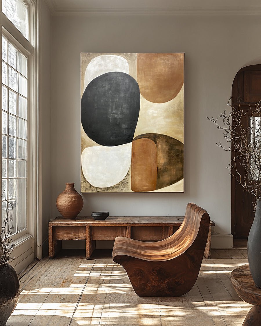
I separate appearance tests from care decisions
I take room photographs at two useful times. I do not need a dramatic sunrise or a special lighting setup. I want the daylight scene I normally see and the evening scene I live with. I include the oak, wall and main furniture in both pictures.
I view the artwork reference on the same screen for the comparison. I keep brightness reasonably consistent and avoid treating an edited listing photo as a perfect physical sample. If the color relationship is critical, I ask about available samples or clearer neutral-light photographs. I do not claim that a screen preview can settle every color question.
I pay attention to texture shadows. A warm pale painting may look brown in a strong side-lit image because the raised surface creates dark areas. I request a straight-on view as well. This helps me separate the painted palette from the shadows in one photograph.
I check the proposed location against basic care and display guidance.[1][2] I do not place the painting in direct sun just because the brighter light makes it match the oak better. I also avoid using a nearby heater as an incidental lighting or display solution.
I write down the palette choice in plain terms. I might choose pale cream with muted blue and a small dark edge. That description gives the order discussion a clearer basis than saying that I want something warm but not too warm.
| Decision | My check |
|---|---|
| Normal daylight | I compare the wall, oak and reference together. |
| Evening lamps | I inspect the warmer scene I actually use. |
| Care check | I avoid solving color concerns with unsuitable exposure. |
Conclusion
I choose oak-room art by observing the real wood, deciding on contrast and testing the frame and lighting. I use color names as clues, not promises.