How do I choose between blue and green wall art?
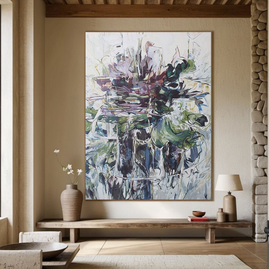
I can love blue and green paintings equally and still struggle to choose one for my room. The useful choice depends on the surrounding colors.
I choose between blue and green by comparing the room undertones, existing accents and normal lighting. I test both at the same size and position. I judge the complete palette rather than relying on color names or promised emotional effects.
I use the room to narrow the choice. These checks help me see whether blue or green adds the clearer relationship without making the whole space match.
What colors in the room should guide my choice?
I can choose art from my favorite color and discover that it competes with permanent furniture. The room needs a place in the decision.
I start with the largest fixed surfaces and the main furniture. I note their undertones and existing accents. I choose a painting that connects with one useful feature rather than repeating every color.
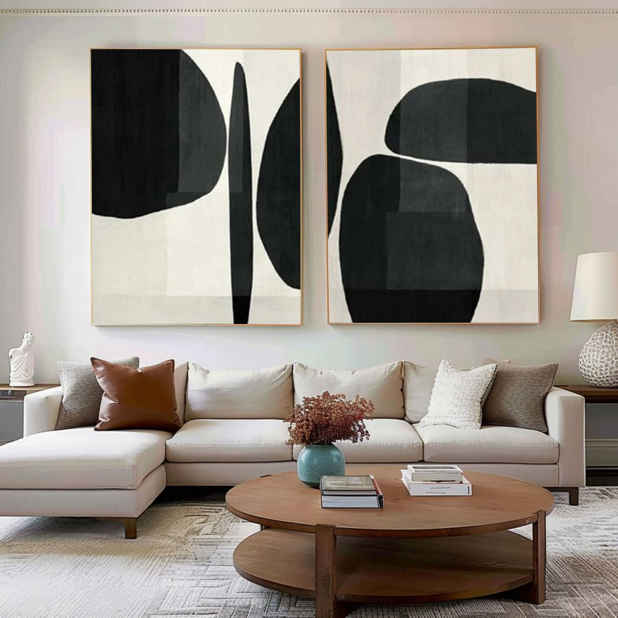
I list the colors that will stay
I begin with the floor, wall and largest upholstered piece. I write down their visible colors in plain language. A creamy wall, warm oak floor and gray sofa give me different clues from a white wall, dark floor and blue chair. I use the actual surfaces instead of a generic room style label.
I identify the accents that already carry blue or green. A green plant is not the same kind of reference as a large green sofa. One changes position and the other anchors the room. I decide which features should matter in the artwork choice and which are incidental.
I compare blue and green options that have similar size and visual weight. A pale blue painting and a deep green painting would test both color and darkness at once. I first choose a fairer pair so I can see what the color family changes. I can compare stronger options afterward.
I also check undertones within each family. Blue can lean gray or violet. Green can lean yellow or blue. I do not assume that every blue painting suits a cool room or every green painting suits wood. The particular image matters.
I can send the room palette through the custom art service. I describe the permanent features and the feeling of contrast I want. I keep photographs as approximate references rather than demanding an exact screen-based match.
| Decision | My check |
|---|---|
| Fixed surfaces | I start with floor, wall and main furniture. |
| Existing accent | I distinguish a major feature from a movable object. |
| Fair comparison | I compare similar size and darkness first. |
How do I choose between muted and bright shades?
I can select the right color family and still buy a painting that feels too loud. Color strength changes the room as much as hue.
I compare the strength and area of the color within the painting. I test a muted option and a brighter option from the usual viewing point. I choose the intensity that supports the role I want the artwork to play.
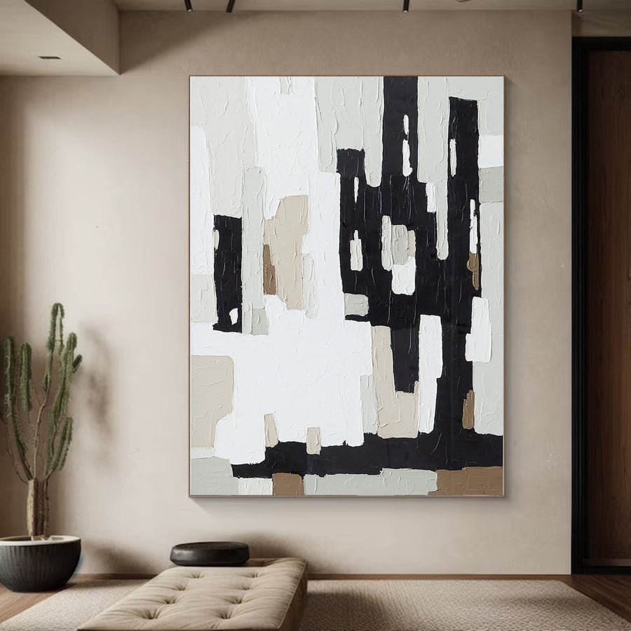
I decide how strongly the color should speak
I look at the whole image rather than one attractive patch. A small bright blue mark on a quiet ground can feel different from a canvas filled with bright blue. I note how much colored area each painting contains. This helps me explain why two works in the same family can have different visual weight.
I test a muted option when the room already has busy patterns or several strong accents. I test a brighter option when I want the painting to become a clear focus. I do not treat muted color as inherently tasteful or bright color as inherently difficult. I choose the job before judging the style.
I compare the artwork from the doorway and the main seat. A color that feels lively at close range may read as a calm block from across the room. A very pale muted shade may disappear against a similar wall. I use the actual viewing distance to judge this difference.
I check the dark and light shapes within the design. A muted green painting with a large black area can still feel strong. A bright blue painting with plenty of pale space may feel lighter. I keep color strength and contrast as separate observations.
I browse the collections with a short description such as muted blue with pale space or green with a small bright accent. That description makes a useful shortlist. I do not rely only on broad listing words such as ocean or botanical.
| Decision | My check |
|---|---|
| Color area | I compare a small accent with a broad field. |
| Intensity | I test muted and bright options at full size. |
| Contrast | I inspect dark and pale shapes separately from hue. |
How will daylight and lamps affect blue or green art?
I can approve green art in daylight and see it shift under warm lamps. A single listing photograph cannot show every room condition.
I compare both colors in ordinary daylight and the room lighting I normally use. I ask how artwork photographs were lit. I treat images as references and check display conditions before choosing the wall.
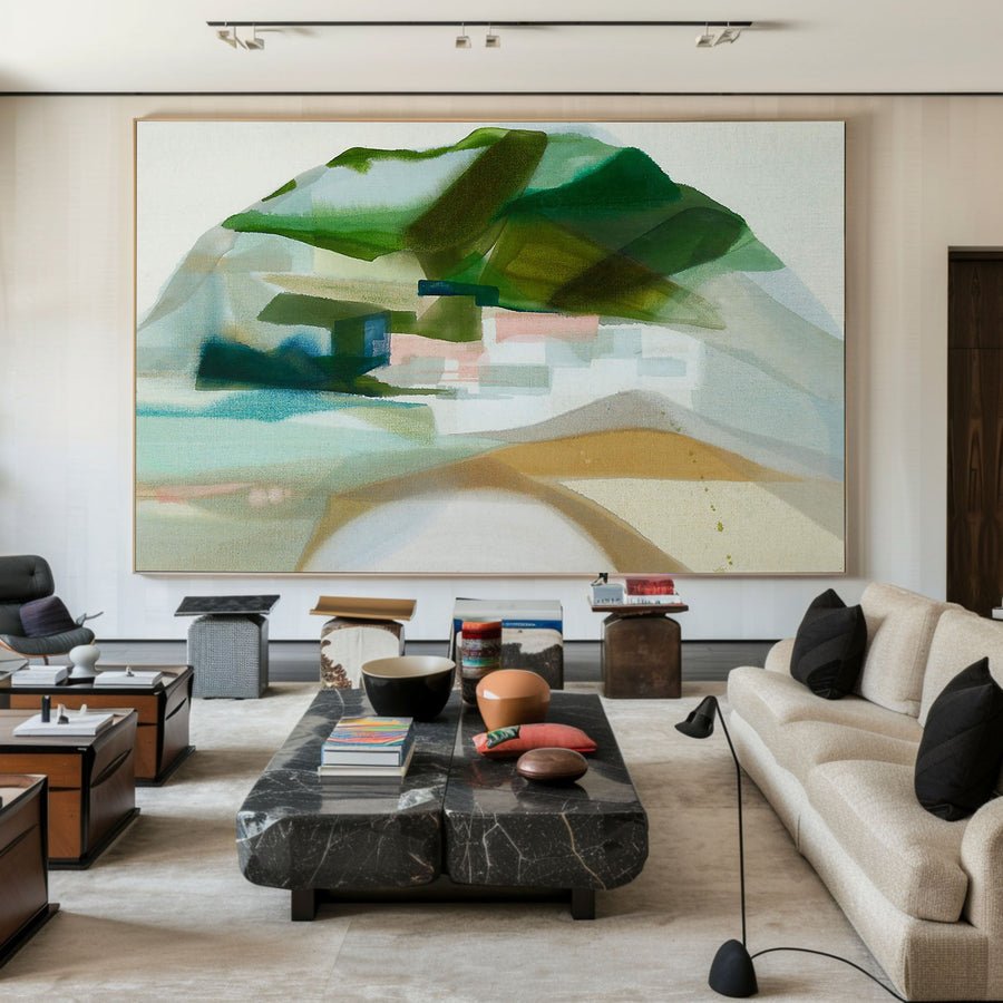
I use two normal lighting scenes
I take a room photograph during useful daylight and another with the normal evening lamps. I include the wall and furniture in both. I avoid a special bright light that I do not use in daily life. The artwork needs to work in the room as it exists.
I view the two candidate images on the same screen. I keep the display setting reasonably consistent. I know that the screen cannot show the final physical color exactly. I use this comparison to identify obvious relationships and questions, not to remove every uncertainty.
I ask for additional artwork photographs if the choice depends on a subtle shade. A neutral straight-on view can be more useful than a styled room shot with strong colored lighting. A close surface view can also show whether shadows are changing the apparent tone. I ask what lighting was used rather than guessing.
I do not move a painting into direct sun to make a blue or green look brighter. Care and display guidance help me assess light and environmental concerns.[1][2] I use them as background for the specific work and location, not as universal exposure limits that I have measured in the room.
I record which lighting scene matters most to me. If the room is mainly used at night, the lamp-lit comparison gets particular attention. I still check daylight so the painting does not feel unrelated to the room during the day.
| Decision | My check |
|---|---|
| Day scene | I use ordinary daylight rather than a dramatic sun patch. |
| Night scene | I use the lamps that normally light the room. |
| Supplier image | I ask for a neutral view when undertones matter. |
Can I combine blue and green in the same painting?
I can think the choice must be either blue or green and miss a mixed palette that fits better. The balance of colors matters.
I can choose a mixed blue-green palette when it has a clear dominant color and a useful link to the room. I compare the color proportions, contrast and frame. I avoid adding unrelated accents only to match every object.
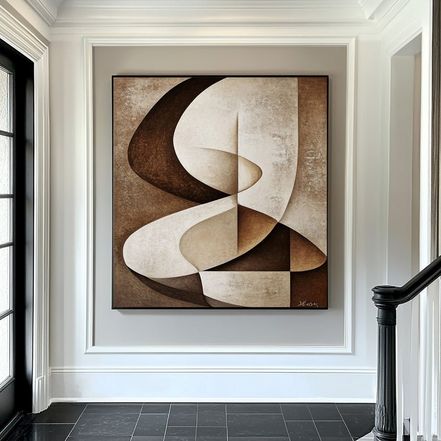
I choose a dominant relationship
I look for the color that occupies the largest area or draws the first attention. A painting can include both blue and green without giving them equal roles. I describe the palette as mostly blue with a green accent or mostly green with cool blue passages. That helps me discuss the image more clearly.
I compare the mixed painting with the room features I listed earlier. I want one clear connection, such as a muted green area relating to a chair while pale blue gives contrast to warm wood. I do not need the painting to contain every color in the room. Too many deliberate matches can make the brief less clear.
I inspect the transitions between colors. A broad calm blend and a sharp divided pattern create different effects. I choose based on the focus I want. I do not make claims that a blue-green palette automatically creates calm or improves wellbeing. I speak about visual relationships that I can actually compare.
I include the frame in the trial. A dark frame may make the mixed palette feel more contained. A pale frame may soften the edge against the wall. I confirm suitable framing and complete outer measurements before I decide.[3]
I test the final candidate at the intended size with a paper outline. The color balance can feel different when enlarged. I keep the preview as a composition guide and ask for clear artwork information before ordering.
| Decision | My check |
|---|---|
| Dominant color | I identify which family leads the image. |
| Room connection | I choose one useful relationship rather than many matches. |
| Finished frame | I test its effect on the full palette. |
Conclusion
I choose blue or green through room context, color strength and normal lighting. I test the full palette and frame rather than deciding from a color name.