How do I add colorful art to a neutral room without losing balance?
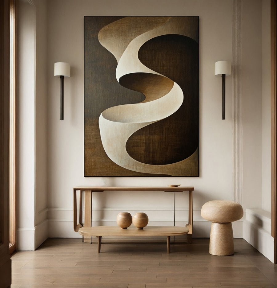
I can love a colorful painting and fear that it will overwhelm my neutral room. Adding color needs a clear role, not a whole-room makeover.
I add colorful art by choosing a dominant palette, testing its visual weight and connecting it with a few existing room details. I keep most neutral surfaces in place. I judge the full framed image at its intended size before buying.
I start with the painting as one focused change. These checks help me decide how much color the room needs and where that color can sit clearly.
How much color does my neutral room need?
I can choose the brightest painting because the room feels plain and then create too much competition. The amount of color needs a deliberate test.
I compare a small colorful accent, a mixed neutral palette and a broad colorful field at similar sizes. I choose the level that creates the focus I want. I keep color quantity separate from artwork size.
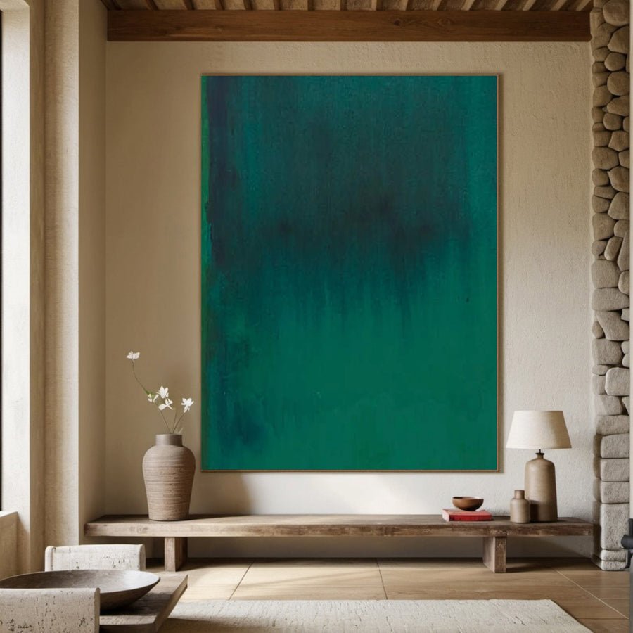
I compare the colored area rather than one swatch
I first describe the room as it is. A neutral room can still contain strong texture, busy wood grain and several dark objects. I do not assume that a lack of bright color means a lack of visual activity. The painting may need to add a clear focus rather than simply add more information.
I compare three kinds of image. One may use a small bright mark on a pale ground. Another may mix neutral and colored areas. A third may fill most of the canvas with color. I keep their planned sizes similar for the first test so I can judge color quantity more fairly.
I put each reference inside the same paper outline on the wall. I look from the doorway and the main seat. I ask which option gives the room a useful center without making the furniture feel incidental. I do not use a rule that every neutral room needs a fixed percentage of accent color.
I also check darkness and pattern. A muted colorful painting with dense dark marks can feel stronger than a bright image with broad pale space. I keep those observations separate so the shortlist does not reduce every decision to bright versus muted.
I can discuss the desired role through the custom art service. I explain whether I want a small accent or a main colorful focus. That is more useful than asking for a colorful painting without describing the room.
| Decision | My check |
|---|---|
| Small accent | I test color within a mostly pale composition. |
| Mixed palette | I compare colored and neutral areas together. |
| Broad field | I check whether color becomes the desired main focus. |
Should I repeat the painting colors in accessories?
I can buy matching cushions and vases before the painting arrives and make the room feel over-coordinated. A connection does not require repetition everywhere.
I look for existing details that already relate to the painting. I repeat a color only when it helps the room feel connected. I avoid buying a full set of accessories just to make the artwork belong.
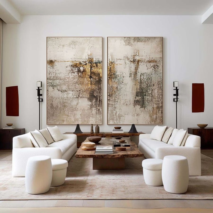
I begin with the useful things already in the room
I list the colors that appear in existing objects. A book cover, a chair fabric or a plant may already provide a small link. I do not need the connection to use exactly the same shade. I want the painting to feel part of the room without making every object look selected from one palette card.
I keep the practical objects visible during the mockup. A lamp, a tray and a frequently used blanket have real roles. I do not remove them only to make the image look tidy. The artwork has to work with ordinary use rather than with an empty styled scene.
I test one small repeated color if the painting feels isolated. I may use an object I already own. I compare the room before and after adding it. If the arrangement becomes busier without becoming clearer, I remove that addition. I do not treat more matching as automatic improvement.
I keep the neutral surfaces as part of the design. The sofa, wall and curtains can give a colorful painting room to stand out. I avoid changing those large surfaces too quickly. The single artwork may already provide the difference I wanted.
I browse the collections for a painting with a useful existing connection rather than a perfect accessory match. I choose the composition I want to live with. I can adjust small objects later, but I do not let a cushion dictate the entire artwork choice.
| Decision | My check |
|---|---|
| Existing link | I look at useful objects already in the room. |
| New repetition | I test one small change before buying more. |
| Neutral base | I keep large quiet surfaces in their role. |
How do size and framing change the color impact?
I can approve a colorful thumbnail and overlook how large it will become on the wall. Scale and frame weight change the result.
I test the full framed size with a paper outline and a rough image reference. I compare the artwork from the normal viewing points. I include frame color, width and depth because they affect both visual weight and footprint.
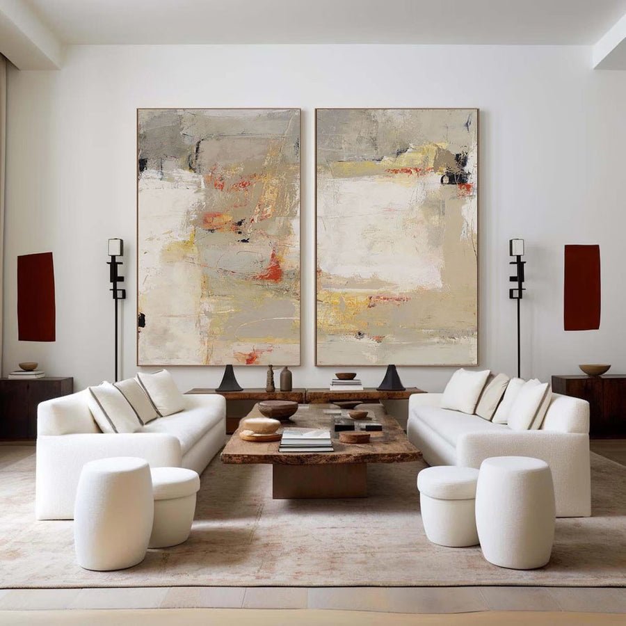
I test the complete object at room scale
I write down the planned canvas dimensions and the finished frame dimensions separately. I do not assume that the listing size includes the border. A frame can add enough width to change the gaps beside furniture or a doorway. I want the paper trial to show the object I will actually install.
I compare two realistic sizes of the same image. A larger painting may give the colorful design a clear role on a broad wall. It may also dominate a compact room more than I want. I judge this from the main seat and entrance rather than from a close view beside the template.
I test a quieter frame and a stronger frame. A dark border can make a colorful image feel more contained, but it can also increase contrast. A pale border can soften the edge against a light wall. I do not choose by a general rule. I compare each option around the actual artwork reference.
I ask about suitable framing and support. The Canadian Conservation Institute provides background on framing paintings.[1] I use that guidance to prepare practical questions for the specific work. A decorative finish is only part of the frame decision.
I also note frame depth in a narrow room. A projecting edge can affect a walking route even when the front outline looks good. I keep the size decision connected with installation and daily use so the colorful focus remains practical.
| Decision | My check |
|---|---|
| Outer size | I include the border in the wall template. |
| Color scale | I compare two sizes of the same image. |
| Frame weight | I test the complete visual and physical footprint. |
How do I keep the color choice useful in changing light?
I can choose a vivid palette in a bright showroom image and see a different balance at night. The room lighting needs its own check.
I compare the palette in daylight and normal evening lighting. I ask for clear artwork photographs under stated light. I keep the display position suitable for the work rather than using strong exposure to make colors look brighter.
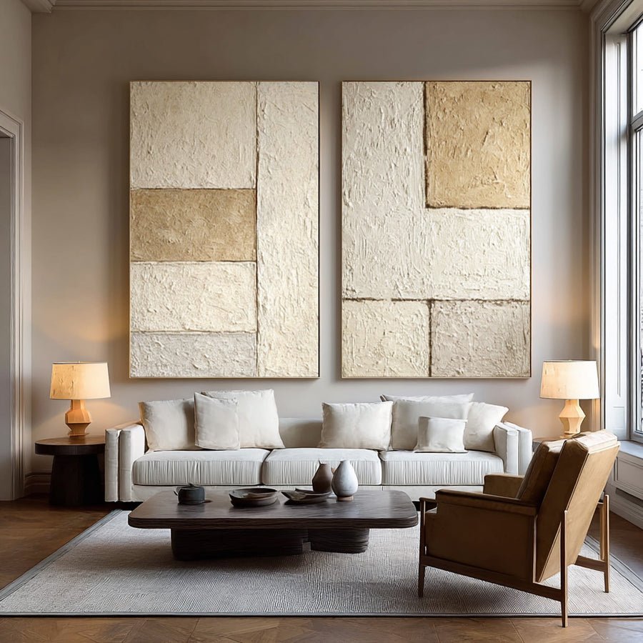
I compare the scenes I will live with
I take room photographs at two useful times. I include the wall, main furniture and normal lamps. I do not create a special bright scene only for the decision. The painting needs to work during the hours when I actually use the room.
I compare the artwork references on the same screen. I keep in mind that the display cannot show the final physical color exactly. A vivid online image may reflect lighting, exposure or editing as well as the painted palette. I ask for additional views when the choice depends on a specific accent.
I look at the most important color relationship. A warm red area may connect with a wood tone in one light and become the dominant focus in another. A pale blue area may look quieter under warm lamps. I describe those visible changes without making a claim that one palette will always create a particular feeling.
I check display and care guidance before selecting the wall.[2][3] I avoid direct sunlight or nearby heat as ways to make the painting appear more vivid. I also keep the work away from routine contact if the colorful focus sits near a busy route.
I record the final palette in plain words and keep the reference images with the order. This helps me discuss the intended balance if the artwork is custom. I confirm the actual review process rather than assuming an exact screen match or unlimited changes will be available.
| Decision | My check |
|---|---|
| Daylight | I check the color beside the actual wall and furniture. |
| Evening | I compare the normal lamp-lit scene. |
| Order record | I keep a clear palette brief and stated review terms. |
Conclusion
I add colorful art as one deliberate room focus. I test color quantity, existing connections and the full framed size under normal light before buying.