Why can a painting look different on screen and in my room?
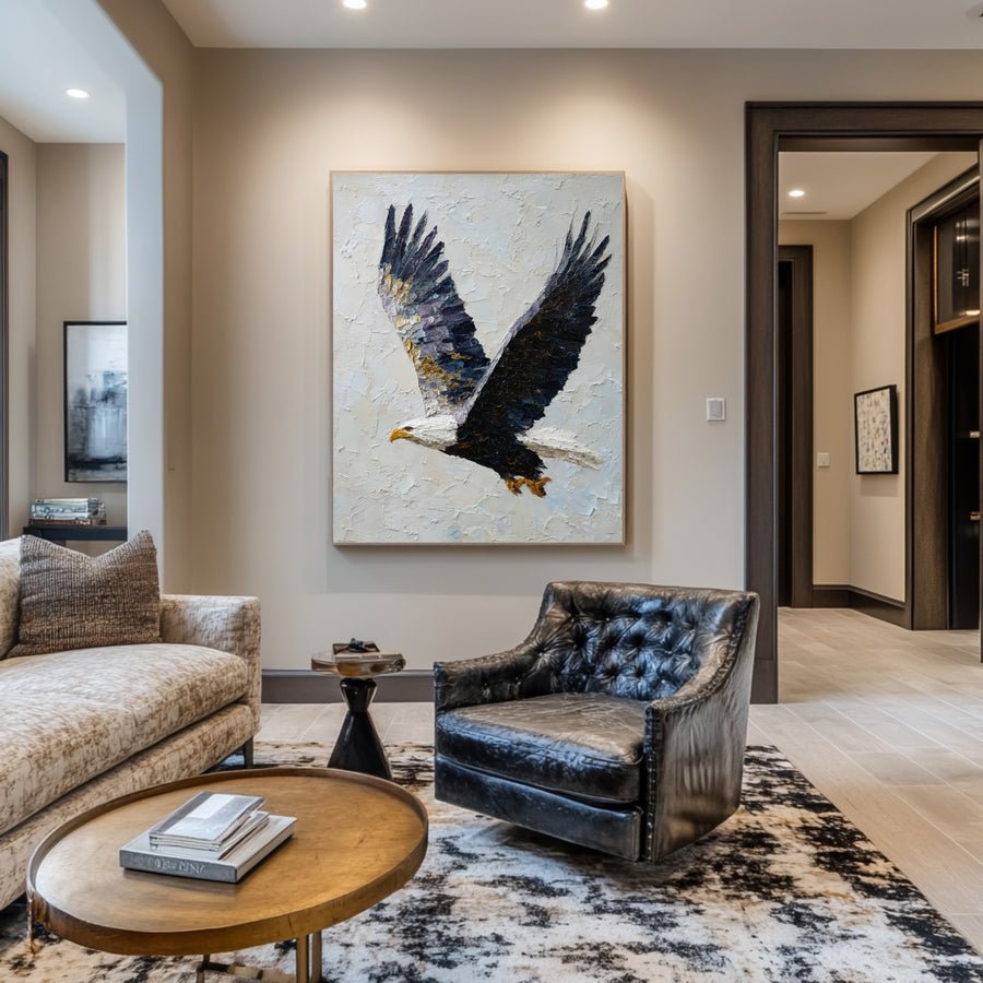
I can fall in love with a painting on my phone and see a different color at home. That gap makes an online purchase feel uncertain.
I treat a painting photograph as a reference rather than an exact color sample. Camera lighting, image edits, screen settings and room light can change what I see. I ask for consistent views and clear material information before deciding.
I separate the image, the screen and the room. These checks help me ask better questions without expecting one photograph to prove every physical detail.
What should I ask about the supplier photographs?
I can compare a bright listing image with a darker close-up and assume that one is wrong. The photographs may use different light and exposure.
I ask for a straight-on image, a close surface view and an angled view under stated lighting. I confirm whether they show the same actual work. I look for consistent information rather than choosing the most flattering image.
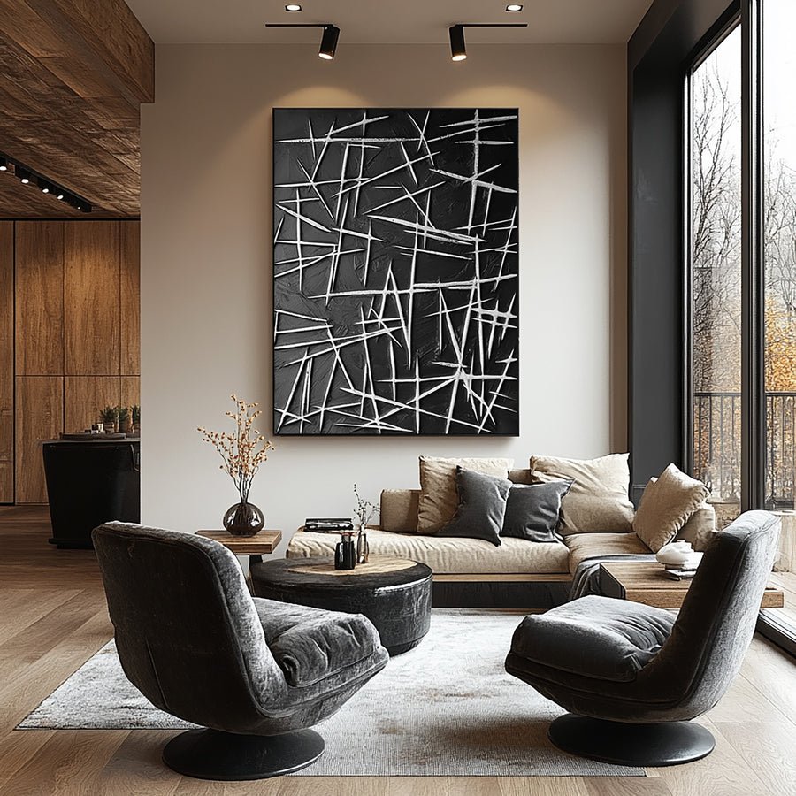
I request a useful set of views
I start by asking whether the photographs show the exact artwork offered. A custom reference, a representative sample and an available finished work are different things. I want that distinction written clearly before I compare small color details. I do not expect a future hand-painted piece to repeat every mark in a sample image.
I request a straight-on photograph that includes the complete artwork. I also ask for a close view and an angled view. The complete view helps me read the palette and composition. The close view helps me inspect surface details. The angle helps me understand depth and sheen without relying on one dramatic lighting setup.
I ask how the photographs were lit. A strong side light can create dark texture shadows. A bright exposure can make a pale ground look almost white. I do not accuse the seller of a problem from those differences alone. I ask for a more consistent comparison when the color choice depends on them.
I also ask whether the images have been heavily edited. I want clear product information rather than a mood image that hides the surface. A neutral reference photograph can sit alongside styled room photographs without needing to replace them.
I can discuss these requests through the custom art service. I explain which palette detail matters to my room. That gives the conversation a specific purpose instead of demanding that every photograph look identical.
| Decision | My check |
|---|---|
| Exact item | I confirm which work each photograph represents. |
| Useful views | I request complete, close and angled images. |
| Lighting | I ask how the images were made when tones differ. |
How much should I trust my phone or computer screen?
I can move between devices and see the same painting shift from cool gray to warm beige. A screen comparison has clear limits.
I use one reasonably consistent screen for shortlisting and avoid comparing images under changing display settings. I do not treat screen color as a guarantee of physical paint color. I seek samples or clearer references when a subtle match matters.
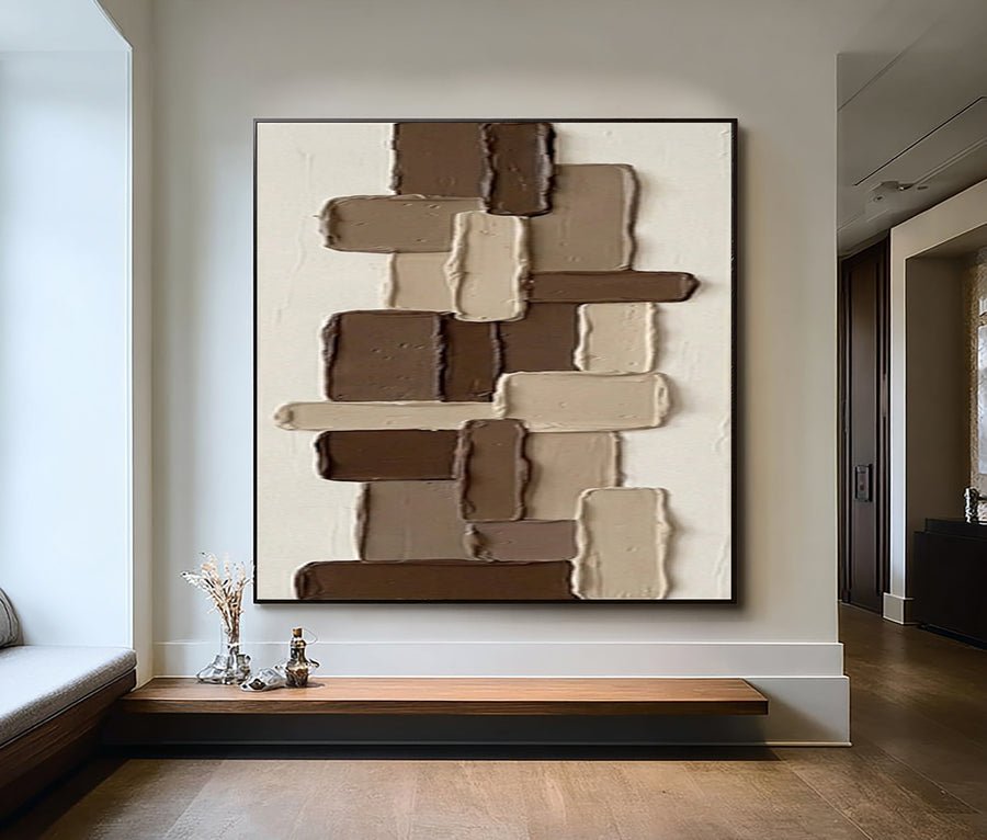
I make the screen comparison more consistent
I compare candidate artwork images on the same device first. I keep the screen brightness reasonably steady and note whether automatic color adjustments are active. I do not need to claim a calibrated setup for an ordinary shortlist. I only want to avoid changing several conditions between images without noticing.
I place the device near the intended room view, but I do not treat its lit screen as a physical object on the wall. The screen emits light while the painting reflects the room light. A rough mockup helps me compare composition and broad palette. It cannot demonstrate exact paint color, surface depth or sheen.
I look at the image on a second device when I suspect a major display difference. If the colors change strongly, I record that uncertainty. I do not choose the device that shows the version I prefer and call it the accurate one. I ask for better supplier references instead.
I consider whether an exact match is really necessary. A deliberate contrast with the wall may leave more room for small differences than a painting meant to match a specific pale fabric. I describe that design choice before ordering. This helps me decide which color questions need more evidence.
I keep the image preview in its proper role. It can support an order discussion, but it is not a promise that the final physical painting will look identical under every light or on every device.
| Decision | My check |
|---|---|
| One-device trial | I keep display settings reasonably consistent. |
| Second view | I note major differences instead of choosing my favorite version. |
| Exact match | I ask for more evidence when small shifts matter. |
How does my room change the color I notice?
I can focus on the artwork image and forget the wall, floor and lamps around it. The room changes the visible relationship.
I compare the artwork reference with the actual wall and main furniture in daylight and normal evening light. I note warm or cool shifts and surrounding contrast. I choose the placement with care needs in mind.
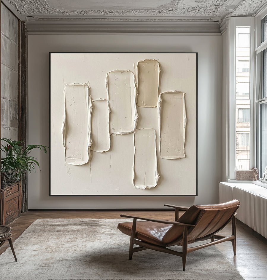
I compare two real room scenes
I photograph the intended wall with the main furniture in place. I do this during useful daylight and again with the normal evening lamps. I avoid setting up a special light that I will not use after installation. I want the choice to work in ordinary conditions.
I look at the wall undertone first. A cream wall and a blue-gray wall can make the same pale painting feel different. The nearby floor and furniture also matter. I write down the visible relationship in simple words such as warmer, darker or quieter rather than pretending I have measured an exact color difference.
I compare the artwork at its planned size. A small thumbnail may look like a minor accent, while a large pale field can become a major part of the room. I use a paper outline and a rough image mockup to judge that scale. I keep the screen limitations visible.
I ask whether shadows from texture are part of what I liked in the reference. The National Gallery definition of impasto helps me use that painting term carefully.[3] I still need the actual material description. A raised surface and a flat image may respond differently to the same light.
I check care and display guidance before choosing the location.[1][2] I do not place the painting in direct sun or near heat merely to make its colors look closer to an online image. The position needs a practical basis as well as an attractive view.
| Decision | My check |
|---|---|
| Daylight scene | I include the wall, floor and furniture. |
| Evening scene | I use normal lamps rather than a staged setup. |
| Care decision | I avoid unsuitable exposure as a color solution. |
What should I record before I approve the order?
I can approve a vague color description and later disagree about what I meant. A clear written brief makes the uncertainty easier to discuss.
I record the intended palette, reference images, materials, size and known preview limits. I ask which aspects can vary and what review process applies. I do not assume exact color matching, unlimited revisions or a remedy that has not been stated.
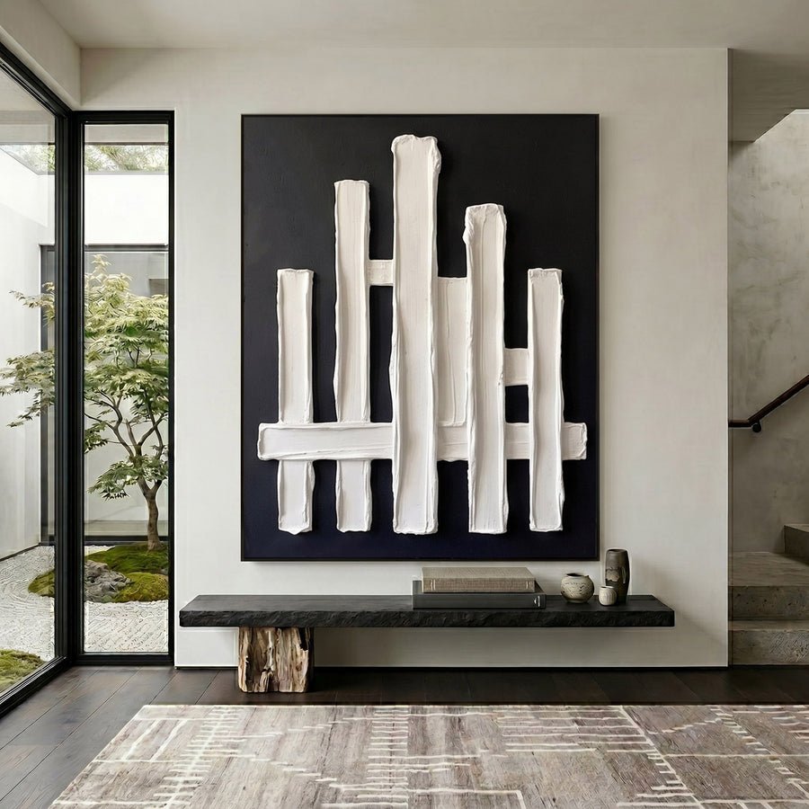
I turn preference into a clear brief
I describe the palette in practical words. I might want warm cream rather than bright white, or muted blue rather than violet-blue. I identify the largest color areas and any accent that matters. This gives the supplier more useful information than saying that I want the image exactly as it looks on my phone.
I attach the reference images with notes about their role. One may show the composition. Another may show a surface style. A room photo may show the wall and furniture. I do not expect one image to communicate all three things without explanation. I also keep the original references rather than relying on a cropped screenshot.
I confirm the actual materials and finished size. I ask whether the listed dimensions include framing. A larger area of color and a stronger frame can change how the piece reads in the room. I want those details settled before I approve a visual brief.
I ask what review or approval process is available for the specific order. I do not invent a revision allowance or assume that every supplier offers the same steps. I also read the stated order and return terms before paying. A realistic discussion of variation is part of an informed purchase.
I browse the collections with this brief in mind if I decide on an existing work instead. I compare its actual photographs and description against the room need rather than treating the first appealing screen image as final proof.
| Decision | My check |
|---|---|
| Palette brief | I name the important tone differences plainly. |
| Reference role | I label composition, surface and room images. |
| Approval terms | I confirm the actual review process before paying. |
Conclusion
I use screen images to shortlist and discuss a painting. I verify photographs, room light and the written brief before treating the physical color choice as settled.