Should I choose textured wall art or a flatter painted surface?
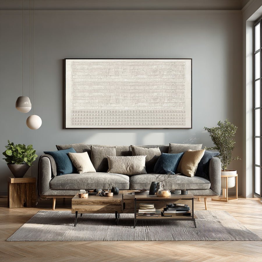
I can choose deep texture for its striking photos and find it too busy at home. A flatter surface may suit the room better.
I compare textured and flatter paintings under ordinary room lighting and from the normal viewing distance. I check materials, depth and care needs. I choose the surface that supports the composition and practical location, rather than assuming more texture means higher quality.
I separate appearance from construction before comparing the options. These checks help me choose a surface for the room I have, not only for a close-up listing photograph.
What does the seller mean by textured wall art?
I can read textured and assume thick oil paint. The visible effect may come from several different materials or even a flat image.
I ask what creates the texture and whether it is physically raised. I request material details, a close view and a side view. I do not use a texture label as proof of hand painting or oil content.
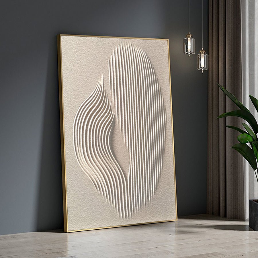
I verify the surface before comparing style
I start with the written material description. I look for a clear statement about the paint and support rather than a list of decorative search words. If the listing mixes oil, acrylic, relief and canvas without explanation, I ask which terms describe the actual work I would receive.
I request a close photograph of the surface. I also request an angled view that shows depth. A flat printed pattern can suggest ridges in a straight-on image. A side view can help, but I still ask for a written description. Photographs and terminology should support each other.
I use painting terms carefully. The National Gallery defines impasto in relation to thickly applied paint.[1] I do not call every raised decorative surface impasto. I also do not assume that visible brush marks prove oil paint. The material needs its own confirmation.
I ask whether the images show the exact artwork or a representative version. Texture can vary in a custom painting. I want to know which qualities are part of the brief and which details may differ. I do not expect a physical surface to copy every ridge in a reference photograph.
I can discuss these questions through the custom art service. I describe whether I want subtle brushwork, a raised surface or a flatter painted finish. Those distinctions make the order conversation clearer than asking for something very textured.
| Decision | My check |
|---|---|
| Physical depth | I ask whether the surface is actually raised. |
| Materials | I request a clear paint and support description. |
| Reference type | I confirm exact item versus representative example. |
How will texture look under my room lighting?
I can love dramatic ridge shadows online and barely see them under soft room light. The lighting setup changes the visible effect.
I compare a straight-on photograph with an angled view and ask how each was lit. I judge the surface under the room lights I normally use. I do not add unsuitable exposure simply to reproduce a listing photograph.
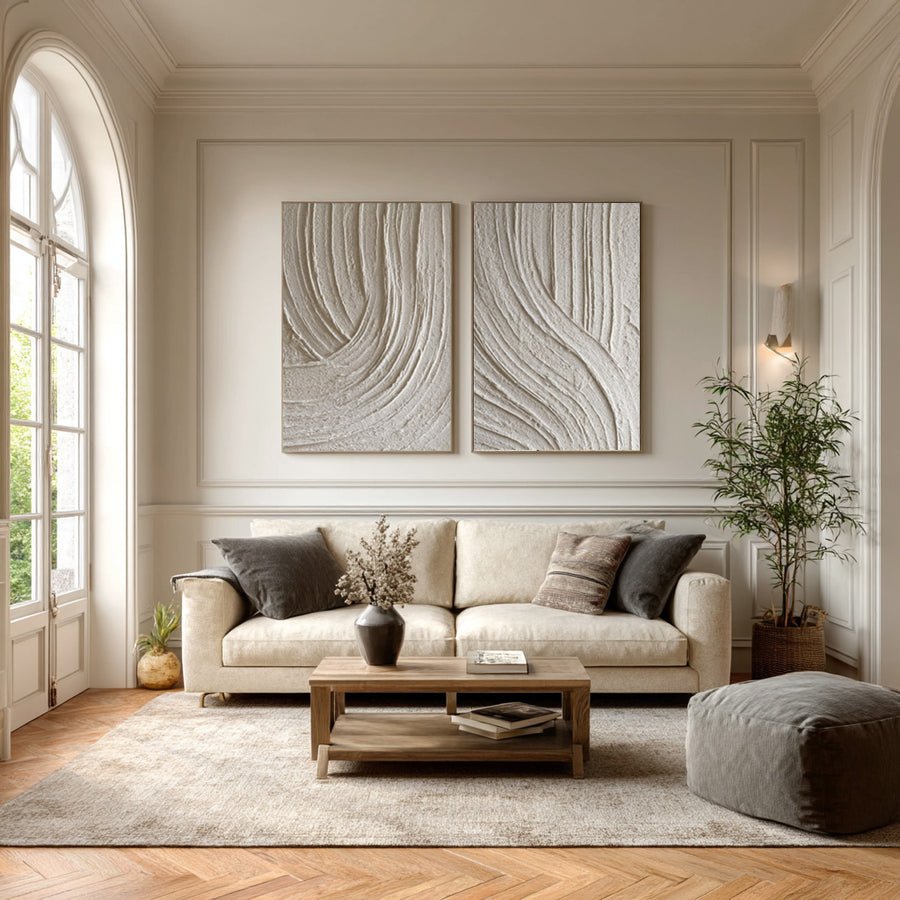
I compare ordinary and dramatic views
I look at the lighting in the listing images. A light placed close to one side can make ridges cast strong shadows. That photograph may help show the surface, but it may not represent a softly lit room. I ask for another view under more even light before deciding that the texture will look equally strong at home.
I note the room light sources. A window on one side, an overhead lamp and a broad wall wash create different patterns. I do not need to calculate a lighting design for a simple room trial. I need to know whether the artwork will receive the same kind of light that made the reference image attractive.
I compare the texture from the main seat. Close-up photographs can make small marks feel dramatic. At a longer viewing distance, those marks may blend into the overall color. I choose whether I want that subtle effect or a clearly visible surface from across the room.
I also check shadows around the frame. A deep canvas and a floating frame may create their own dark edges. I include those in the full-size mockup so I do not attribute every shadow to the painted texture.
I use display guidance when choosing the actual location.[3] I do not put a painting in direct sunlight or next to heat merely because those conditions make its surface look stronger. The lighting choice has to fit the work as well as the desired appearance.
| Decision | My check |
|---|---|
| Listing light | I ask whether side lighting exaggerates the ridges. |
| Room light | I compare the sources I normally use. |
| Viewing distance | I check whether the surface remains visible from a seat. |
When might a flatter painted surface be the better choice?
I can treat a flatter painting as less interesting and miss how its marks work with the room. Surface depth is only one form of visual detail.
I consider a flatter painting when the room already has strong textures, when fine image detail matters or when I want a quieter focal point. I judge brushwork and composition separately from raised depth.
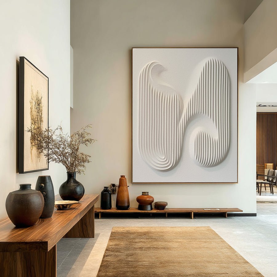
I choose the kind of detail I need
I list the existing textures in the room. A rough stone wall, woven fabric and strongly grained wood may already create plenty of surface variety. In that setting, a flatter painting can offer a clearer area for the eye. I do not need the artwork to repeat every material effect around it.
I consider the subject. A portrait or detailed landscape may rely on subtle marks and clear forms rather than deep ridges. I want those forms to remain readable. A raised surface may still suit the artist's approach, but I do not request more texture merely to make the work seem valuable.
I compare a flatter and a textured option at the same size. I keep the palette similar for the first test. That helps me notice the surface difference rather than simply favoring a more colorful image. I then inspect the full compositions and decide which one supports the room focus.
I also think about the location. A busy narrow route may make a deep projecting surface less practical. I do not assume that a flat painted work is indestructible, but I can ask whether its finished depth is better suited to that position.
I browse the collections with the visual role in mind. I look for quiet marks, clear shapes or richer surface variation as needed. I keep quality questions about construction and finishing separate from the preference for one level of texture.
| Decision | My check |
|---|---|
| Busy materials | I test whether a flatter area gives visual relief. |
| Fine subject detail | I check forms and brushwork rather than ridge depth. |
| Practical depth | I compare projection into the intended location. |
How do care and handling affect the surface decision?
I can choose a raised surface without asking how it should be handled. The purchase needs practical information as well as attractive images.
I ask for care guidance, finished depth, weight and mounting details for the actual work. I keep contact and household cleaners away from both surface types. I seek qualified advice for loose or uncertain areas.
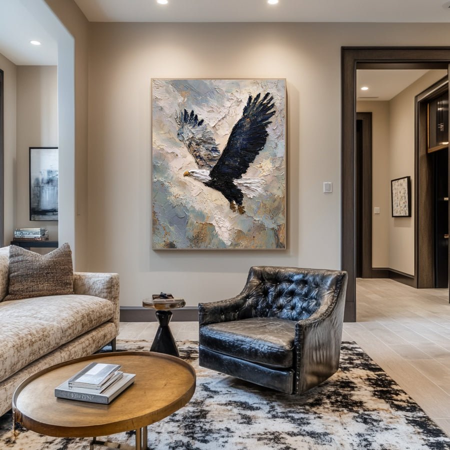
I ask about the actual work, not the category
I request the material and finish details before deciding on a care routine. A textured artwork may have several surface components. A flatter painting may still have delicate paint or a sensitive finish. I do not assume that one category can be cleaned with a standard household method.
I check the room for contact risks. A chair back, a door or a carried bag can reach farther than I expect. I use a paper outline and a depth marker before the painting arrives. This lets me compare the practical footprint without touching or testing the real surface.
I ask for finished weight and mounting information. More visible texture does not tell me how heavy the work is. The support and frame also matter. I give the installer the actual details so the wall fixings can be chosen for the work and site.
I read care guidance as background.[2] I keep sprays, damp wiping and improvised cleaning away from the painting. If the surface needs treatment or shows loose areas, I ask for advice that considers its materials and condition. I do not present a dusting shortcut as safe for every painted surface.
I keep the order description and photographs for reference. They help me explain what the surface was meant to look like if I later notice a change. The final choice should fit the room, the composition and the practical care I can provide.
| Decision | My check |
|---|---|
| Care instructions | I ask for guidance tied to the actual materials. |
| Contact route | I test the position with an outline and depth marker. |
| Mounting | I confirm weight rather than estimating from texture. |
Conclusion
I choose surface depth after checking materials, lighting and room context. I compare textured and flatter paintings fairly, and I keep practical care in the decision.