How do I choose wabi-sabi wall art without making my room feel unfinished?
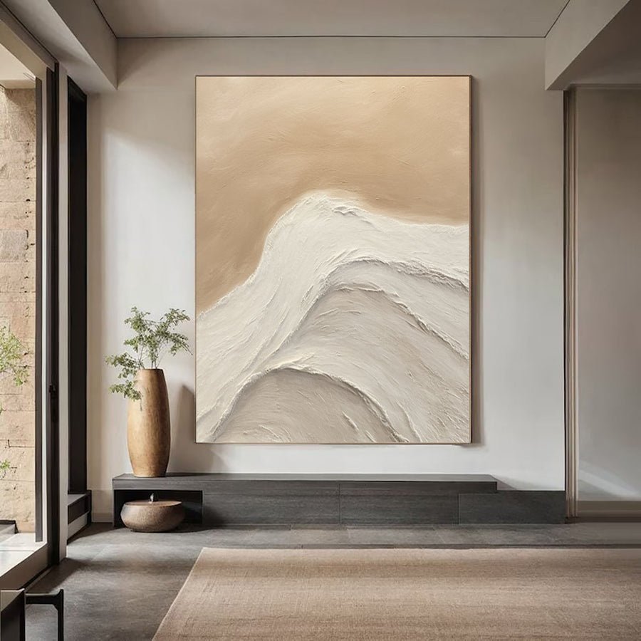
I can choose softly irregular wall art and still make the room look accidental. A quiet painting needs a clear arrangement around it.
I use the wabi-sabi listing label as a starting point, then inspect the actual color, marks and materials. I balance irregular surfaces with deliberate placement and useful room structure. I do not treat decorative wear as proof of quality or authenticity.
I focus on the visible buying decisions rather than making a broad claim about a cultural tradition. These checks help me choose an understated painting without leaving the room visually unresolved.
What am I really choosing when a listing says wabi-sabi?
I can trust a style label and overlook the actual surface. The same word can describe very different paintings and materials.
I inspect the artwork itself and ask for its materials, method and dimensions. I separate irregular marks from damage and texture from a printed effect. I use the style label to search, not to verify construction.
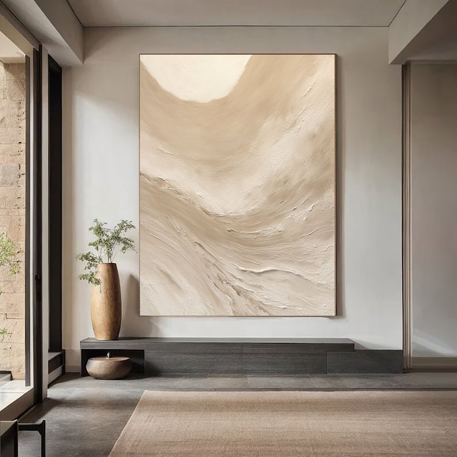
I look beyond the listing name
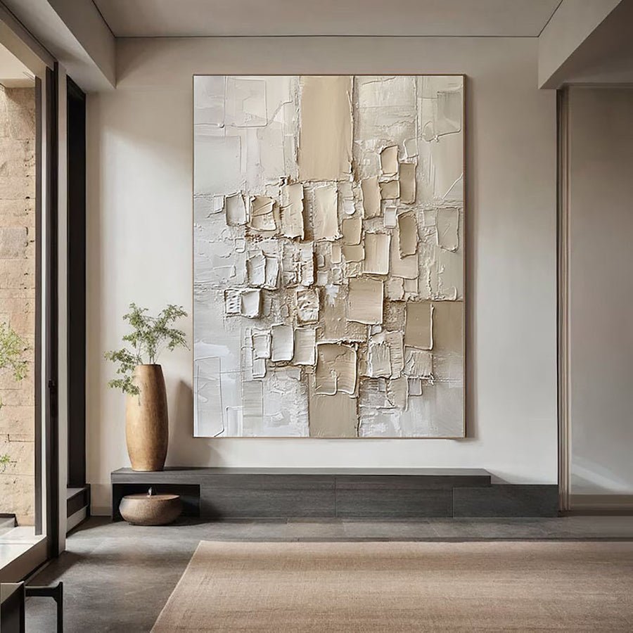
I begin with the image and written description. I note the colors, edge treatment and visible marks. A pale abstract painting with uneven brushwork is different from a relief surface with deep ridges. I do not assume that they share a material or care method because the listing uses the same style word.
I ask how the surface was made. The National Gallery describes impasto as a painting term connected with thickly applied paint.[1] I use that definition to ask a precise question when a seller uses the word. I do not treat every raised decorative surface as impasto or as oil paint.
I request a straight-on photograph and a close view. I also ask whether the pictured work is the exact item, a representative example or a custom reference. That distinction matters when irregular marks are a large part of what attracts me. I want to know what can vary before I place an order.
I keep intentional irregularity separate from condition concerns. A style description does not explain a tear, unstable surface or loose frame. If something looks uncertain in a photograph, I ask for clarification. I do not reinterpret possible damage as character just because the palette is soft.
I can discuss a reference through the custom art service. I describe the visible qualities I want in everyday words. I avoid asking for a vague style label when a clear brief about marks, color and surface would be more useful.
| Decision | My check |
|---|---|
| Style label | I use it for discovery rather than material proof. |
| Surface method | I ask what creates the marks and raised areas. |
| Condition | I separate intended irregularity from unexplained damage. |
How do I balance irregular art with a finished room?
I can add rough-looking art to an already busy room and make every edge compete. A quiet structure can help the painting read clearly.
I give the painting a deliberate position and enough clear surrounding space. I keep some room lines simple, such as the furniture base or frame edge. I avoid making every object irregular or distressed.
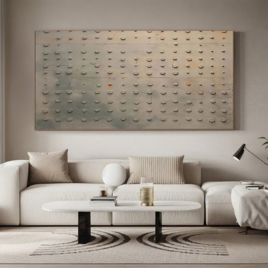
I choose where the irregularity belongs
I look at the room before adding the painting. I note patterned fabrics, open shelves, uneven wood and strong architectural details. If these already create a busy scene, I choose a quieter artwork or a simpler position. I do not need every surface to repeat the same rough character.
I use the furniture as a clear base. A straight console line or a calm headboard can support an irregular image without matching it. I test the artwork with paper and keep the furniture in place. This helps me see whether the painting looks intentionally arranged rather than temporarily left on the wall.
I check the outside frame edges. An unframed canvas can work, but I ask how its edges are finished and how it will hang. A simple frame can create a clear boundary around uneven marks. I compare both options using the complete dimensions, not only the image area.
I remove only the objects that genuinely distract from the layout. I do not turn the room into an empty set for a photograph. I keep the lamp, storage and daily items that have a practical role. The final arrangement should remain readable when ordinary life returns.
I browse the collections for the missing quality in the room. I may need a calmer palette rather than a rougher surface. I may need a clearer shape rather than more decoration. I let that need guide the shortlist instead of repeating a style word everywhere.
| Decision | My check |
|---|---|
| Room structure | I keep a clear furniture or frame line. |
| Irregularity | I choose where it should carry visual interest. |
| Daily objects | I keep useful items in the room trial. |
Which pale colors keep the arrangement from looking unfinished?
I can combine several pale neutrals and lose the artwork against the wall. Quiet color still needs a visible relationship.
I compare the painting ground with the wall, wood and fabrics. I test enough tonal difference to read the edges and main marks. I use warmer or cooler neutrals deliberately instead of assuming that all beige shades match.
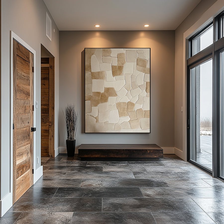
I give the pale palette a clear role
I start with the wall color. I compare it with the largest pale area in the artwork reference. If the two are very similar, the painting may blend quietly. That can be useful, but I still want the main marks to remain visible. I judge the effect from the normal viewing point rather than only at close range.
I look for a second tone within the image. A soft gray line, a muted brown area or a darker edge can provide structure without creating a loud contrast. I compare the amount and position of that tone. A broad dark block will behave differently from a few scattered marks.
I test warm and cool pale options beside the actual room materials. A cream painting may connect with warm linen and oak. A cooler gray-white painting may create a clearer difference. I do not label either option more authentic to the style. I choose based on the visible room relationship.
I check normal daylight and evening lighting. I ask for a neutral-light artwork photograph if the shortlist depends on subtle undertones. I keep screen uncertainty visible rather than promising that a mockup will match the final paint exactly.
I also consider the frame as a tonal boundary. Framing guidance helps me prepare practical questions about fit and support.[2] I choose the border after seeing its color around the actual image. A thin dark edge can define a pale work without changing its whole palette.
| Decision | My check |
|---|---|
| Wall relationship | I check whether the painting blends or separates. |
| Second tone | I inspect the marks that give the image structure. |
| Frame edge | I test a boundary around a pale surface. |
How do I care for a rough or textured surface?
I can assume that a rugged-looking painting is easy to clean. A delicate surface may sit behind that appearance.
I ask for care guidance for the actual materials and condition. I keep routine cleaners and contact away from the painting. I seek qualified advice when the surface is dusty, loose or uncertain rather than using a general cleaning shortcut.
I do not confuse appearance with durability
I request the material description before planning care. A rough-looking surface may contain paint, added fillers or other components. I do not infer its durability from a photograph. I also ask whether the work has a specific finish and whether any care instructions apply to it.
I inspect the intended room position. A location near a kitchen route, a busy doorway or a frequently moved chair can create different risks. I choose a place where the artwork is less likely to receive splashes or knocks. I do not treat a muted style as permission to accept regular contact.
I keep household cleaning products away from the surface. I do not spray nearby furniture toward the painting or wipe raised marks with a damp cloth. The Canadian Conservation Institute provides background on care risks for paintings.[3] I use that source to recognize when the actual materials and condition need more specific advice.
I ask for qualified help if I see loose particles, lifting areas or unexplained changes. I do not try to make a surface look more intentionally weathered by adding wear. The style decision belongs in the artwork brief, while condition concerns need a separate response.
I keep the description and reference photographs with the order record. They help me explain the original surface if I later ask about care. I want the quiet visual character to remain a considered design choice, not a reason to ignore how the painting is made.
| Decision | My check |
|---|---|
| Materials | I request the actual surface description. |
| Routine care | I keep sprays and wiping away from the painting. |
| Uncertain condition | I seek specific advice rather than improvising. |
Conclusion
I choose understated art through its actual marks, palette and materials. I give it clear placement and suitable care so irregularity remains deliberate rather than accidental.